HelloHello👋
I’m Katherine, art director and brand designer.
For over a decade, I’ve built brand identities and art directed how they come to life: on screen, printed, in 3D and in retail spaces worldwide.
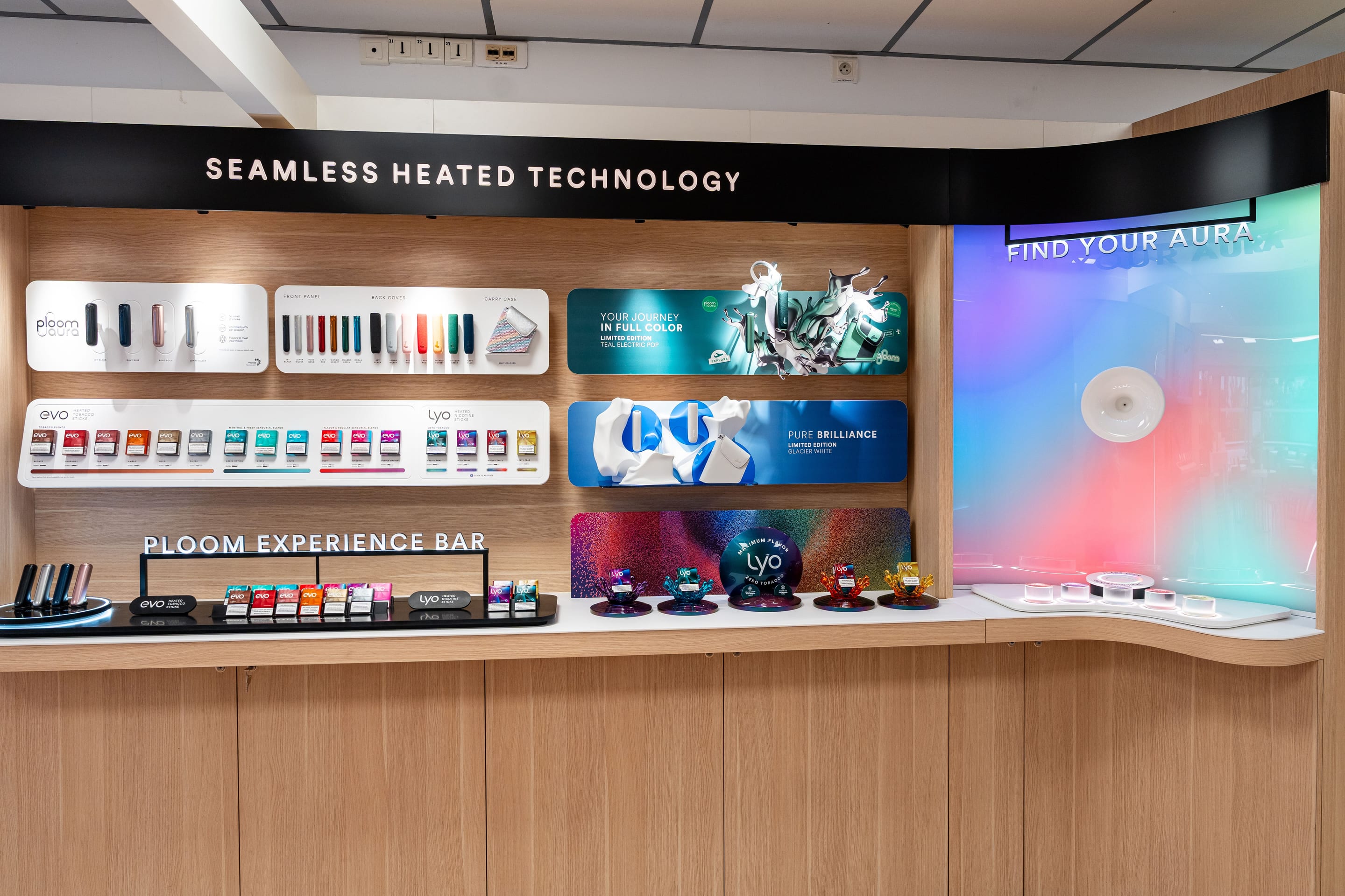
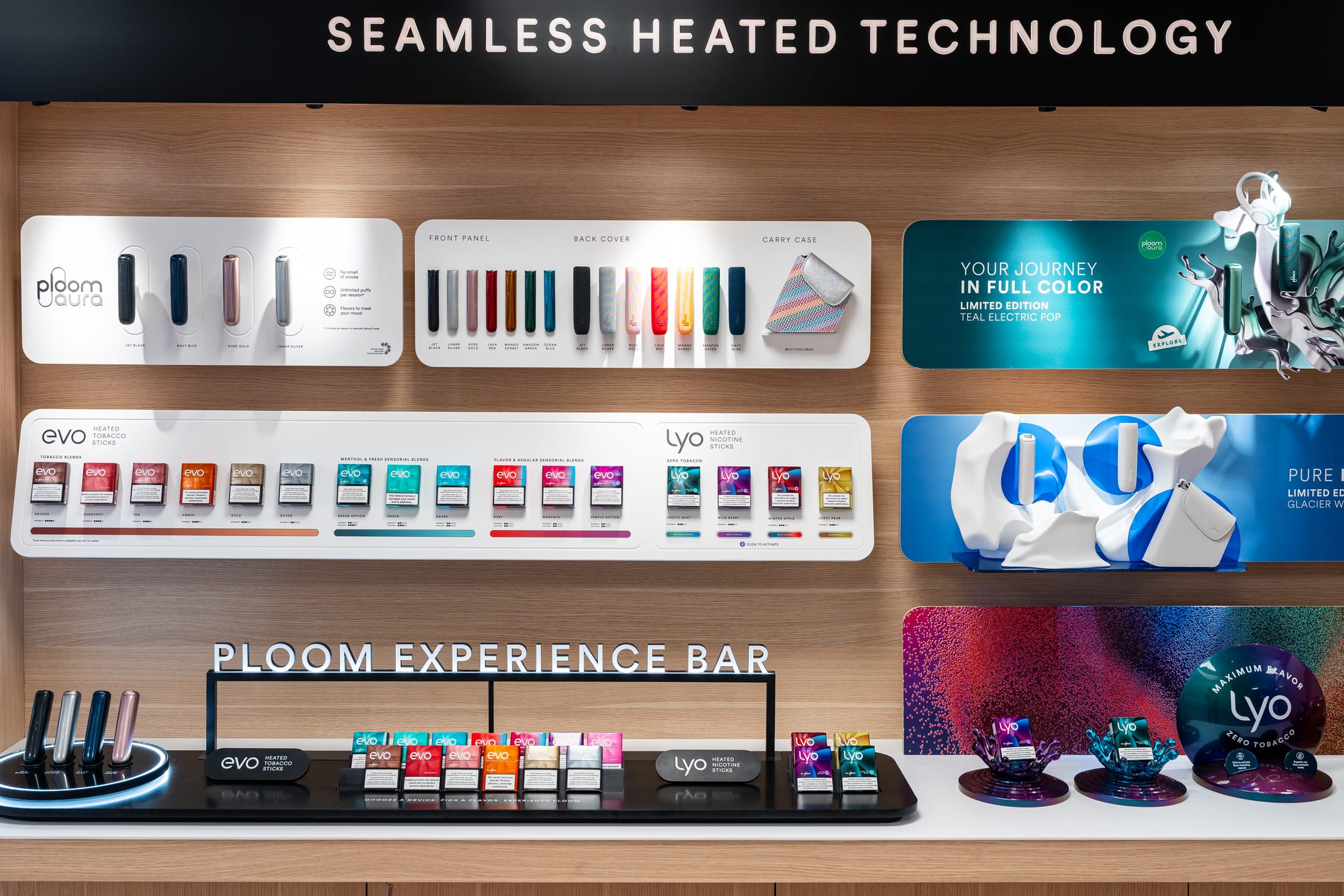
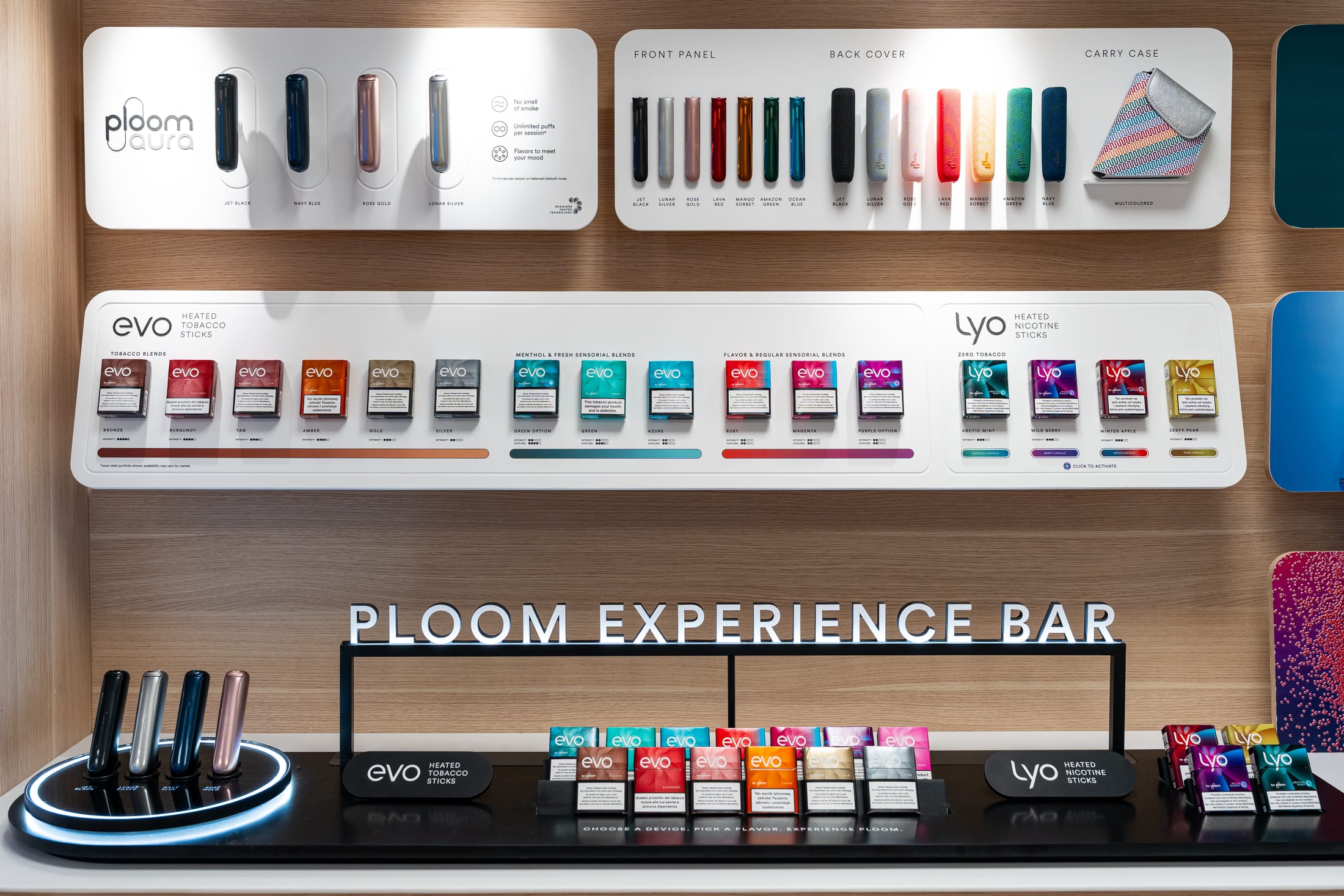
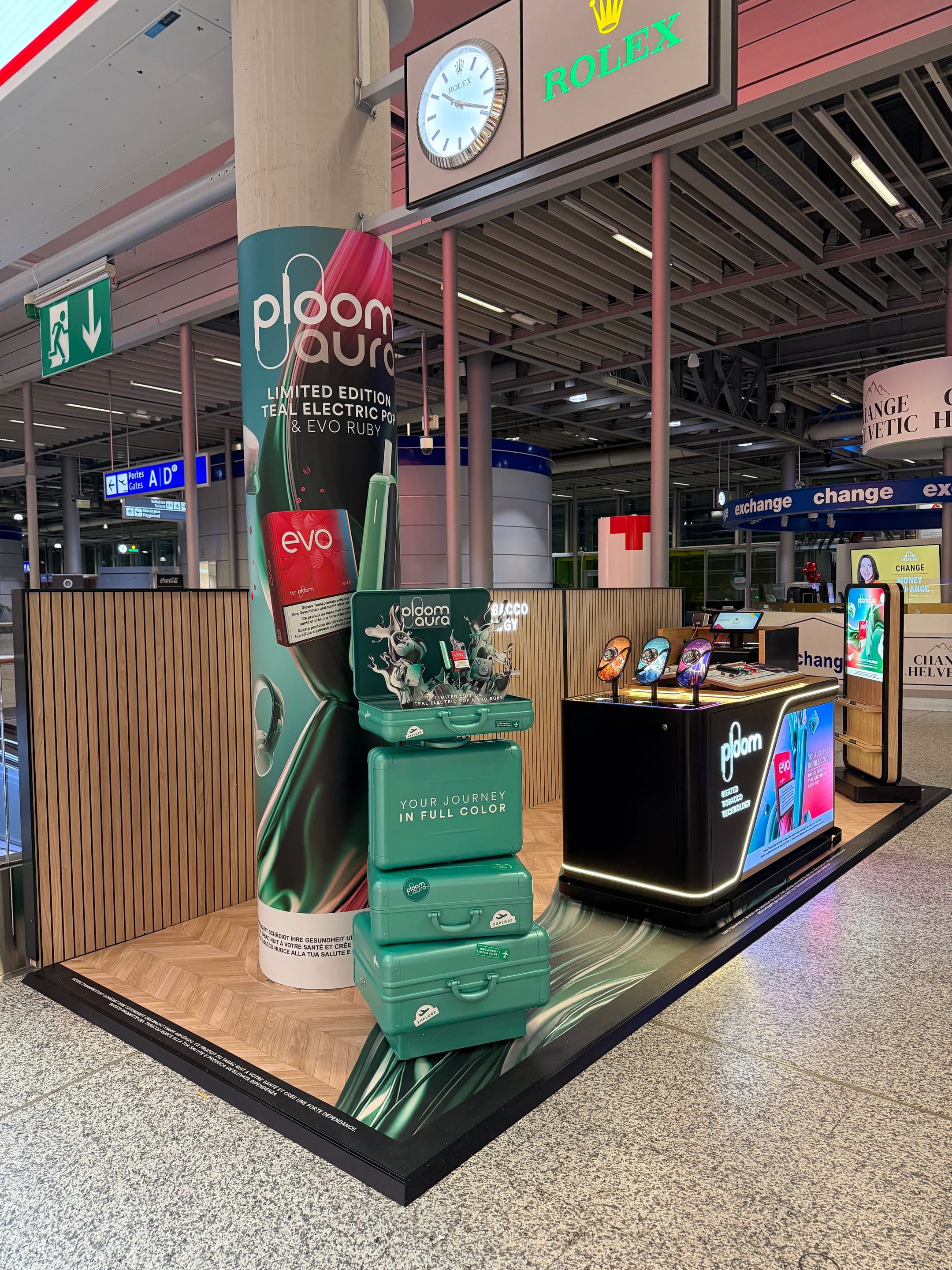
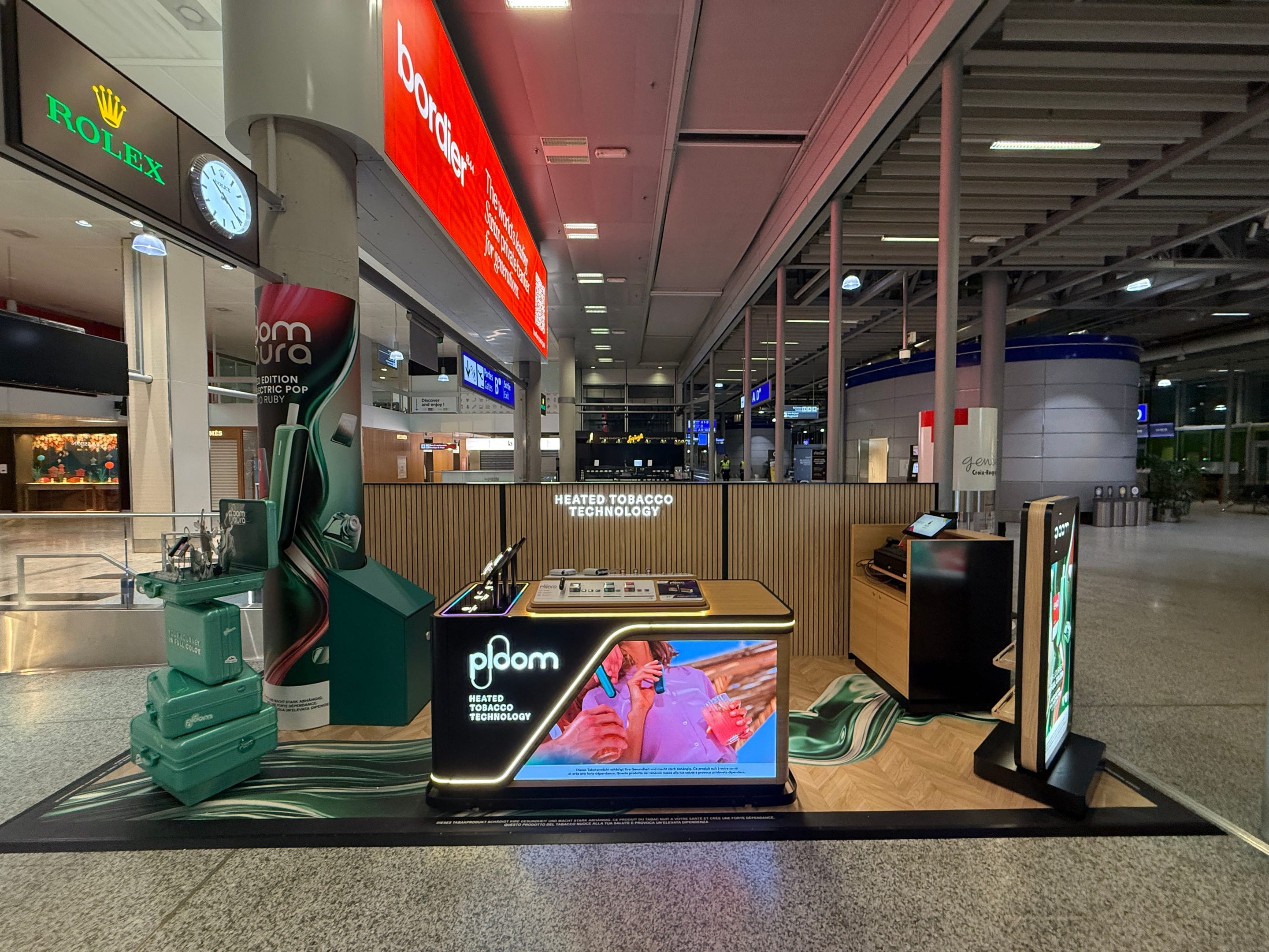
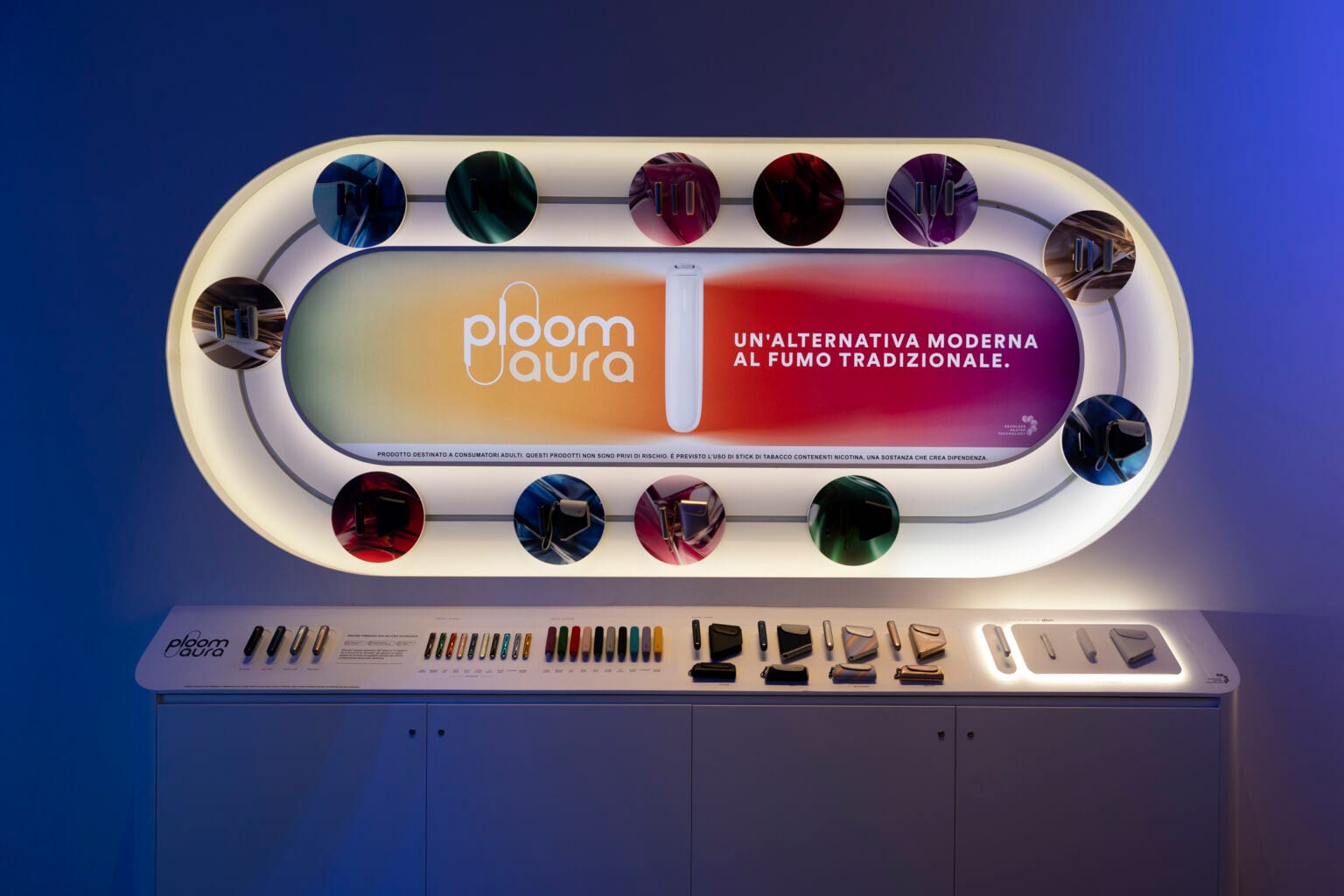
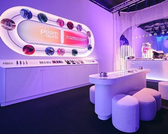
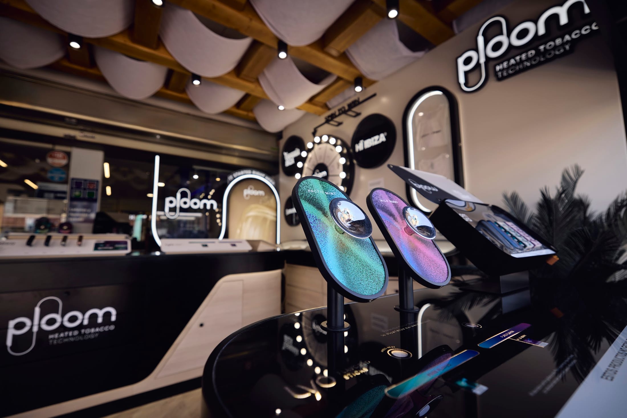
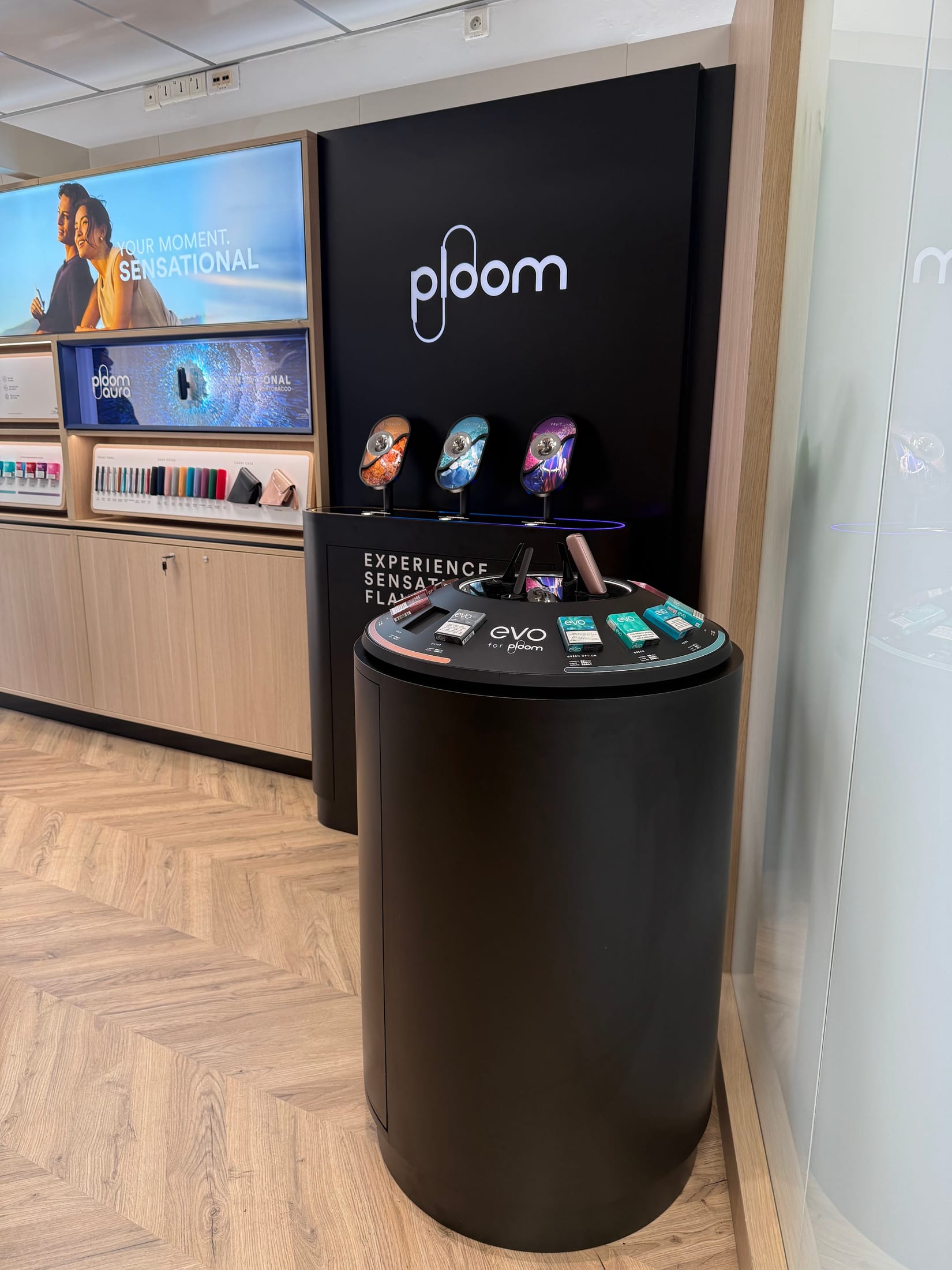
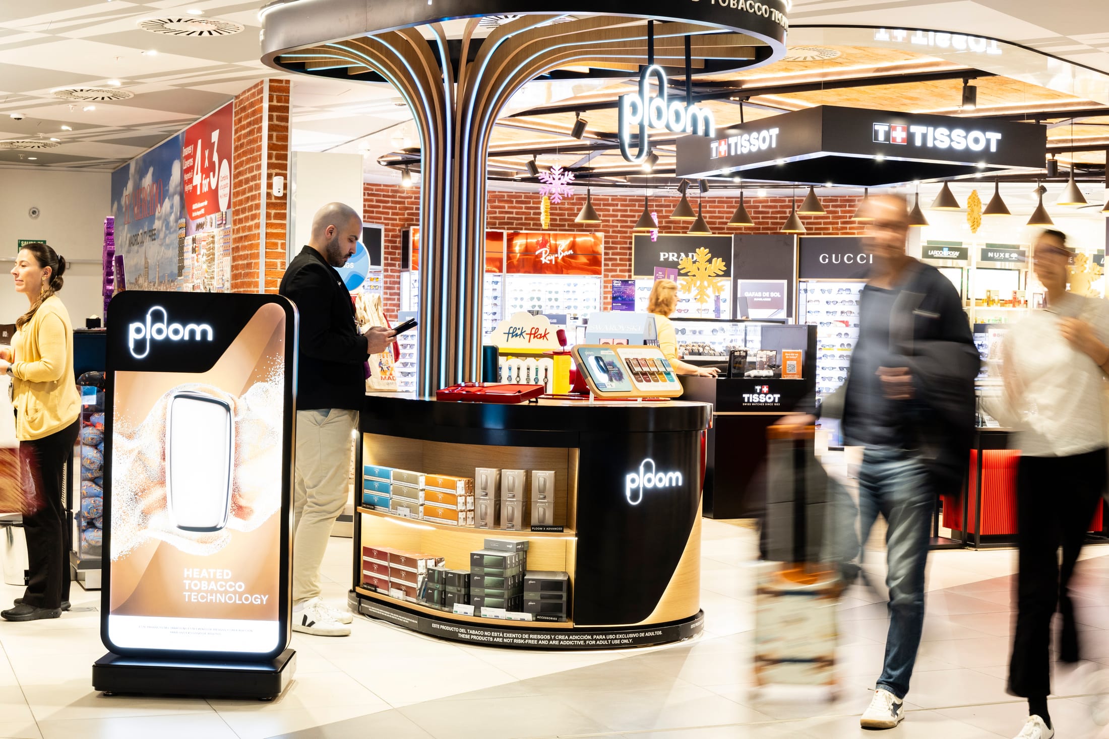
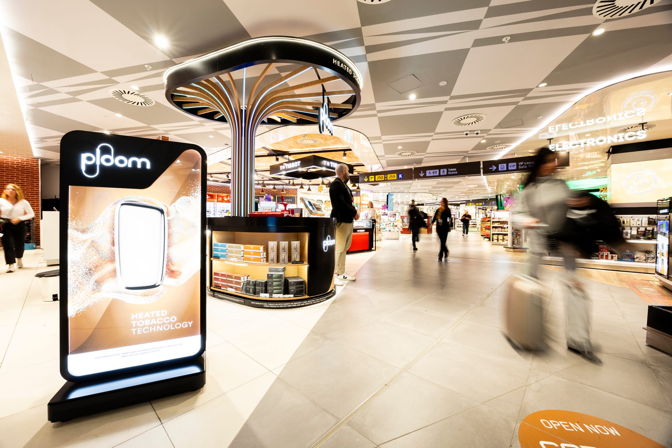
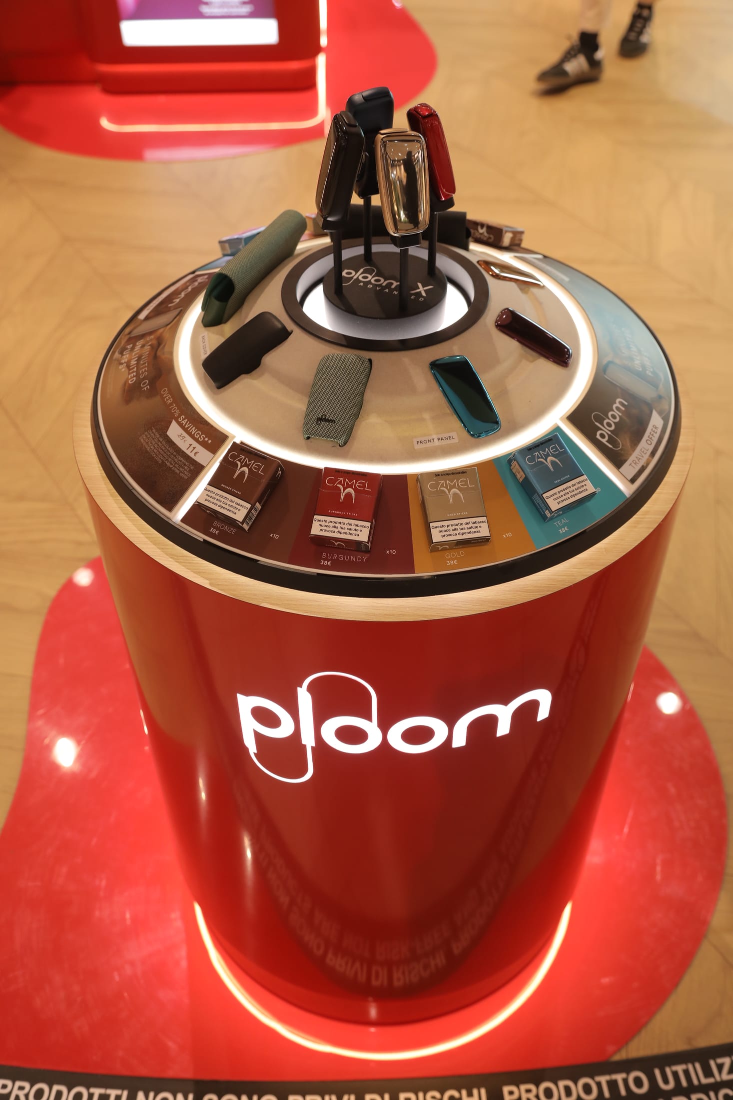
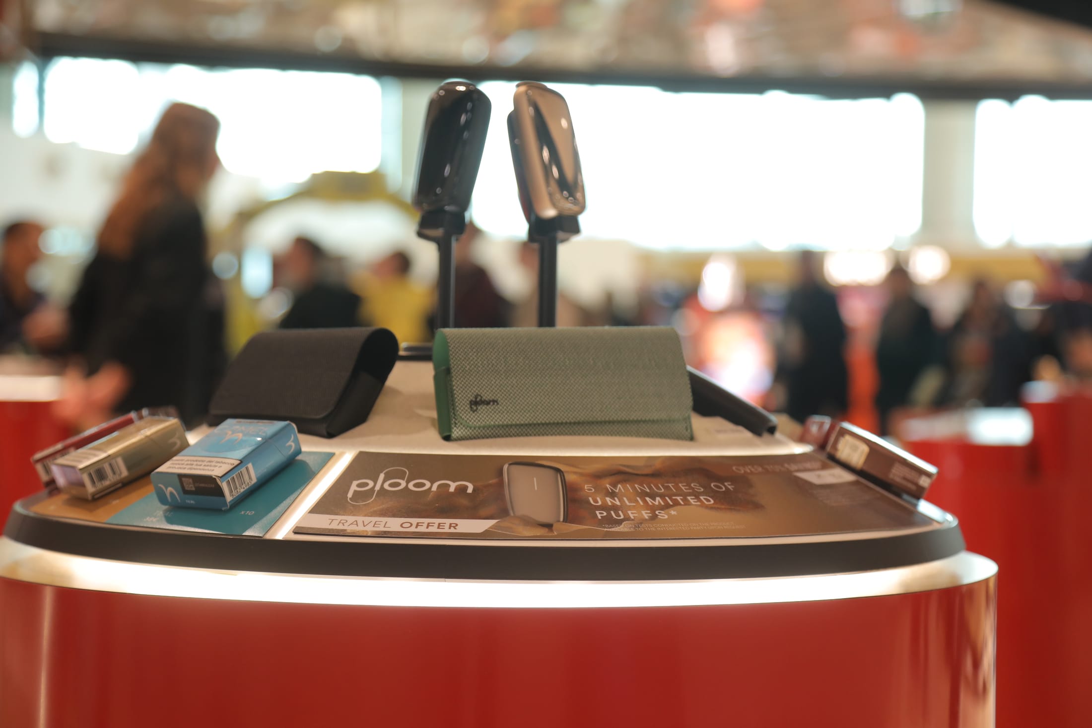
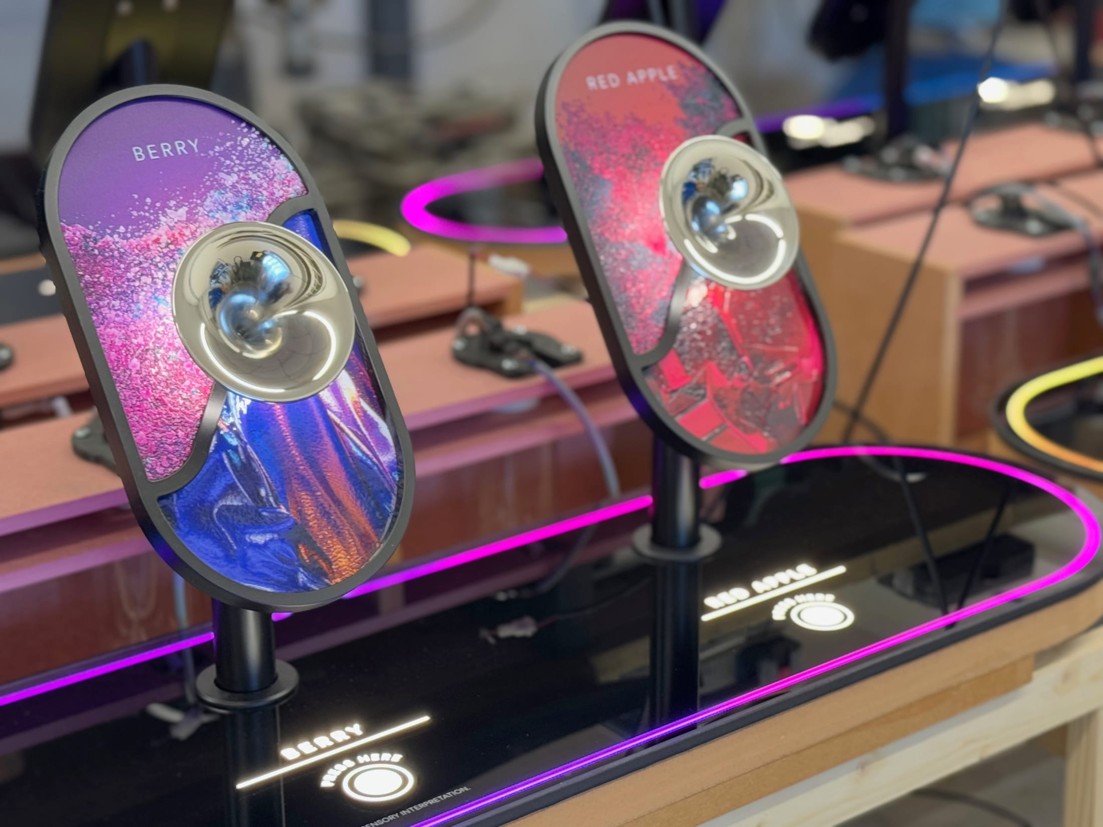
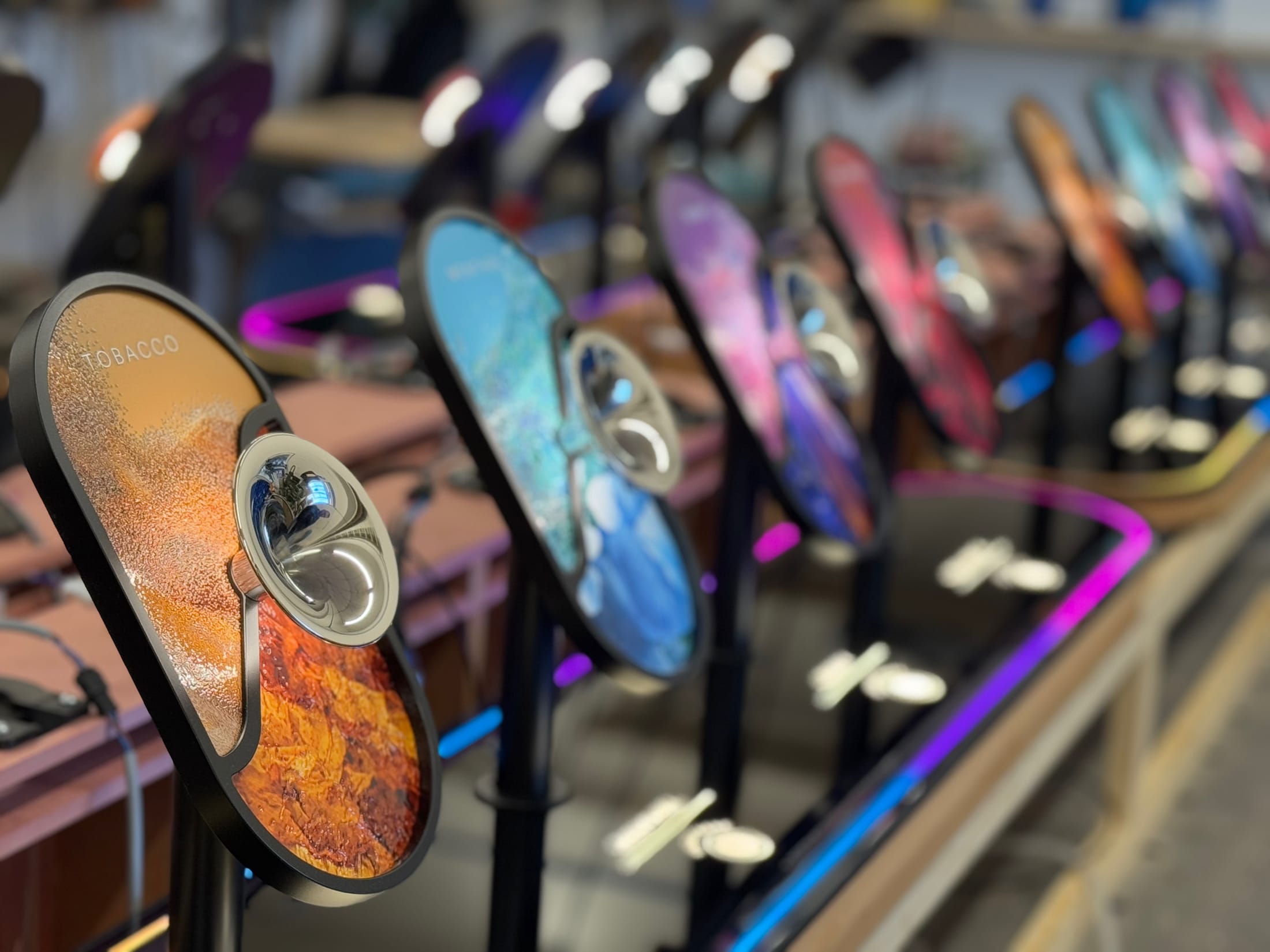
TFWA World Exhibition is travel retail’s biggest trade show. For 2026, the Ploom stand brought the whole range into one space: Ploom devices with EVO and Lyo sticks.
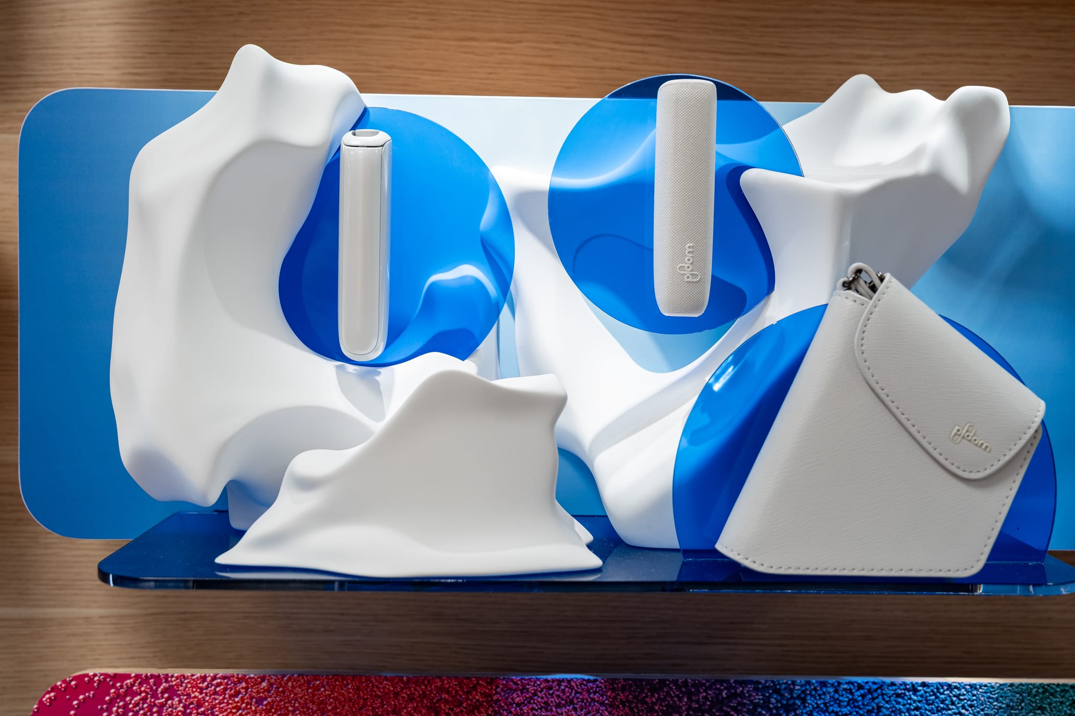
At its centre was Find Your Aura, a sensory bar. Visitors pick a pebble-shaped flavour dome from the counter and breathe it in, and the light wall behind them answers in that flavour’s colour. Around it, each limited edition was given a sculpture of its own, so every product drop reads as a moment rather than a shelf.
I explored ideas for the stand with AI tools first, to visualise directions quickly, before they went into 3D and production.
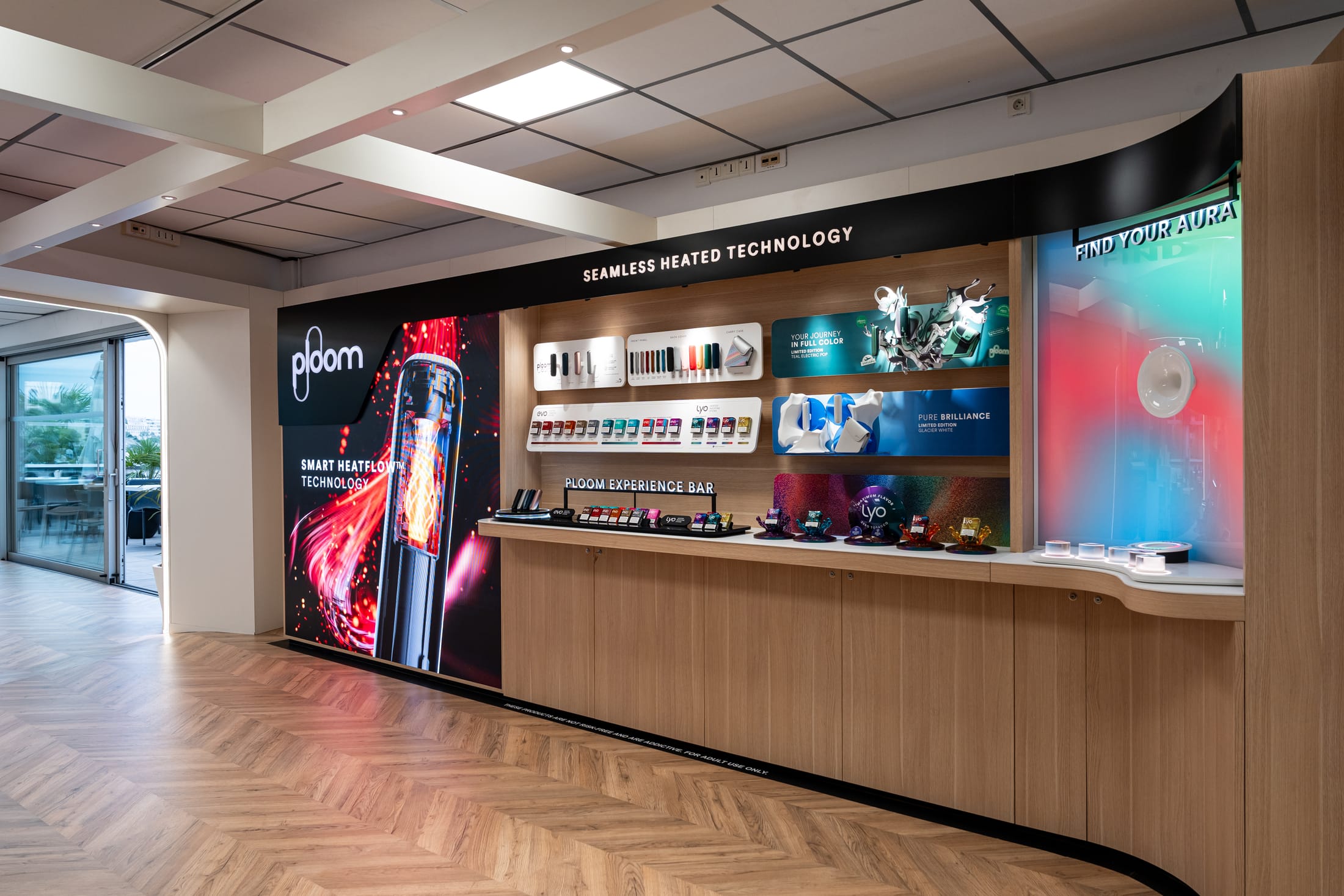
My part: the concept for the pebble-shaped flavour domes, and the creative direction of the light wall animation.
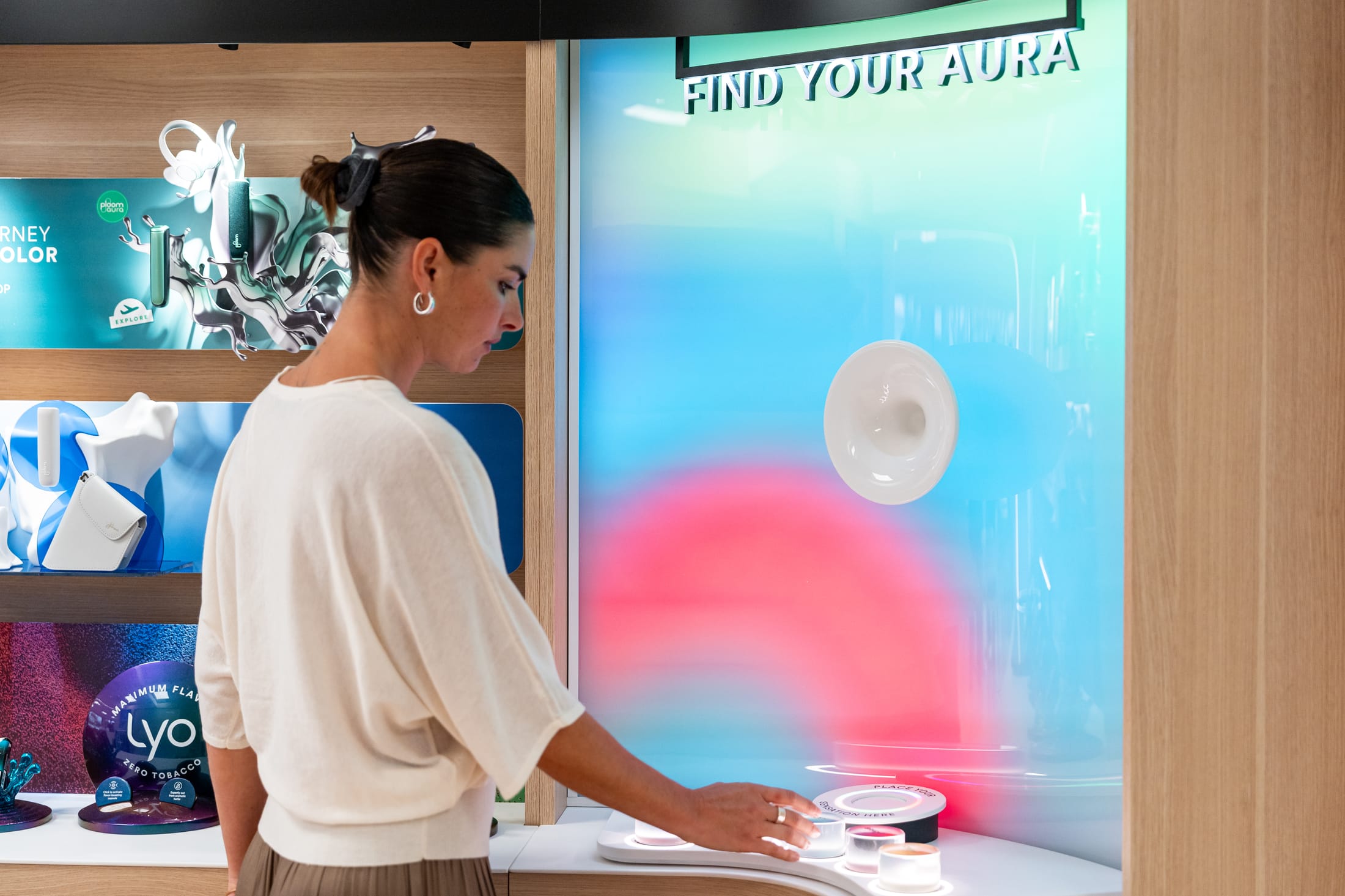
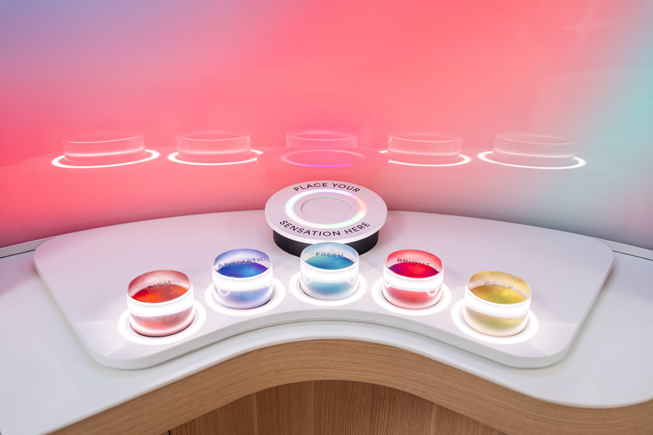
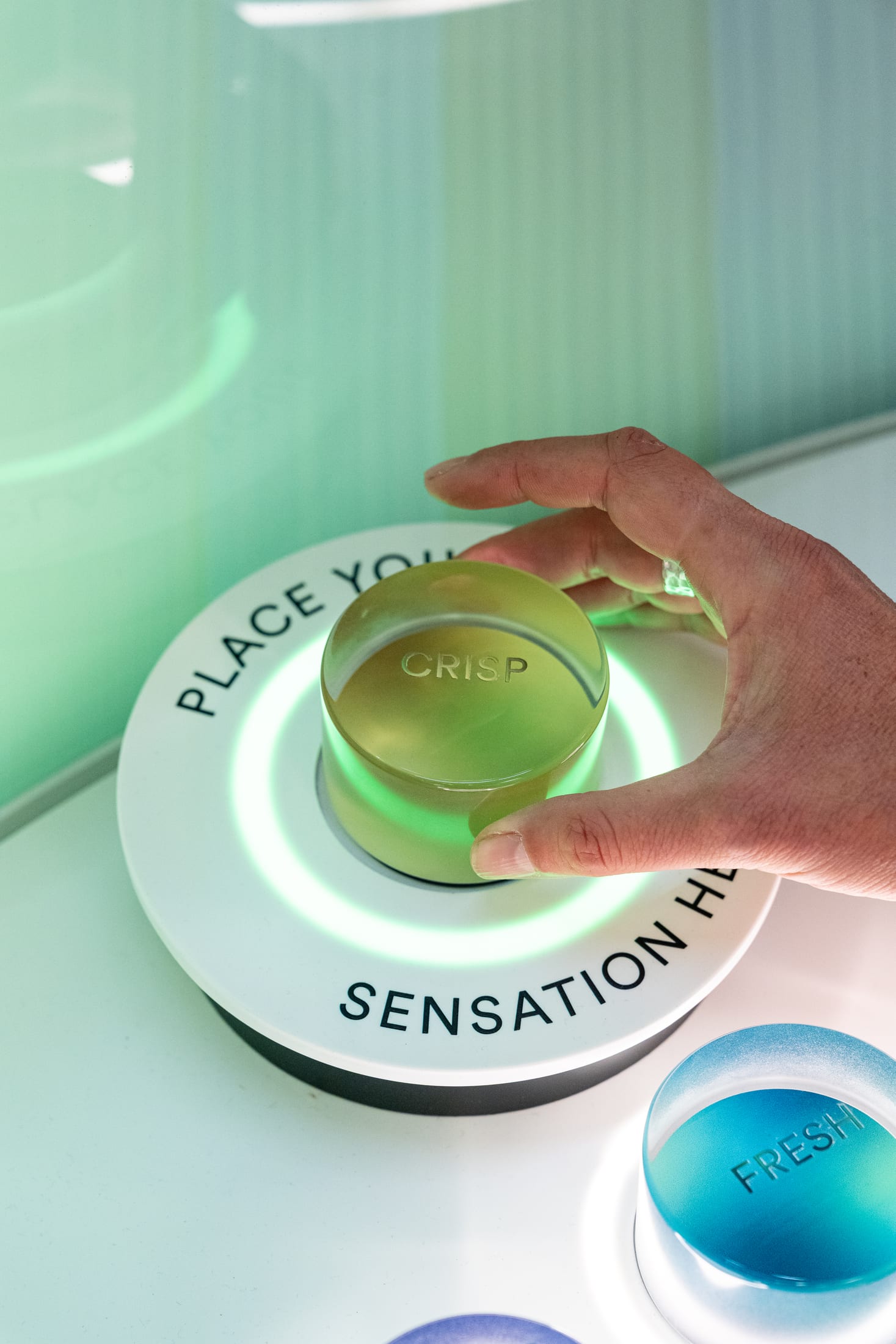
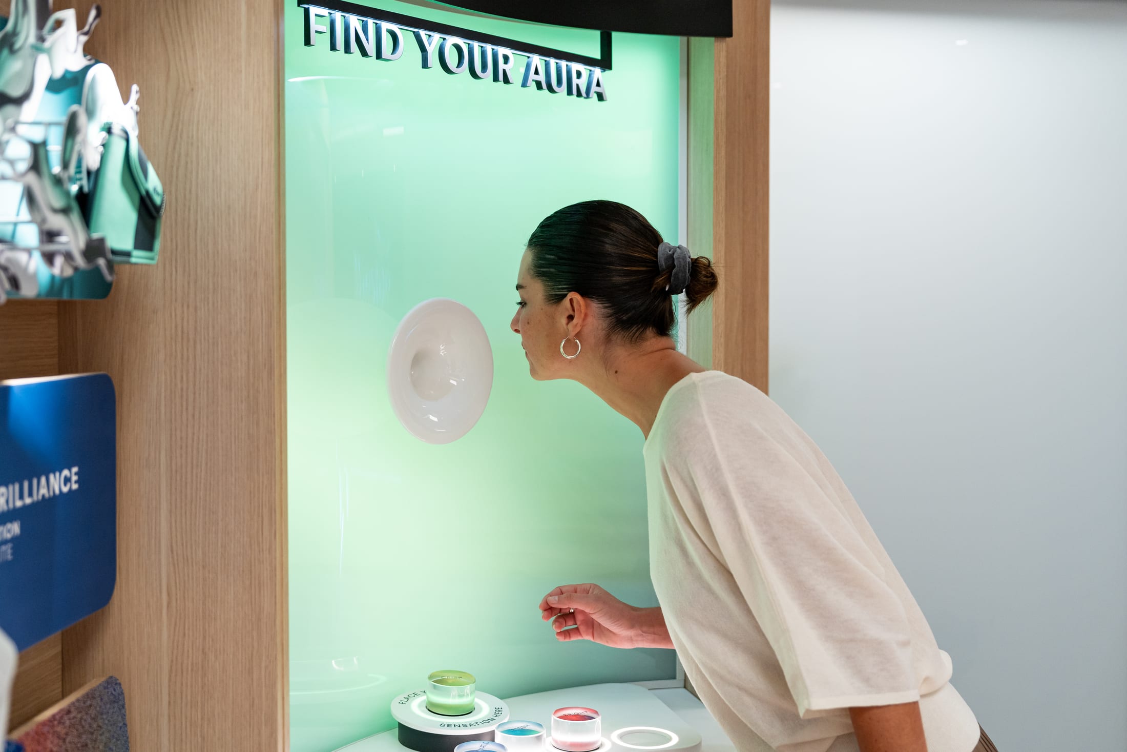
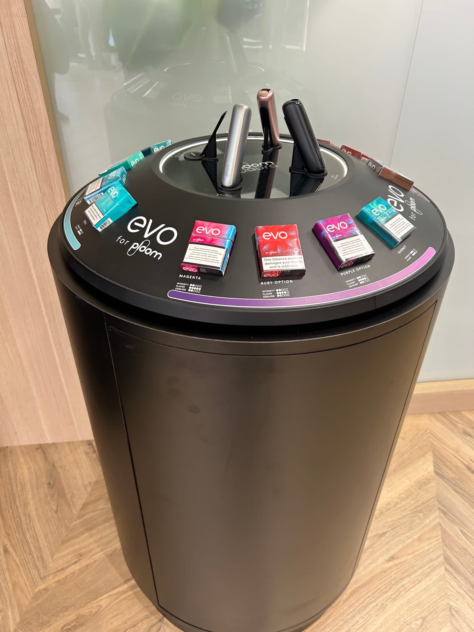
My part: the design and artwork of the displays.
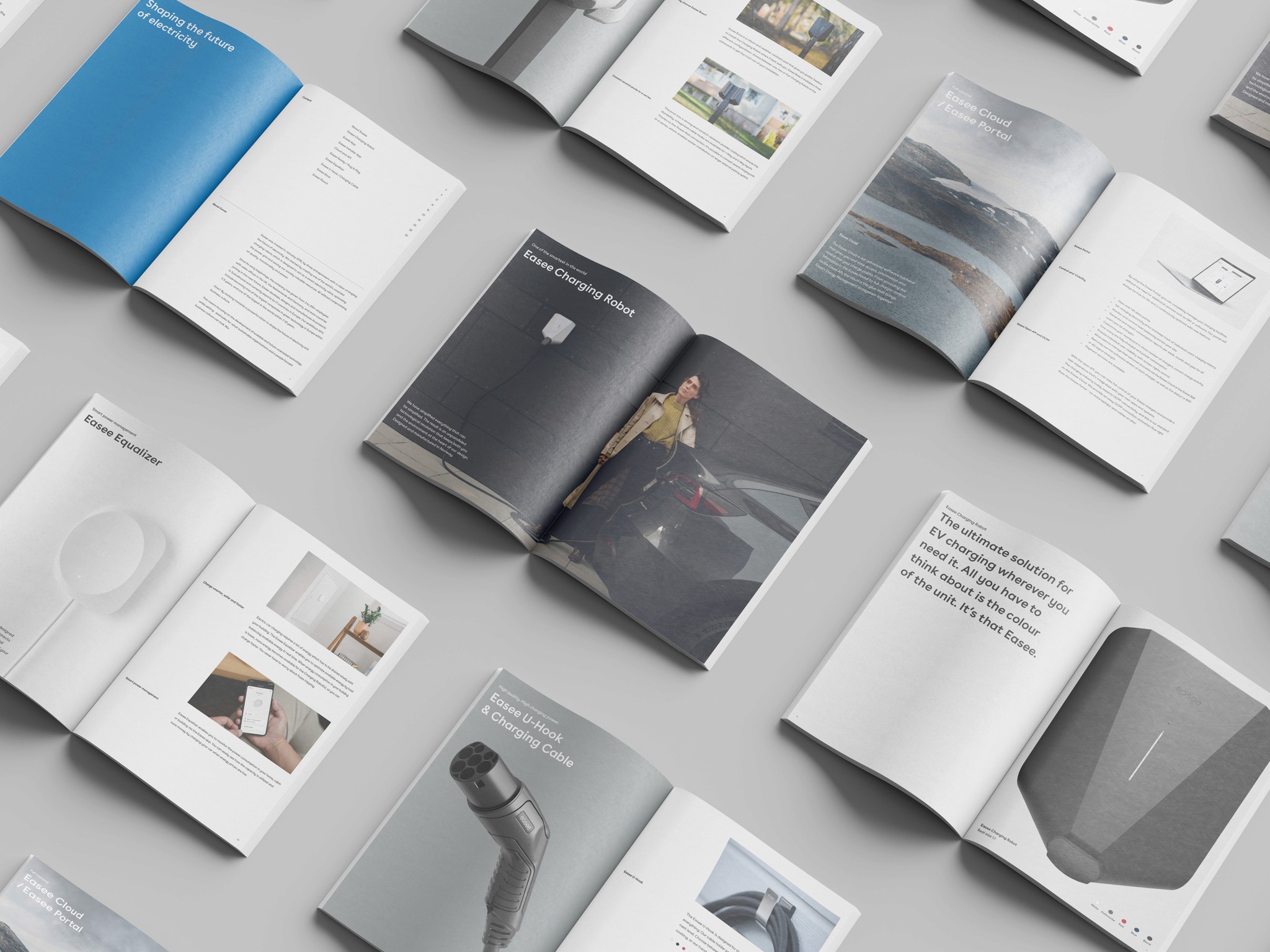
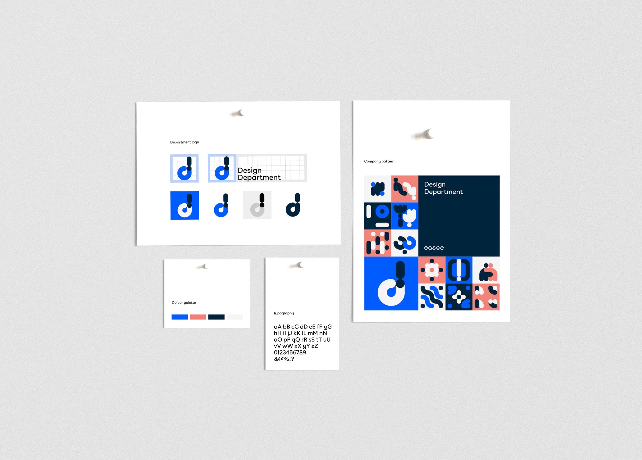
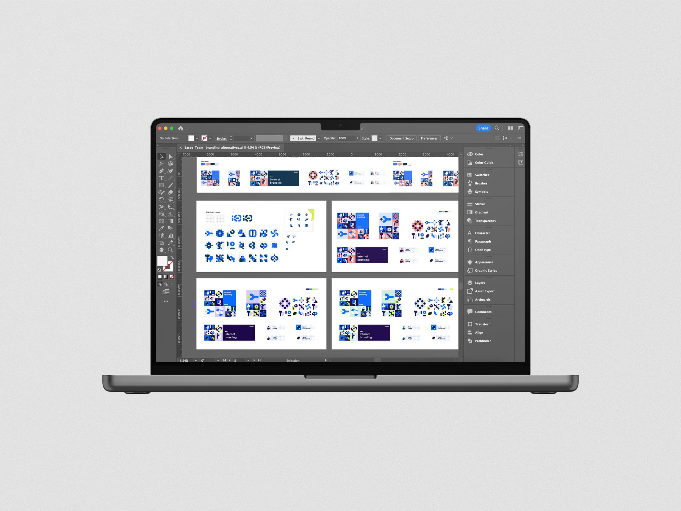
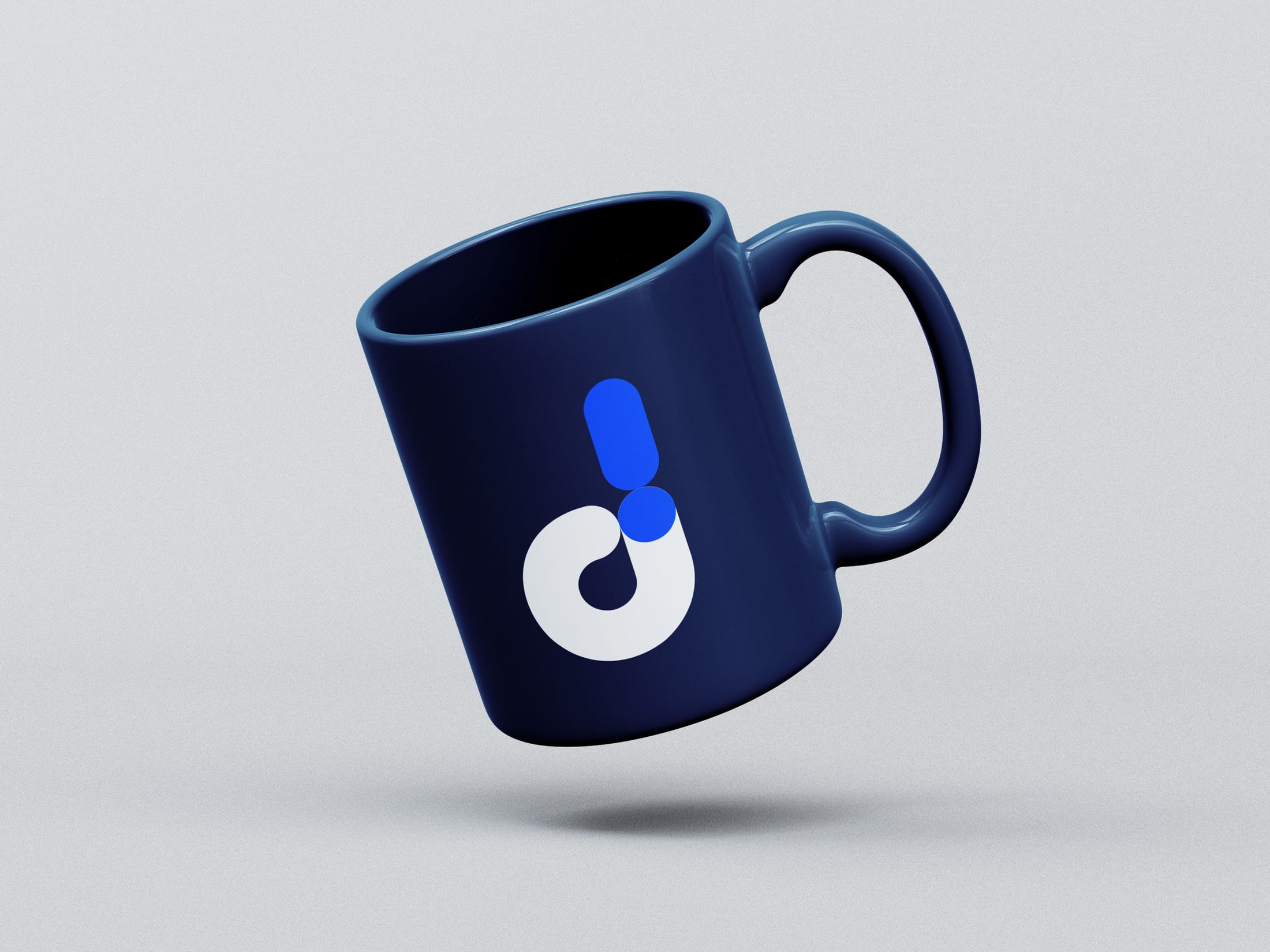
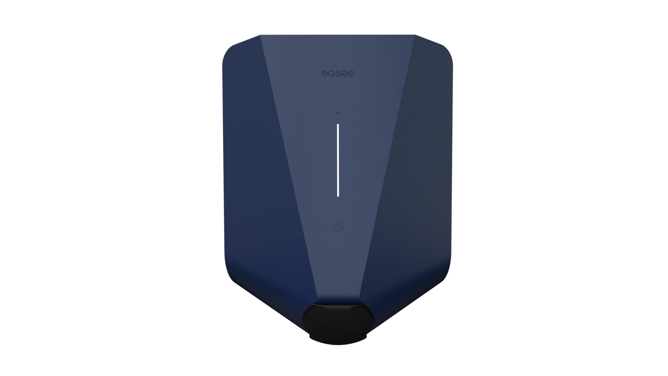
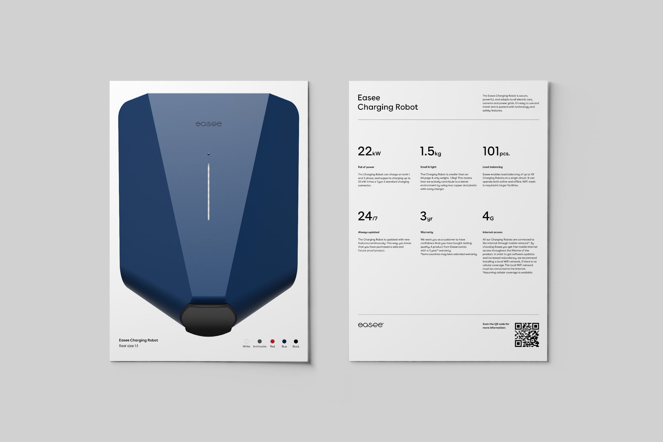
Easee is a Norwegian maker of smart EV chargers, sold across Europe. As brand guardian in a cross-functional team, I kept one clear identity across every touchpoint: packaging, product manuals, digital assets, brochures, flyers and presentations.
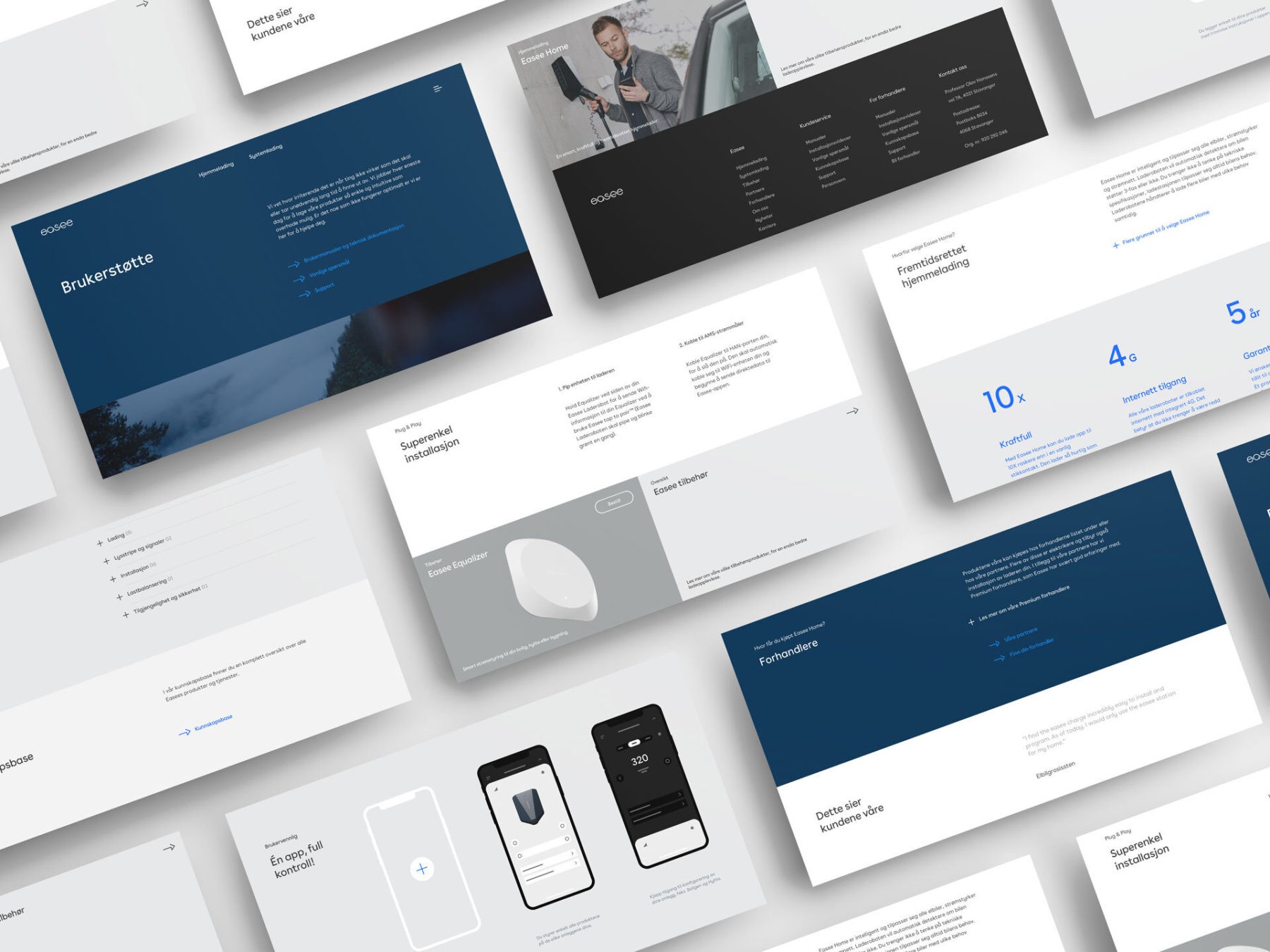
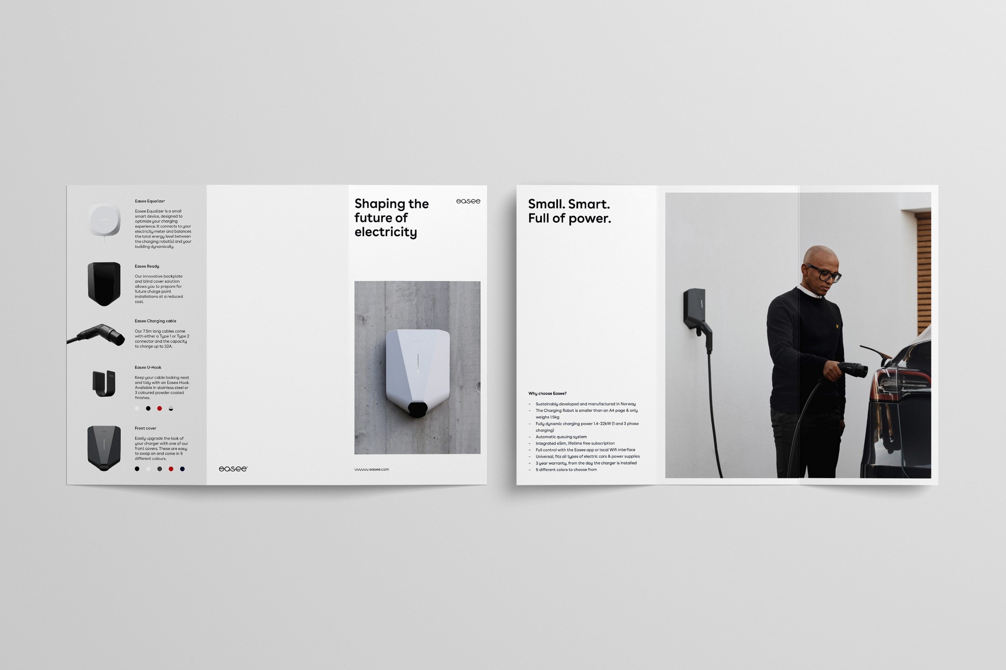
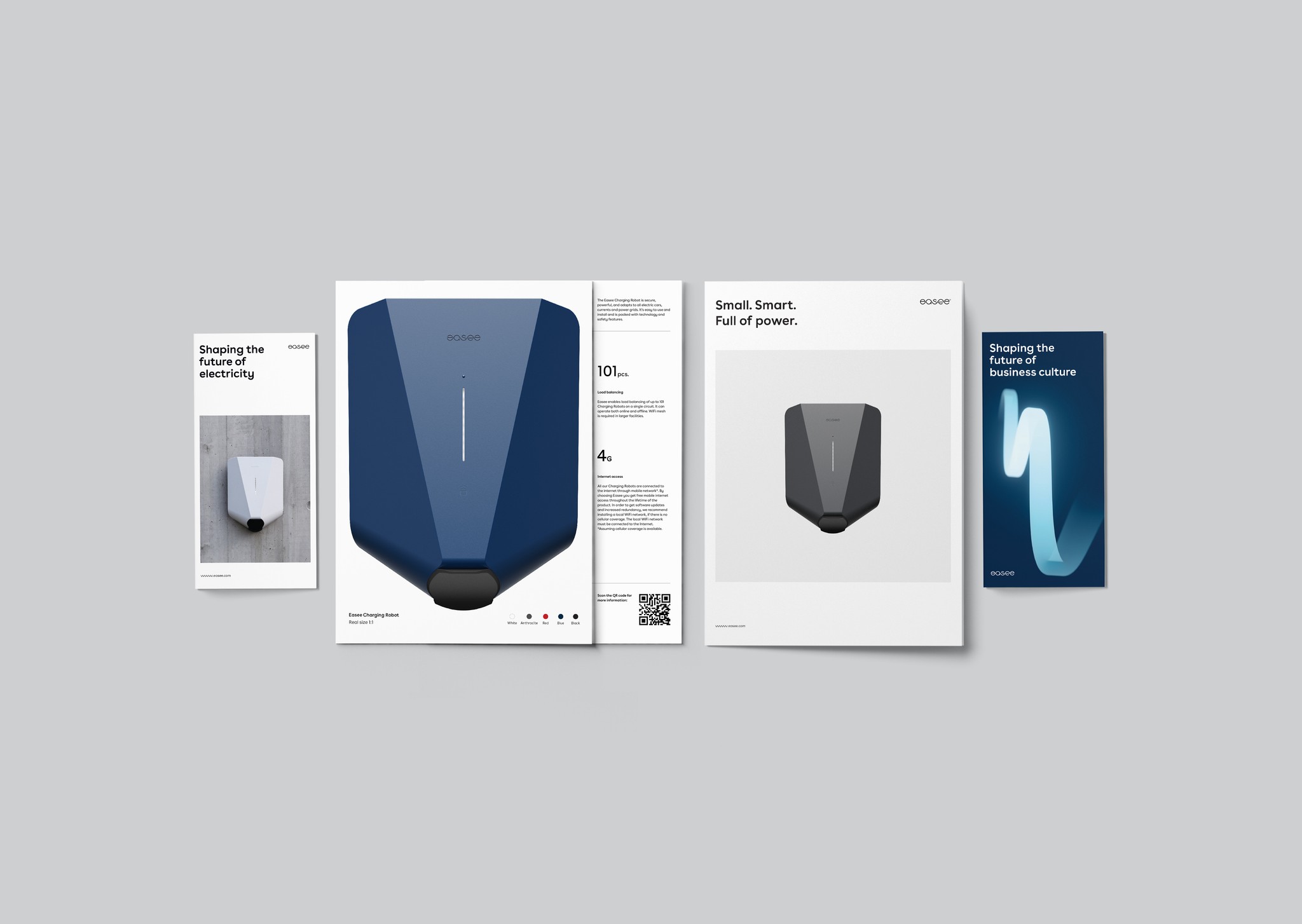
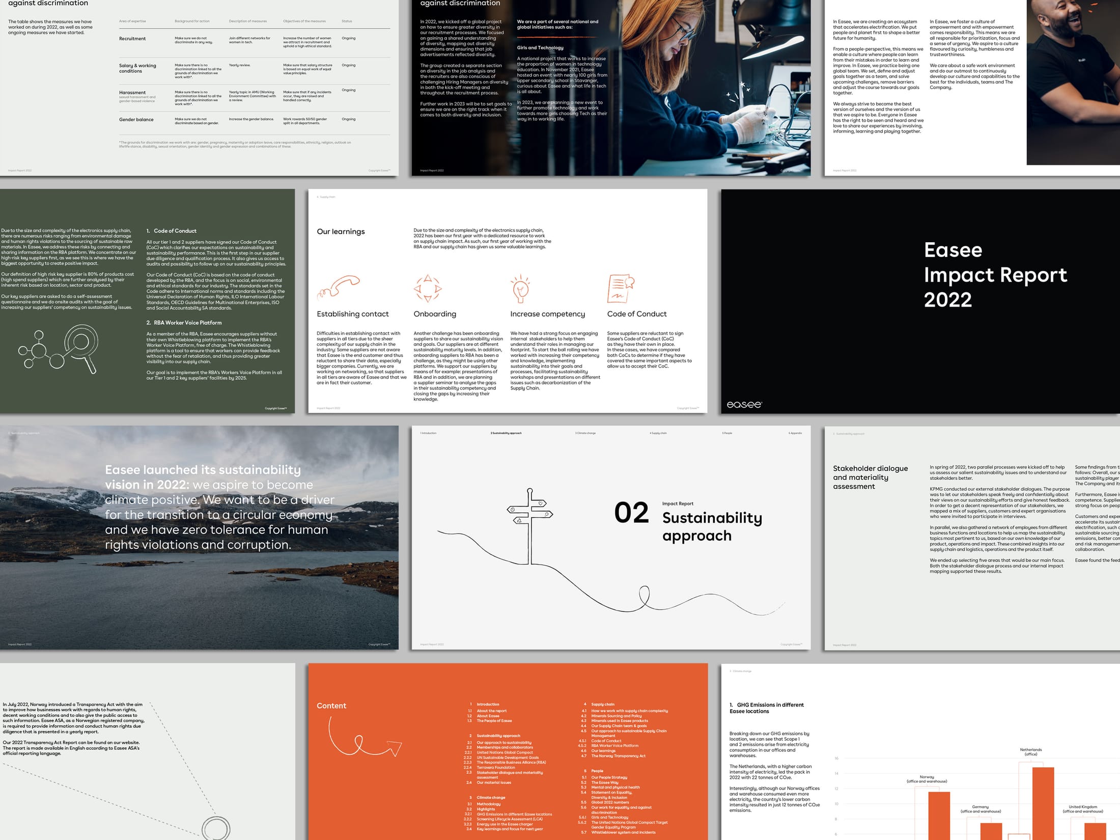
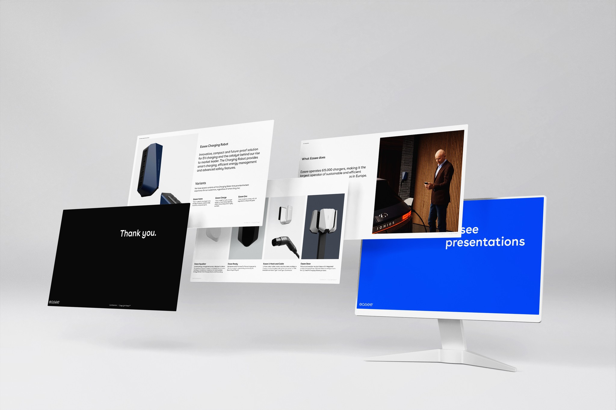
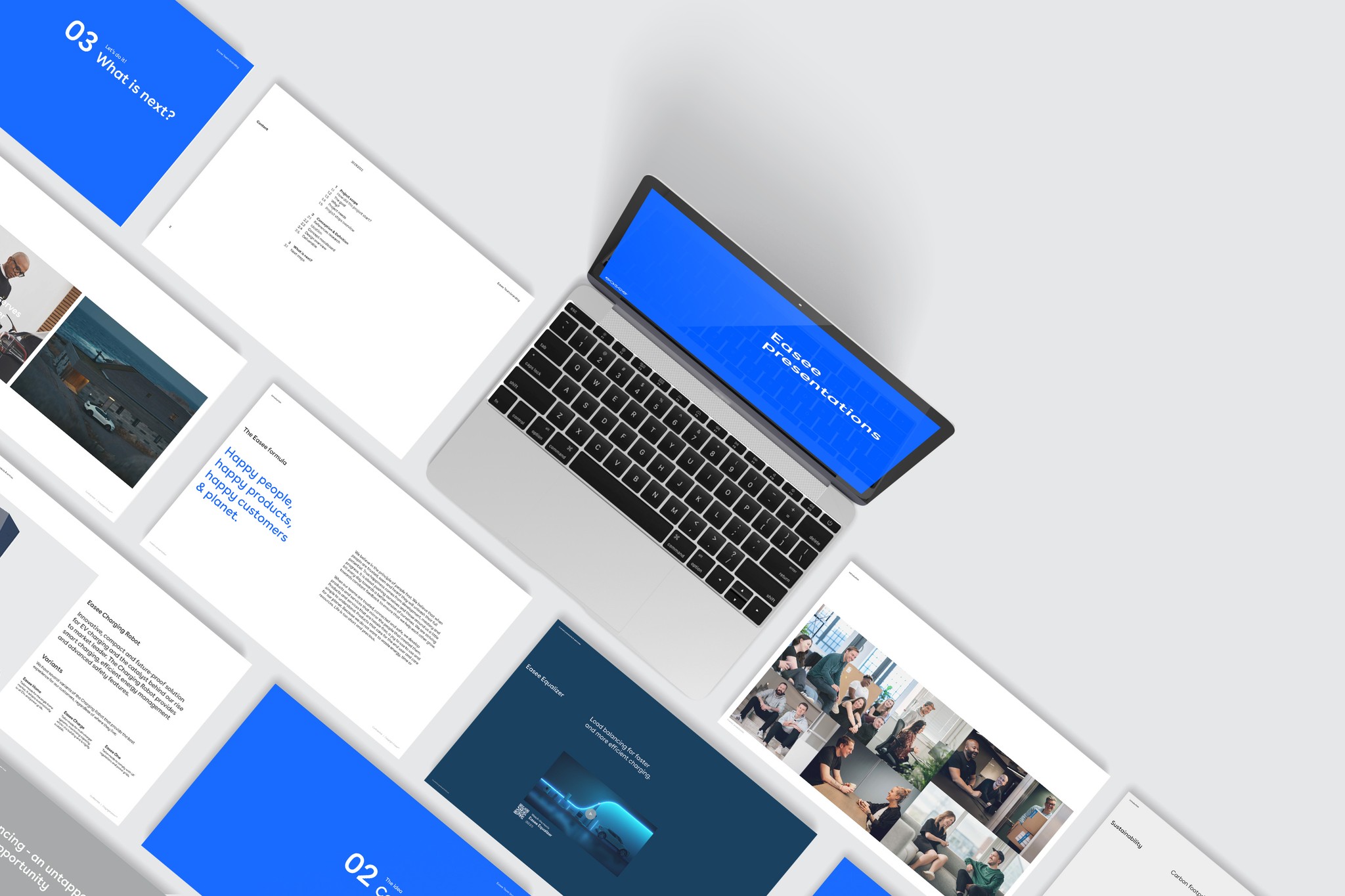
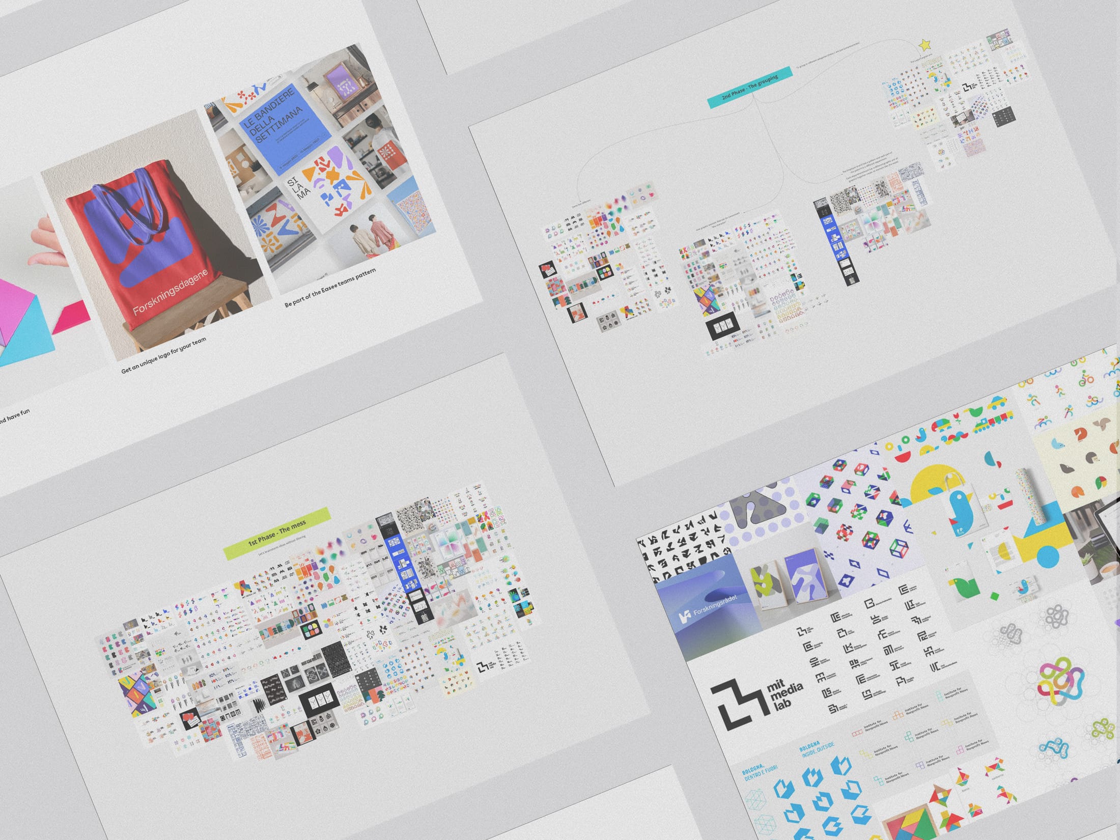
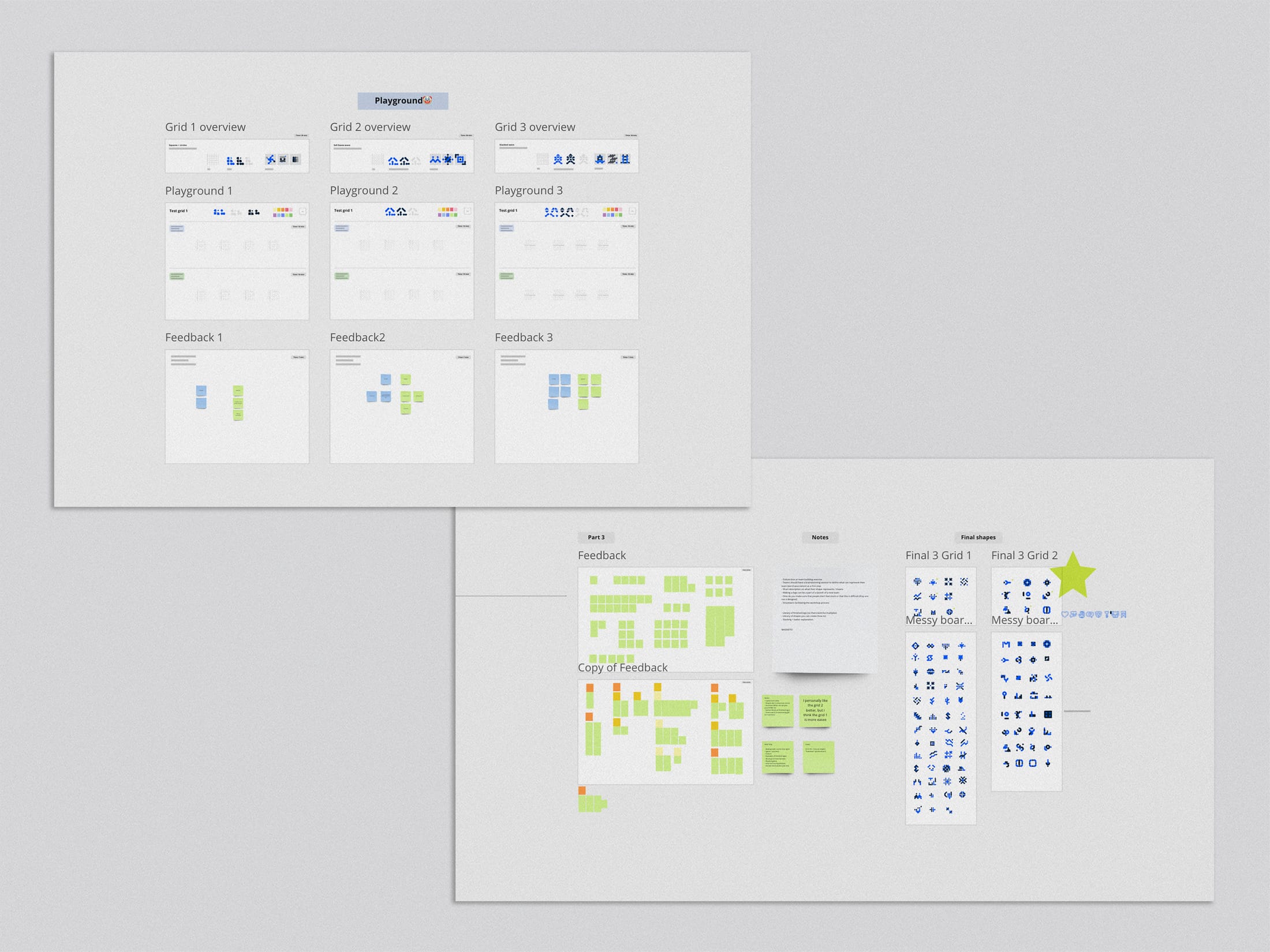
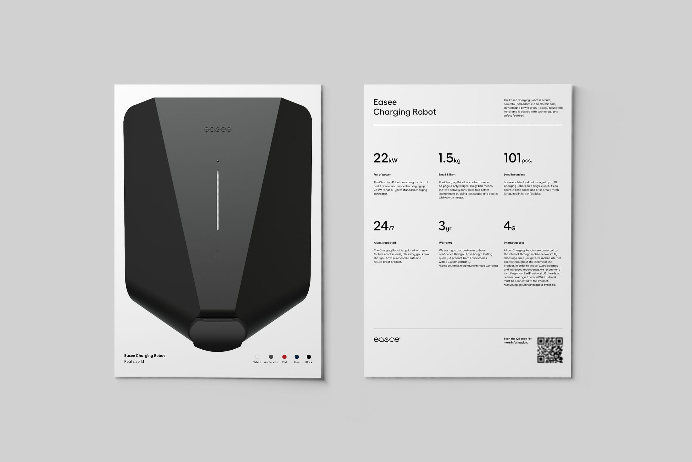
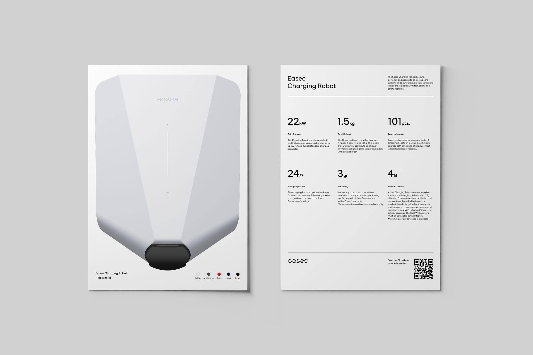
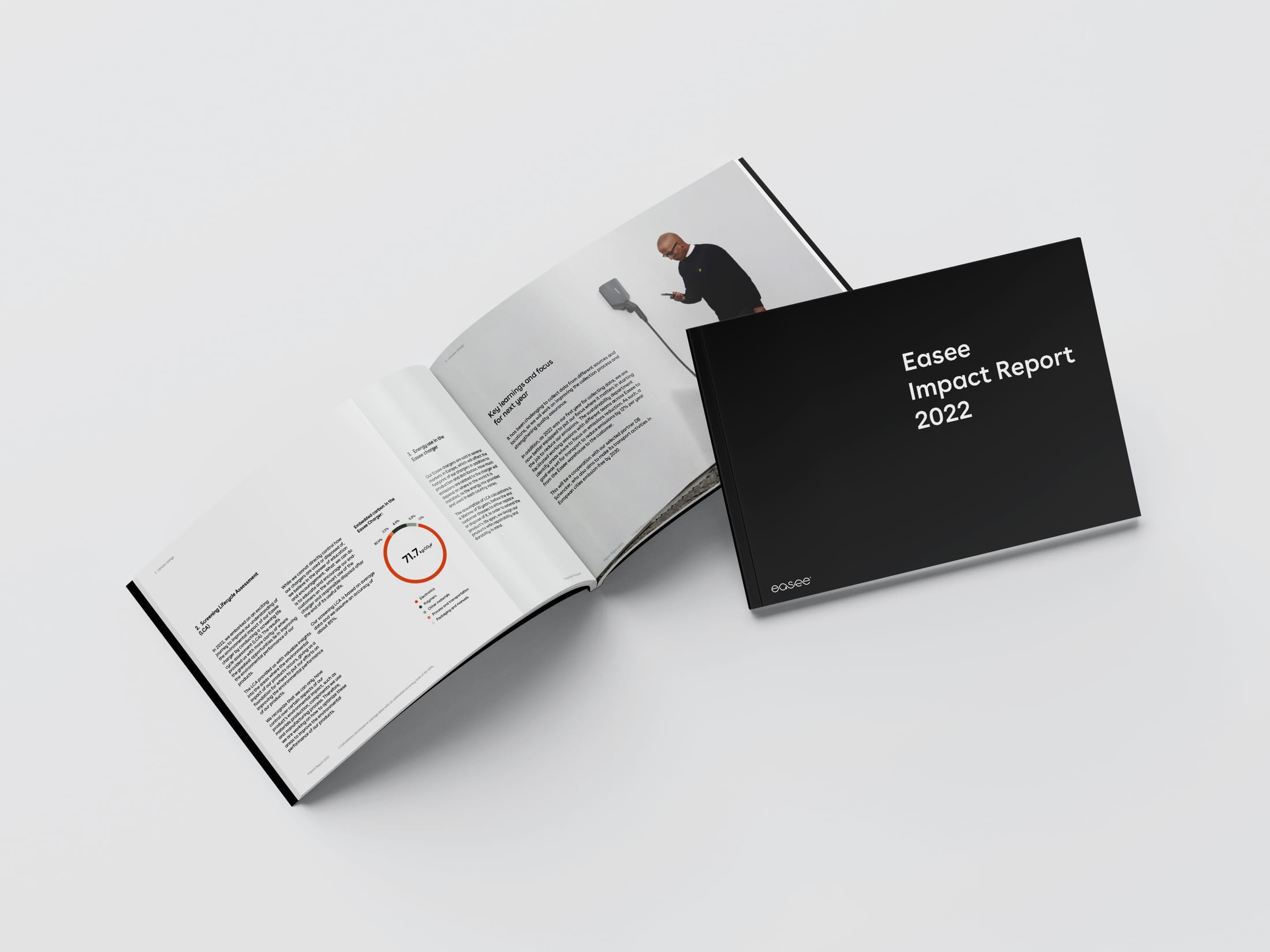
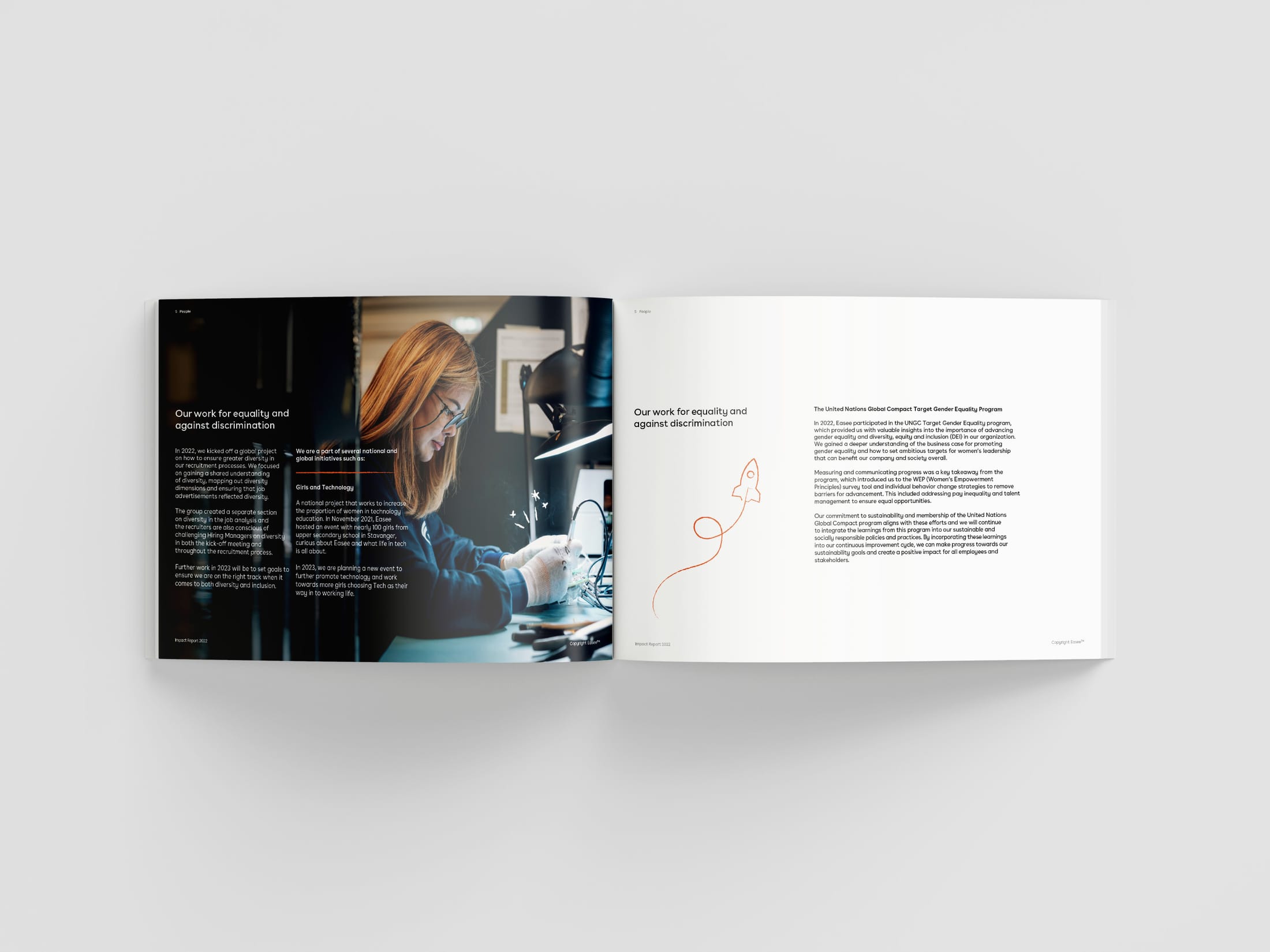
To help the brand scale, I led a system of design templates for product sheets, presentations and reports, so teams in every market could make consistent material quickly, without starting from scratch.
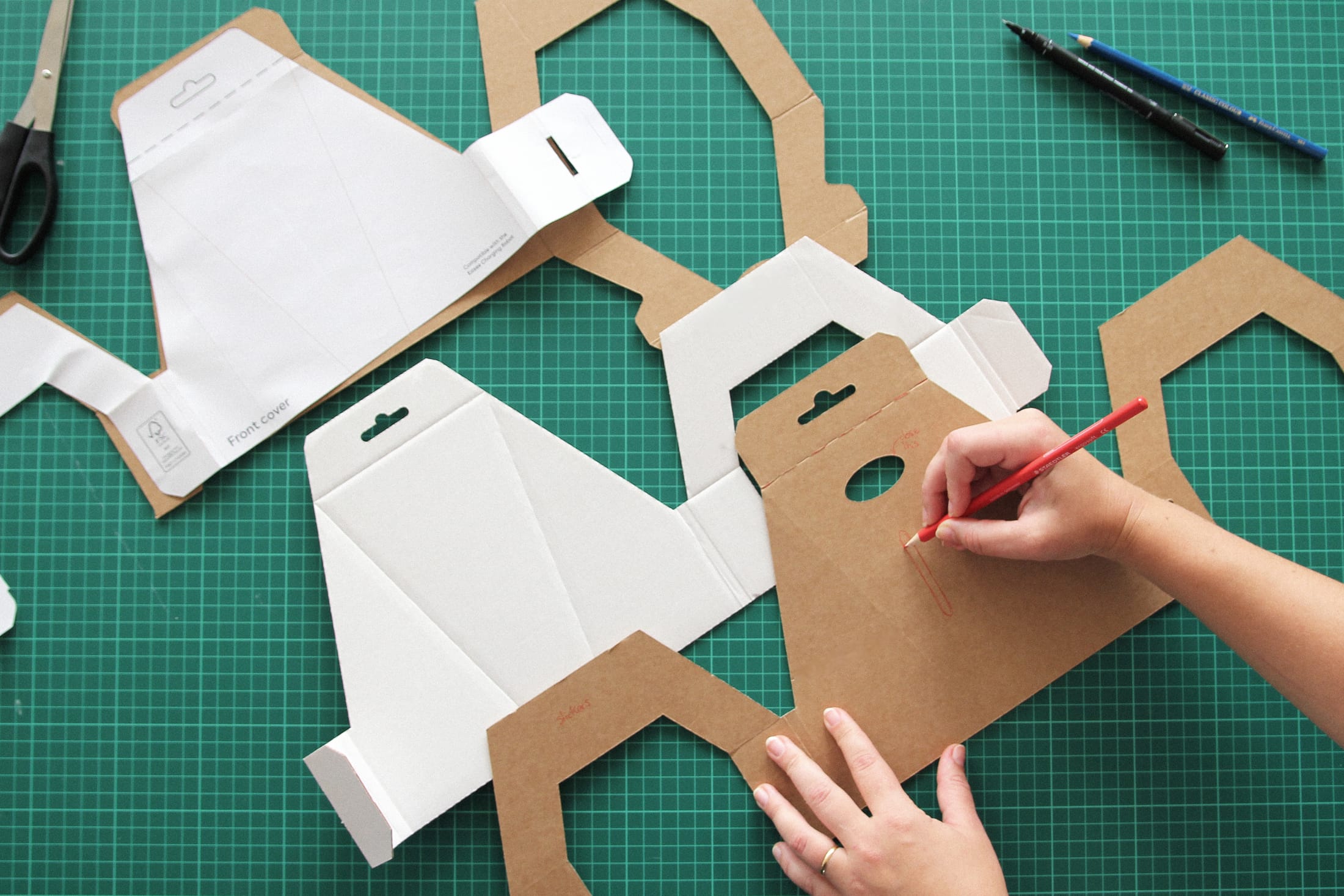
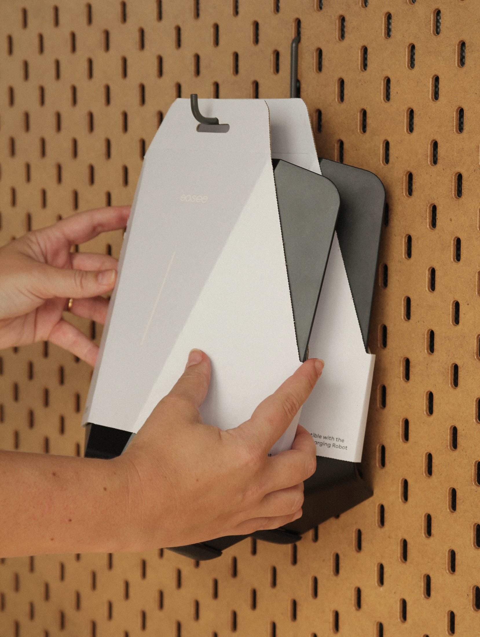
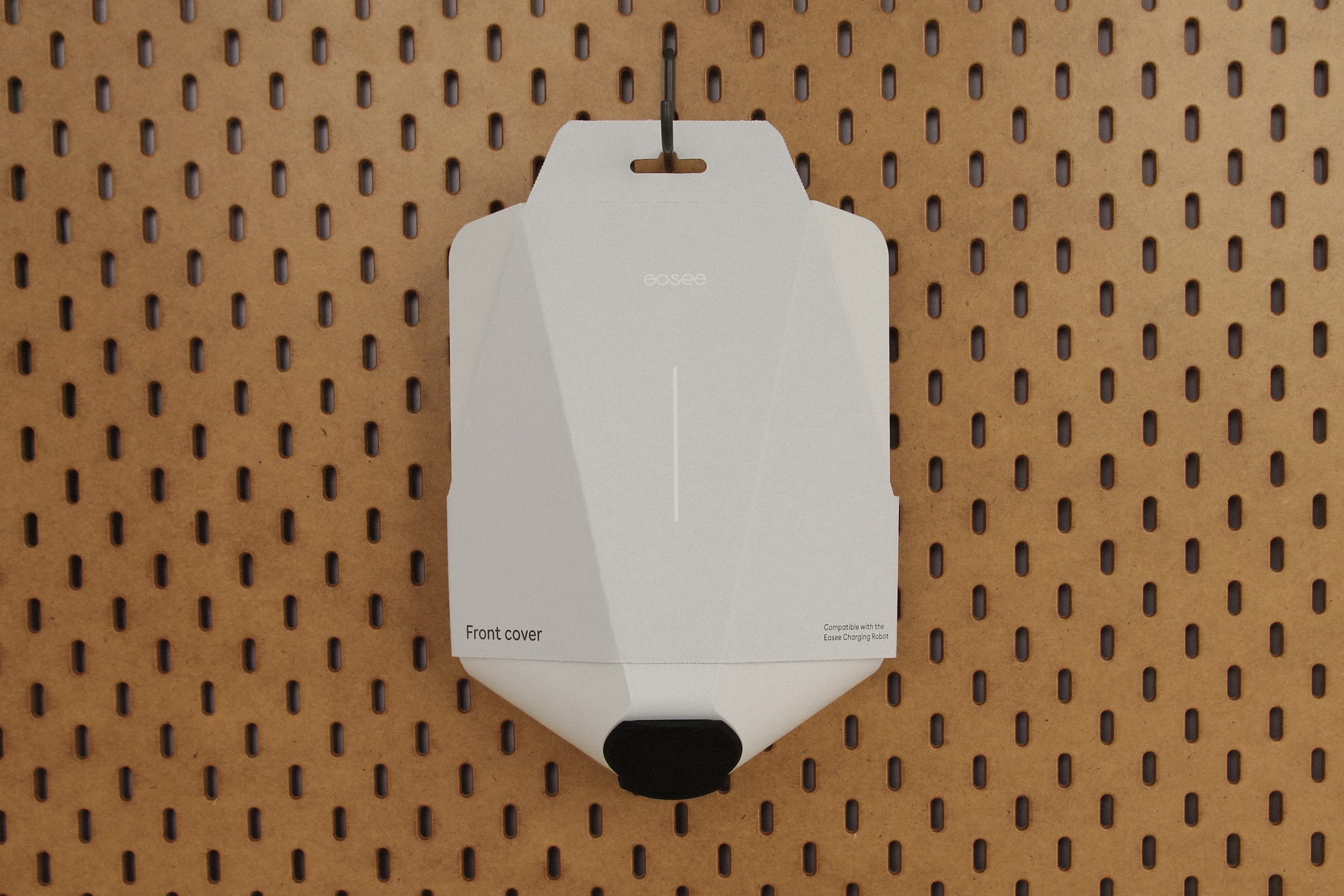
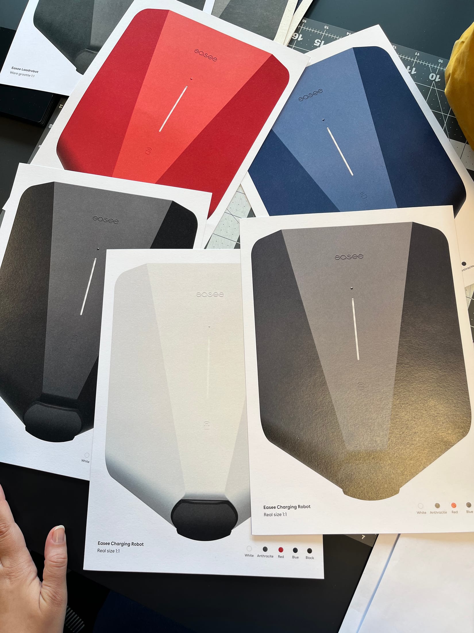
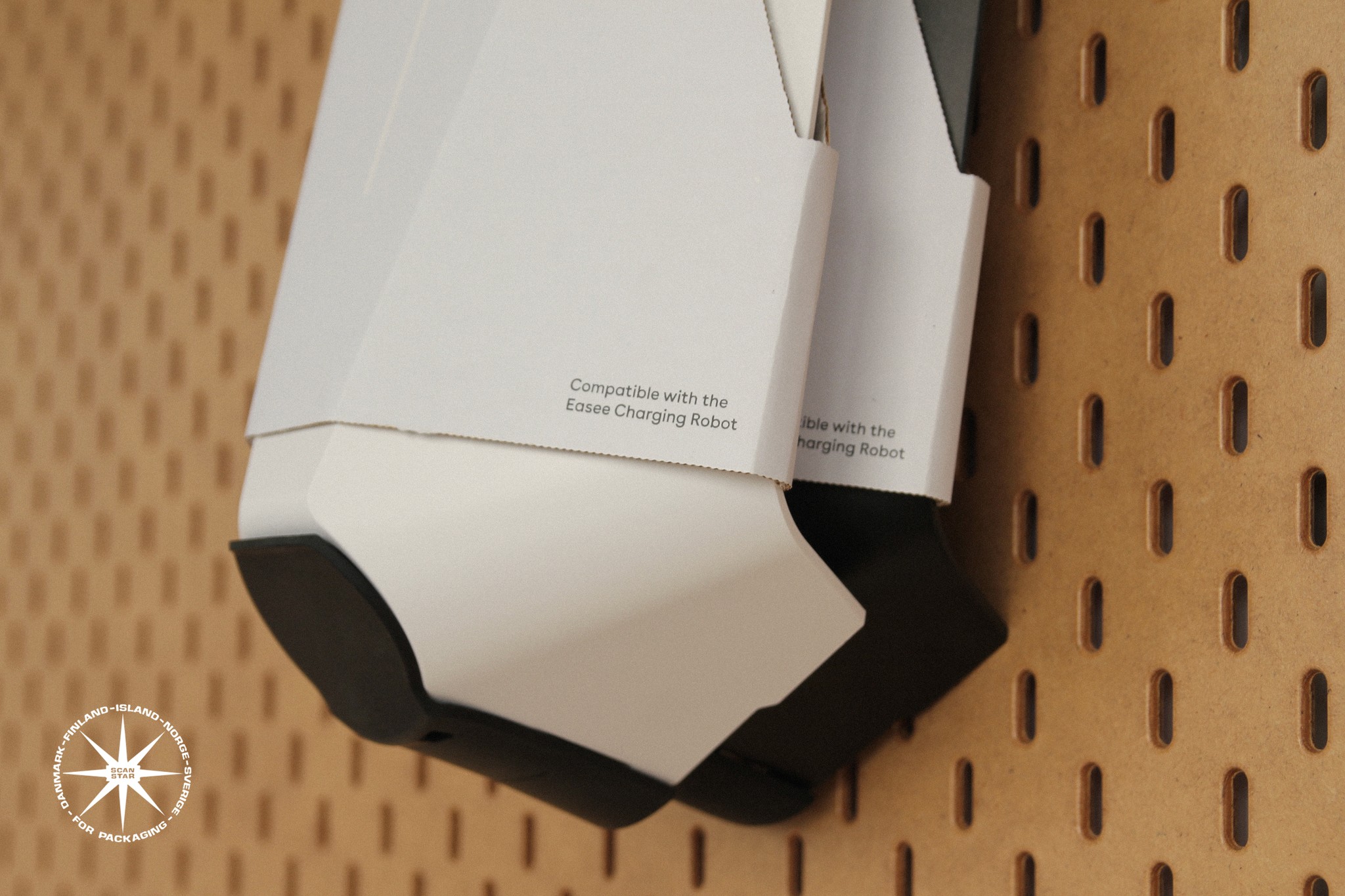
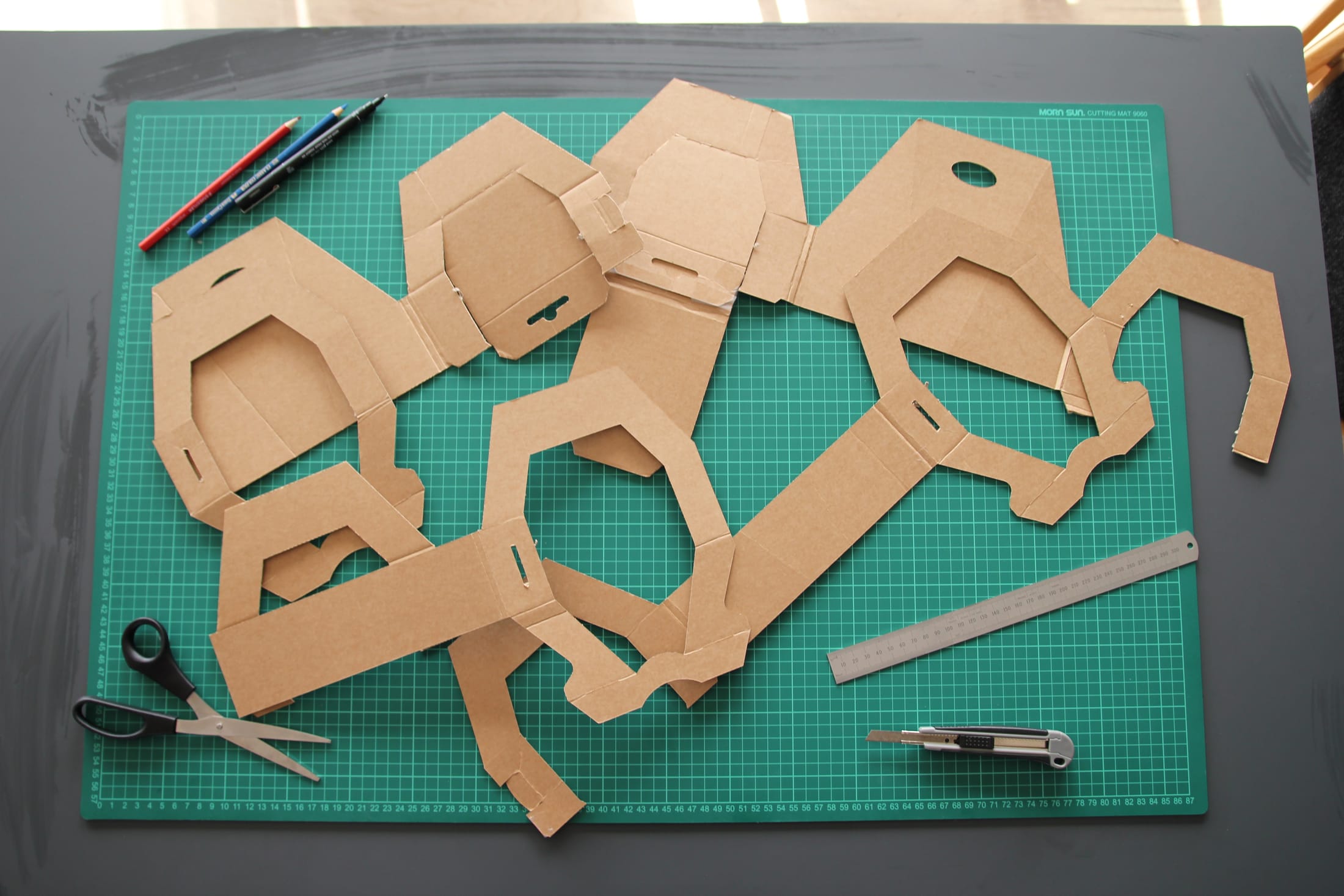
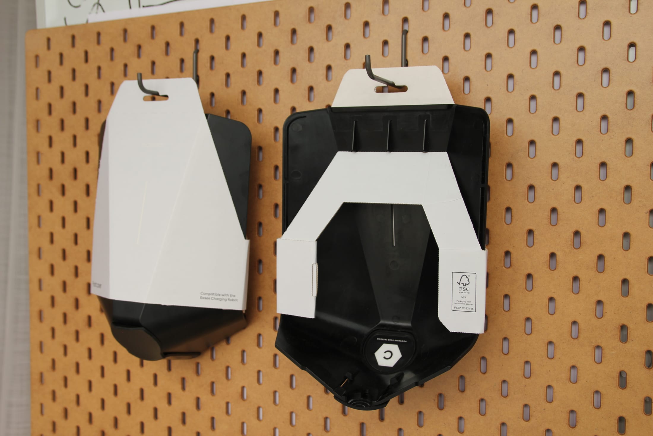
The Front Cover packaging was worked out by hand first: card templates cut, folded and tested around the charger before any final artwork. The finished packaging went on to win the ScanStar competition in 2023.
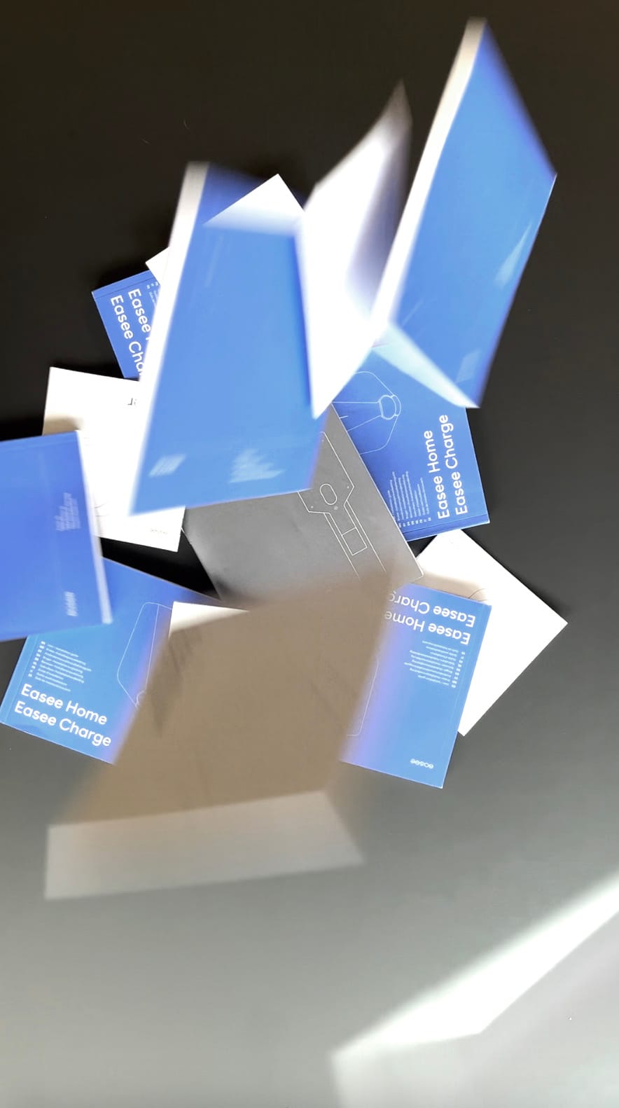
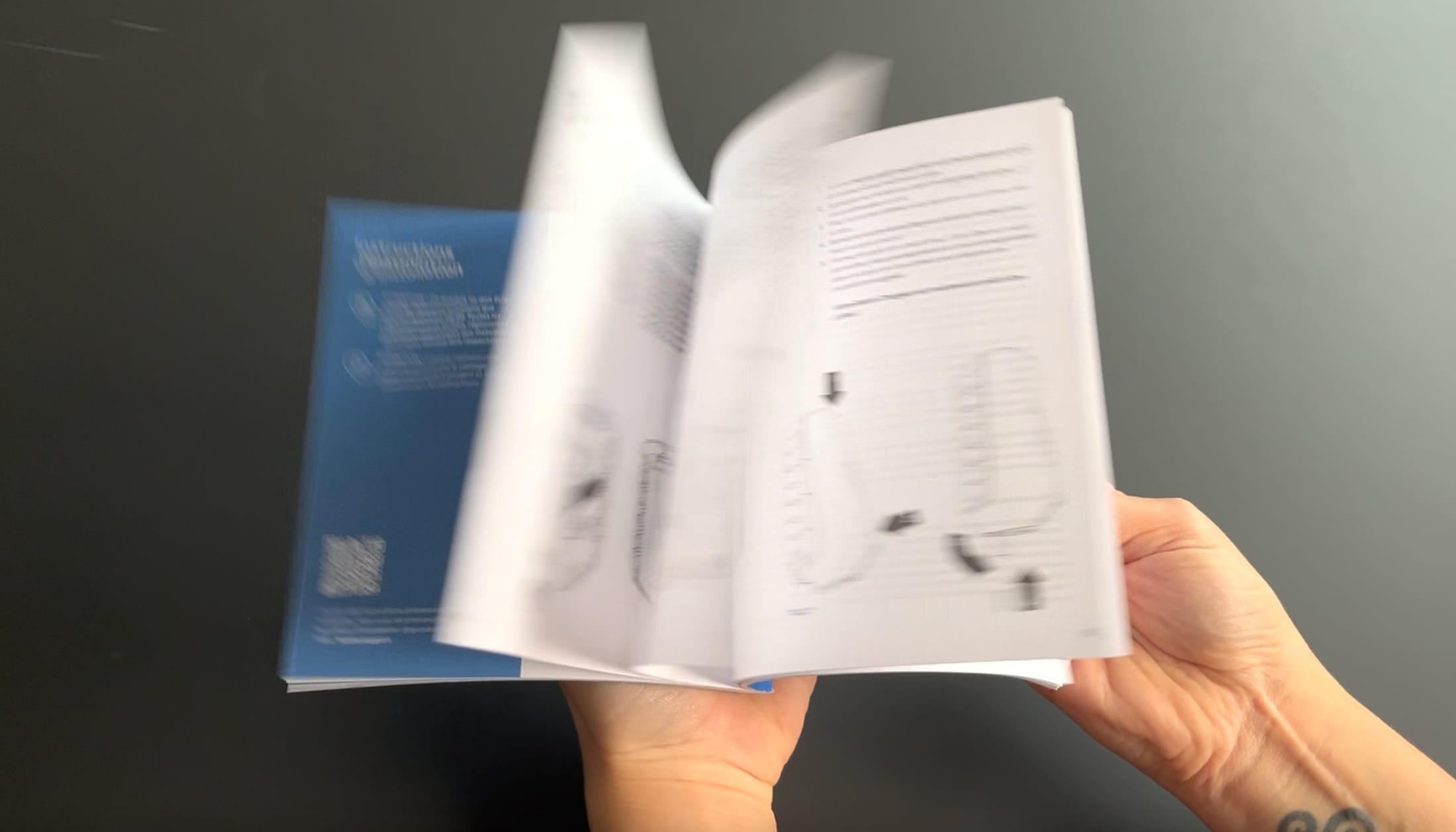
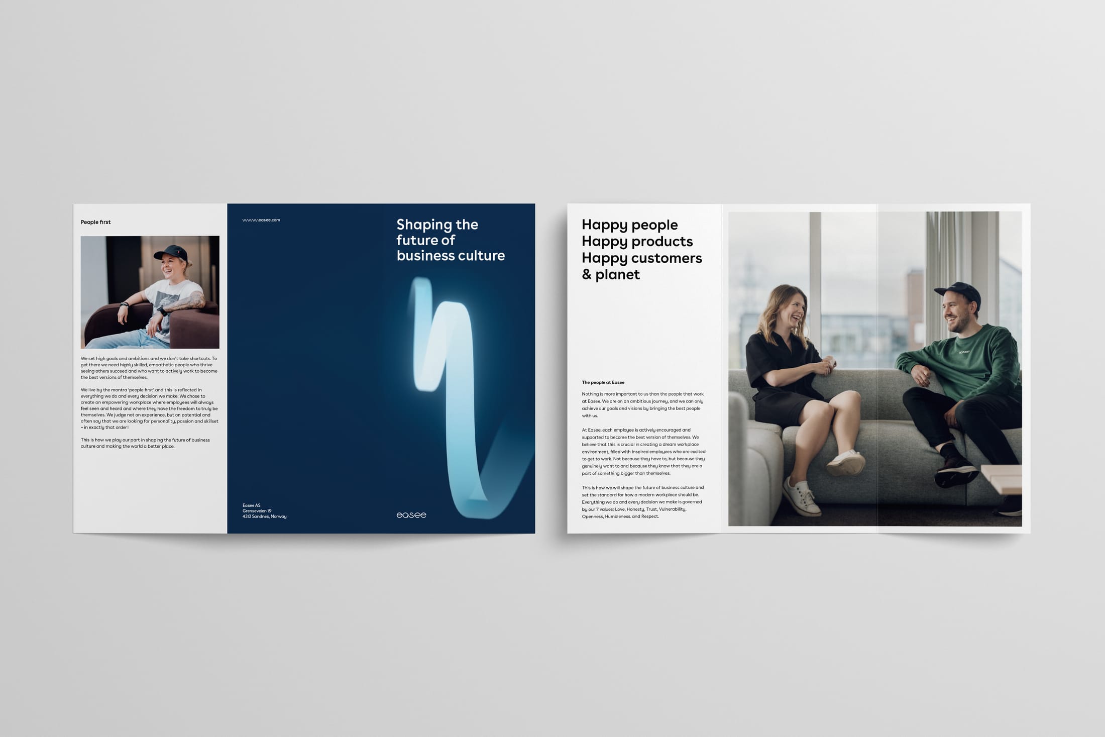
Every product manual was designed on one shared system, so installers and owners meet the same clear layout, type and diagrams whichever charger they have.
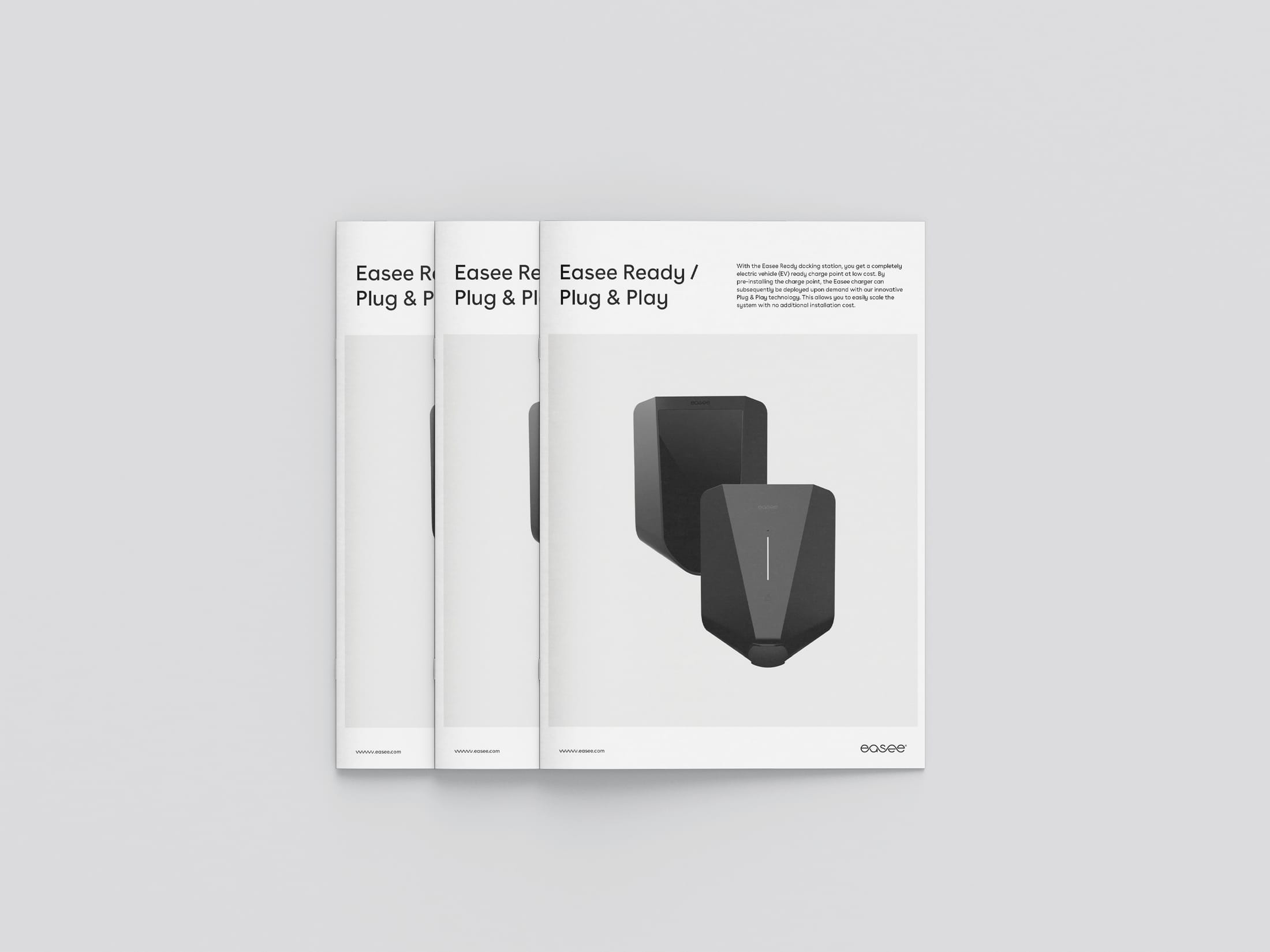
Product sheets, presentations and the impact report were built as templates, so teams in every market could produce them quickly and consistently.
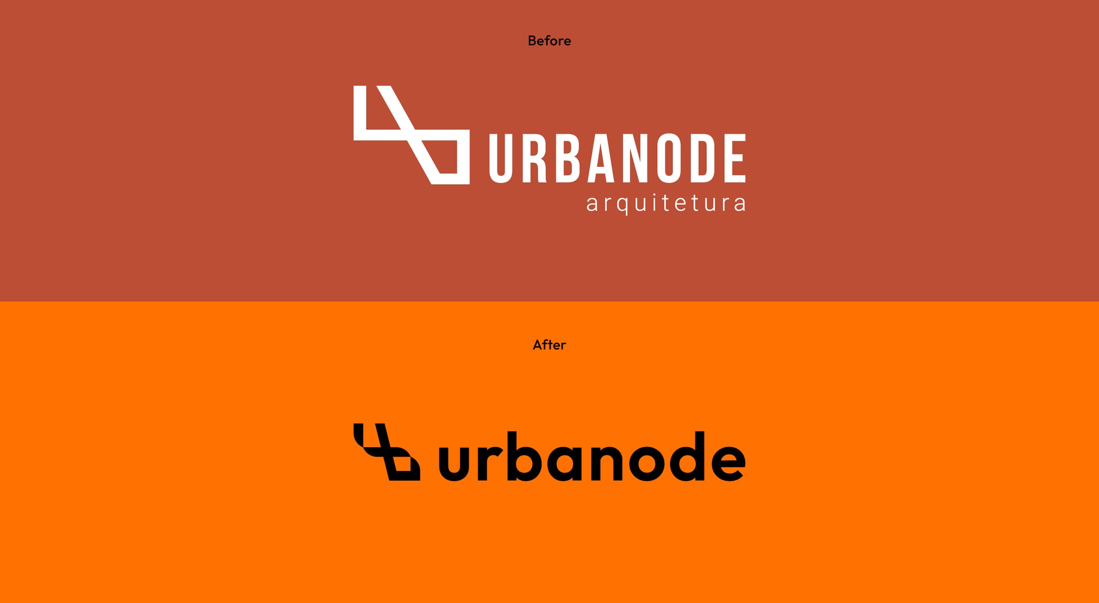
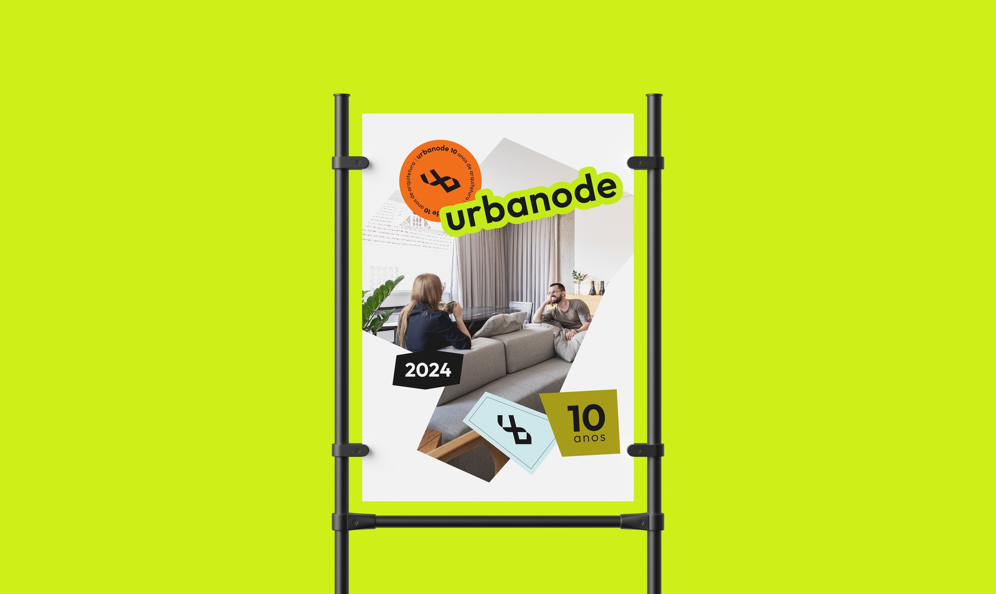
In 2024, the architecture studio Urbanode turned ten and wanted a rebrand to mark the milestone and reconnect with its core values. Over time the brand had lost some of its meaning, so the work started with strategy.
I planned the project in seven milestones and ran two strategy workshops with the owners. Together they produced a Brand Voice book covering vision, mission, principles, persona, personality and tone of voice.
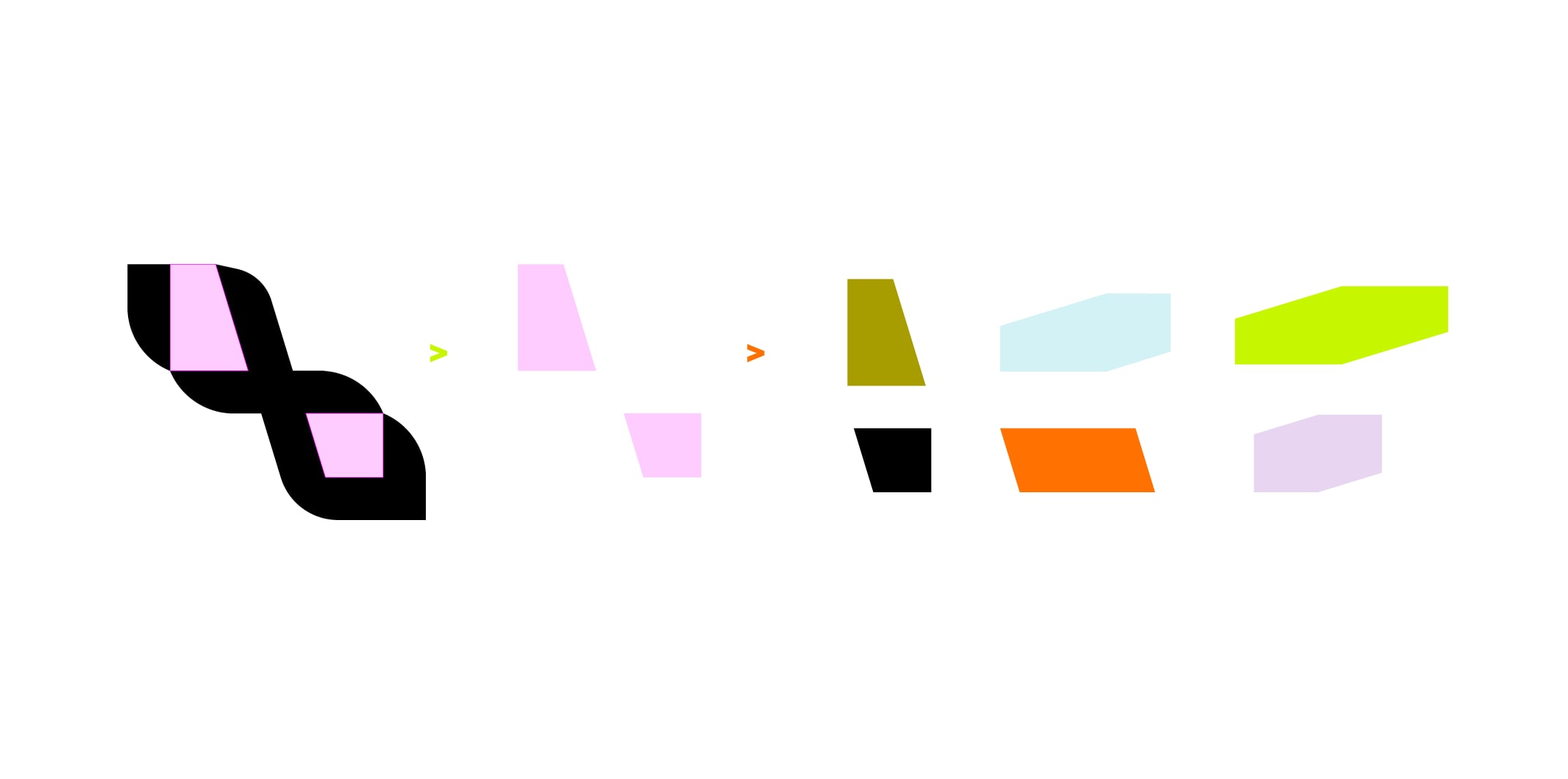
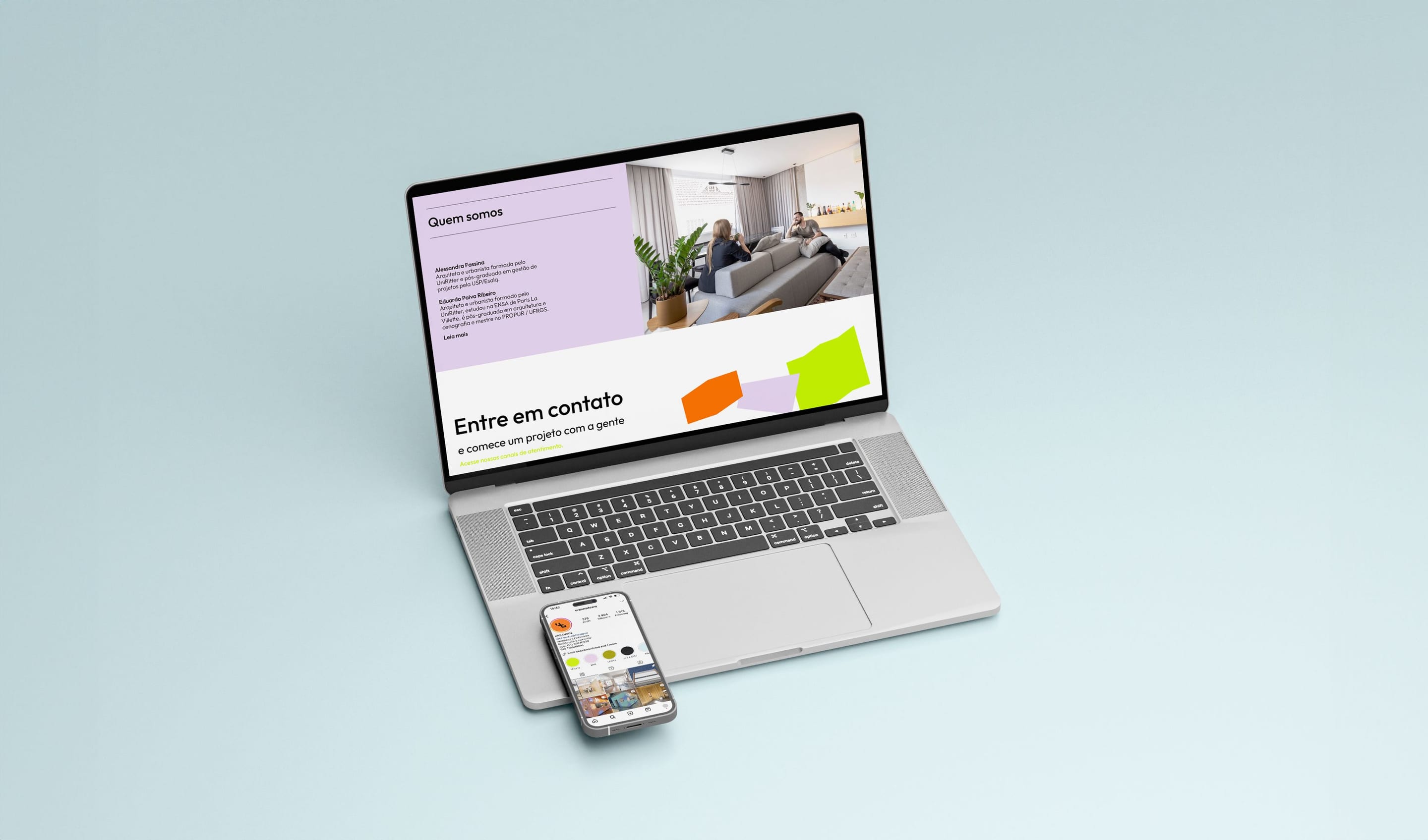
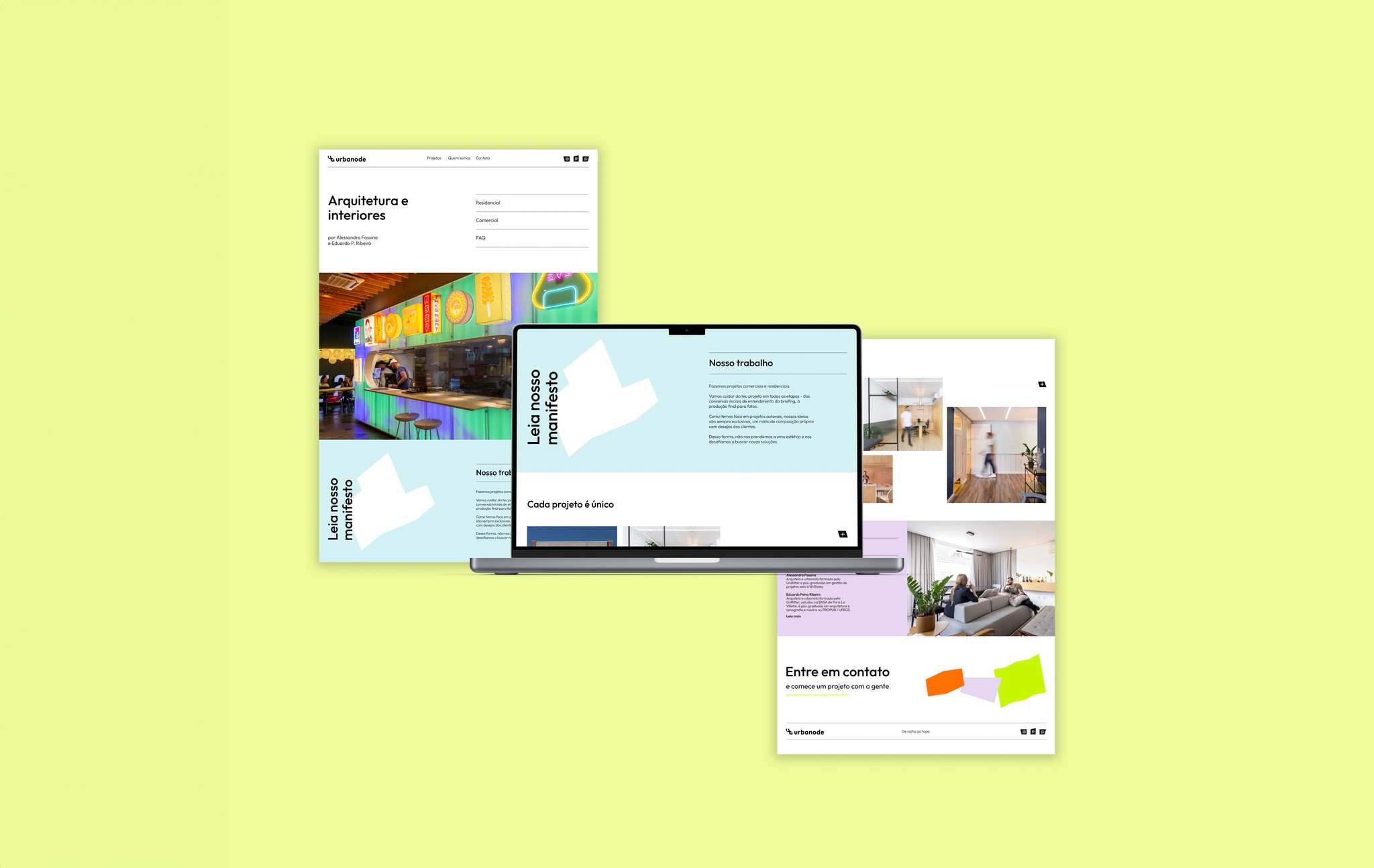
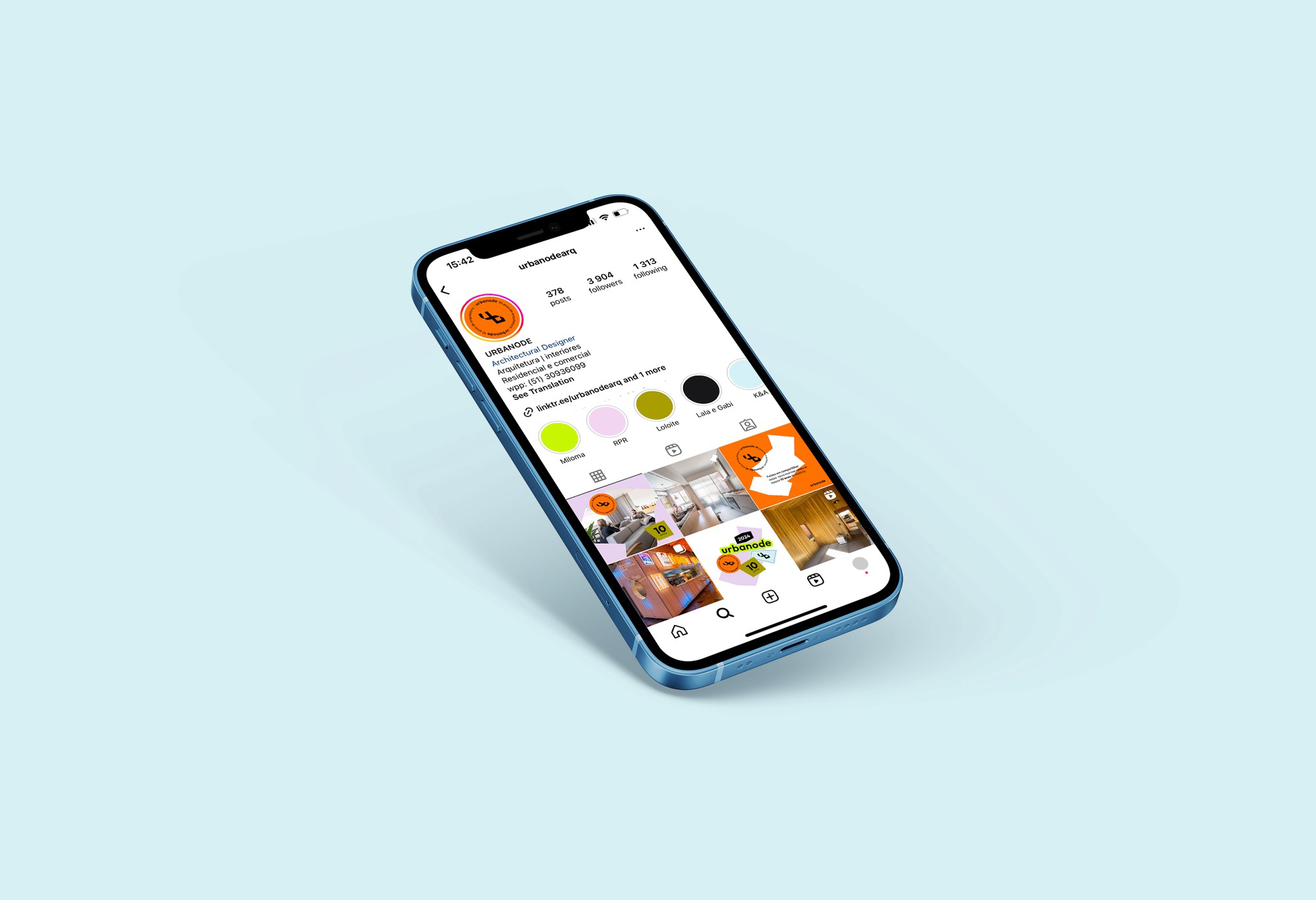
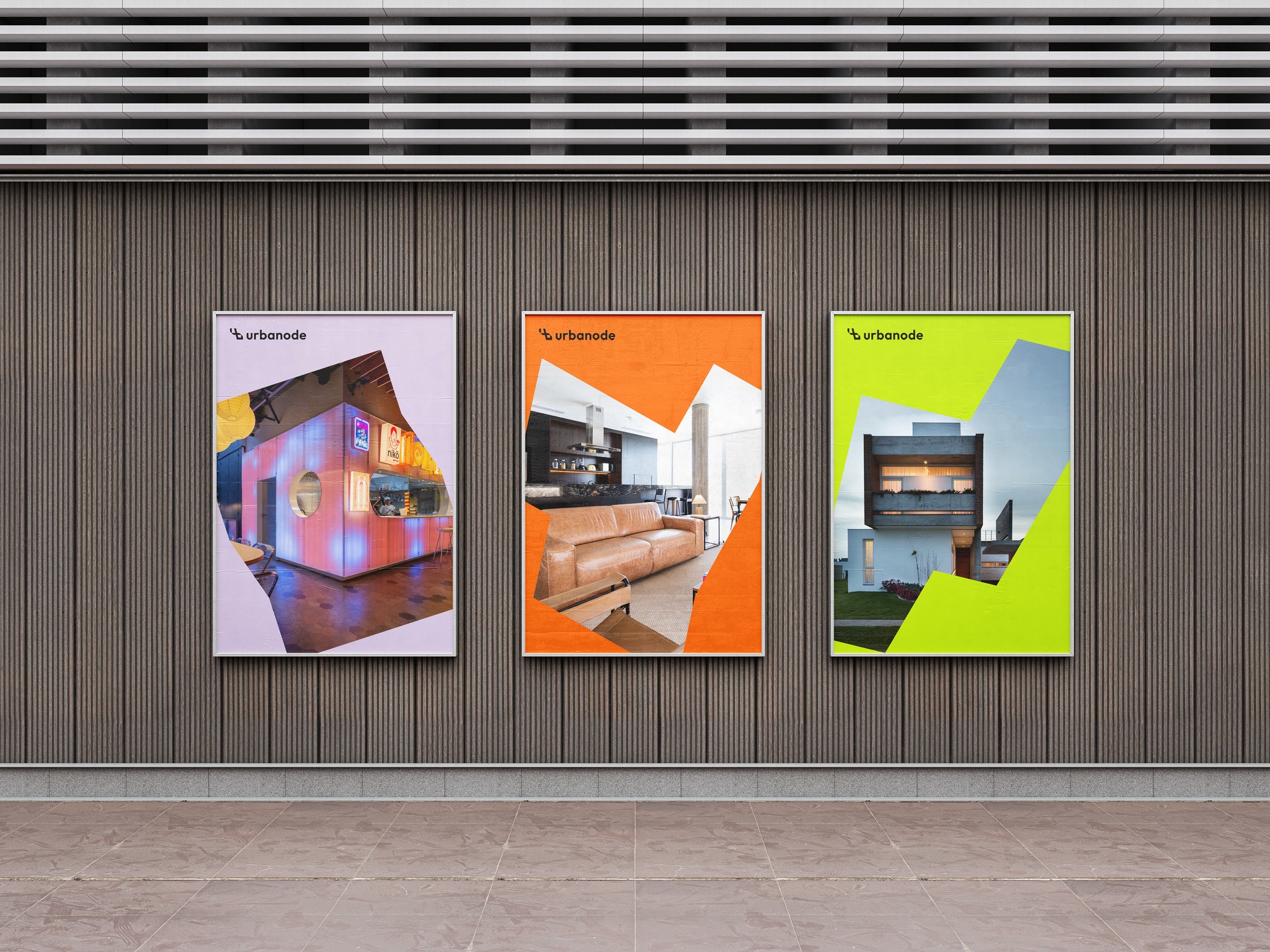
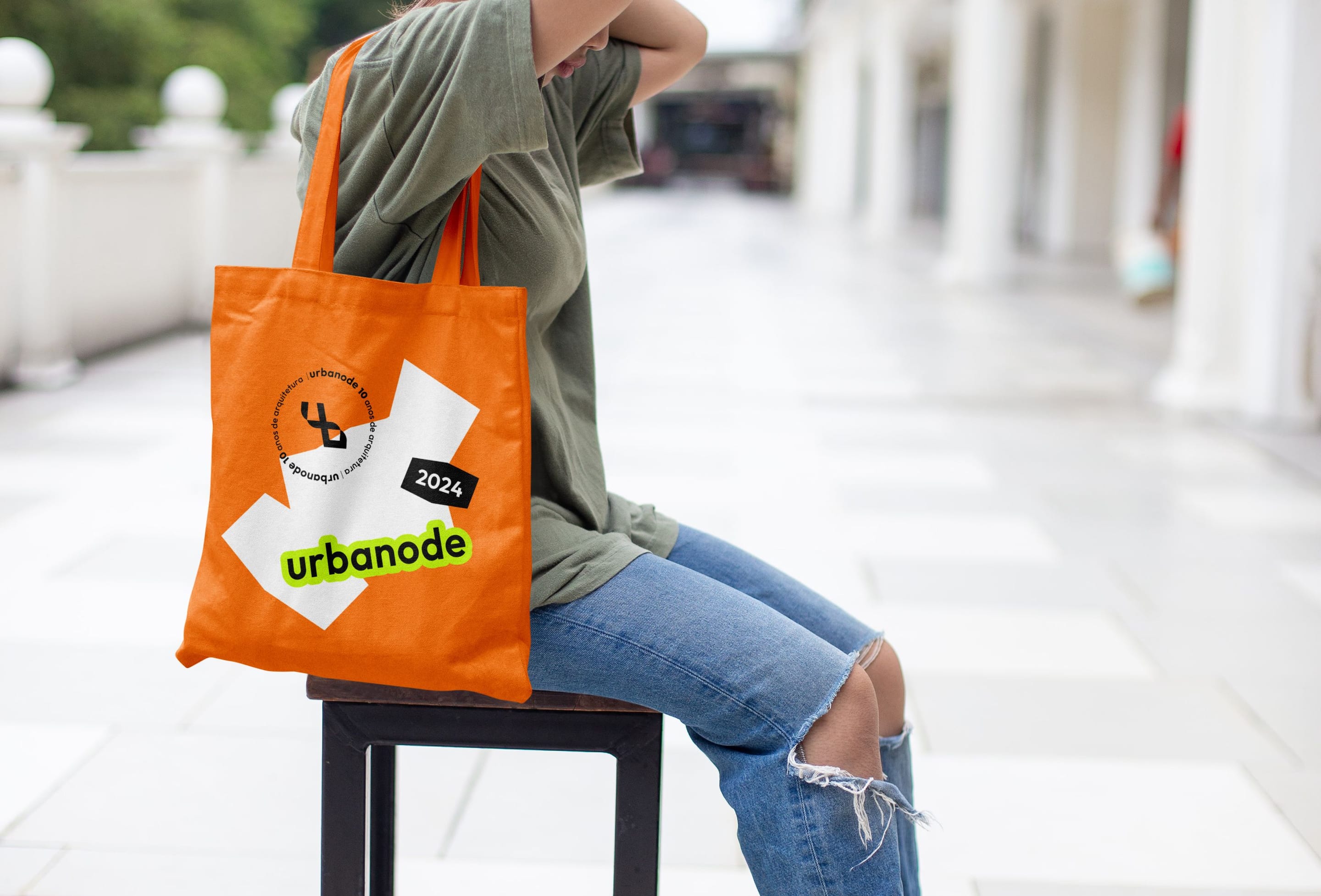
From there I designed the identity system: a simpler symbol that keeps ten years of history, a wordmark and lockups on one grid, graphic elements cut from the symbol, and a bright palette. The system was designed across the website, social media, proposals, posters and merchandise.
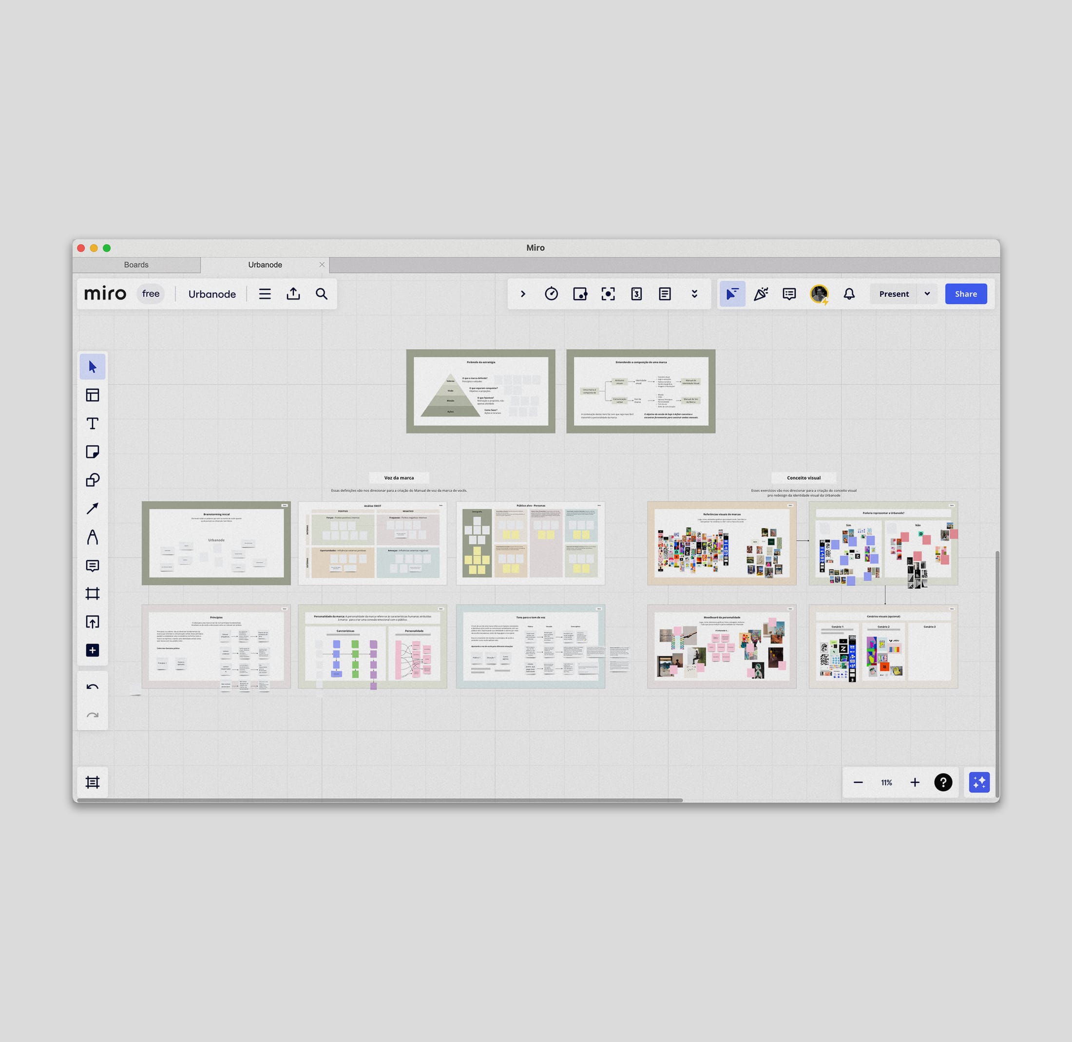
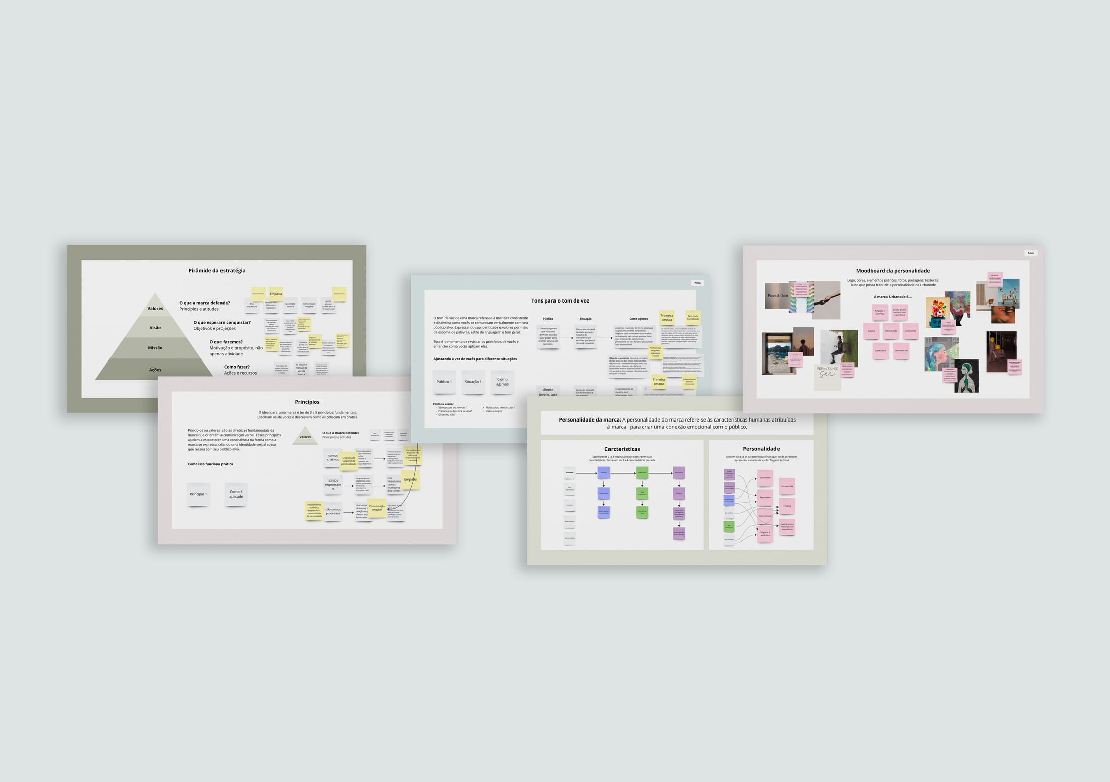
Two strategy workshops with the owners, run on Miro, worked through the studio’s vision, mission, principles, persona and tone of voice. Every sticky note fed the Brand Voice book.
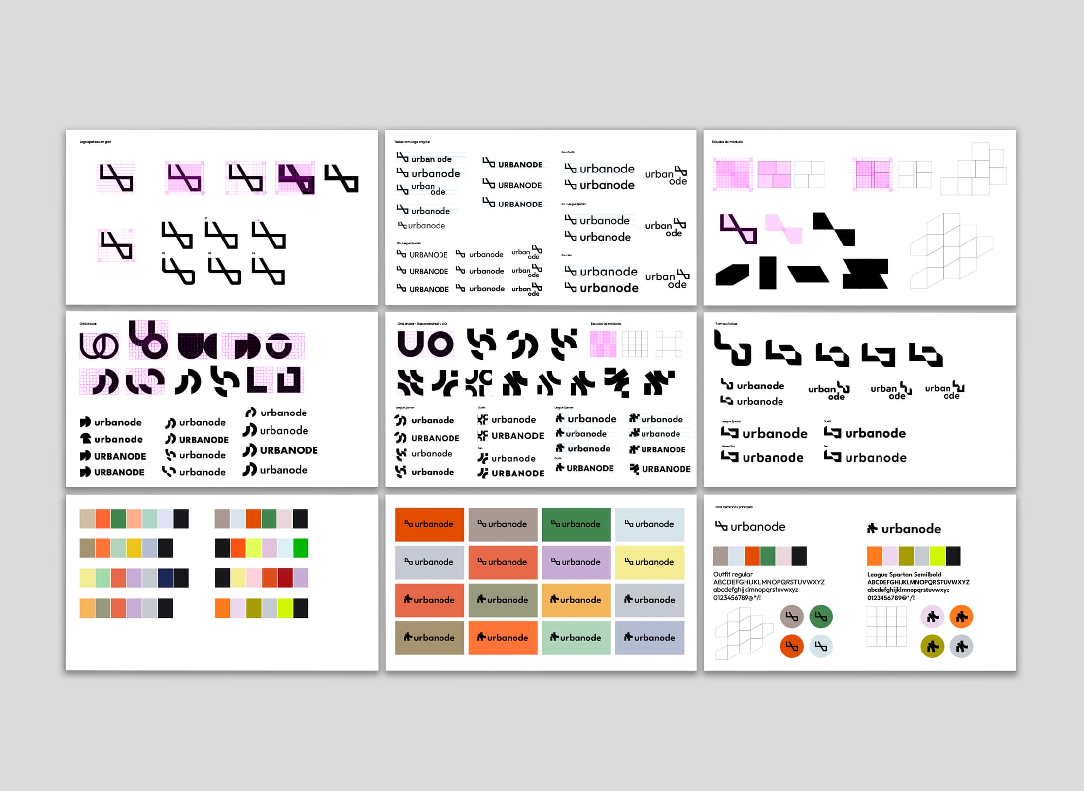
The new logo was explored across many variations of form, weight and colour. Each round was narrowed with the owners until one direction carried the values from the workshops.
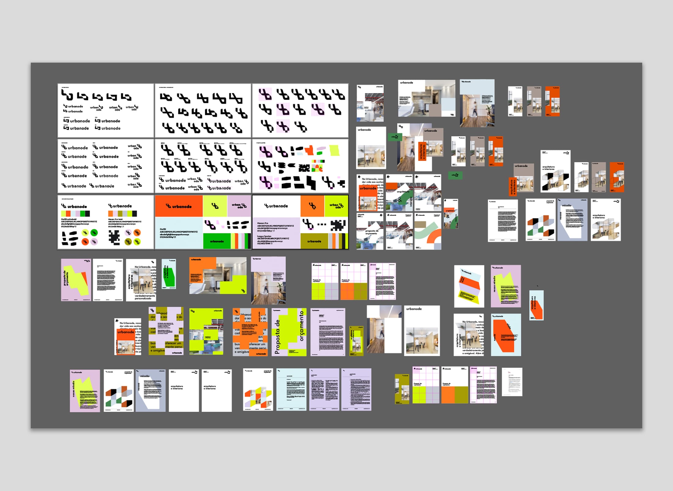
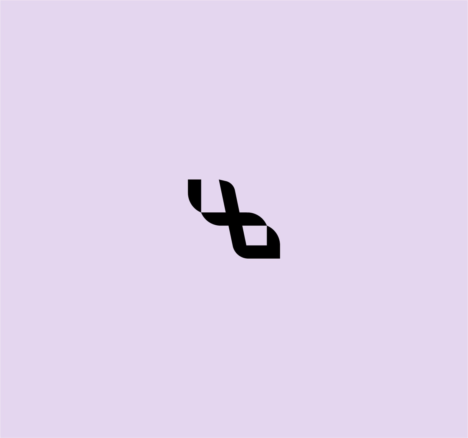
The final symbol keeps the studio’s ten-year history and gives it a simpler, more confident form that works at every size.
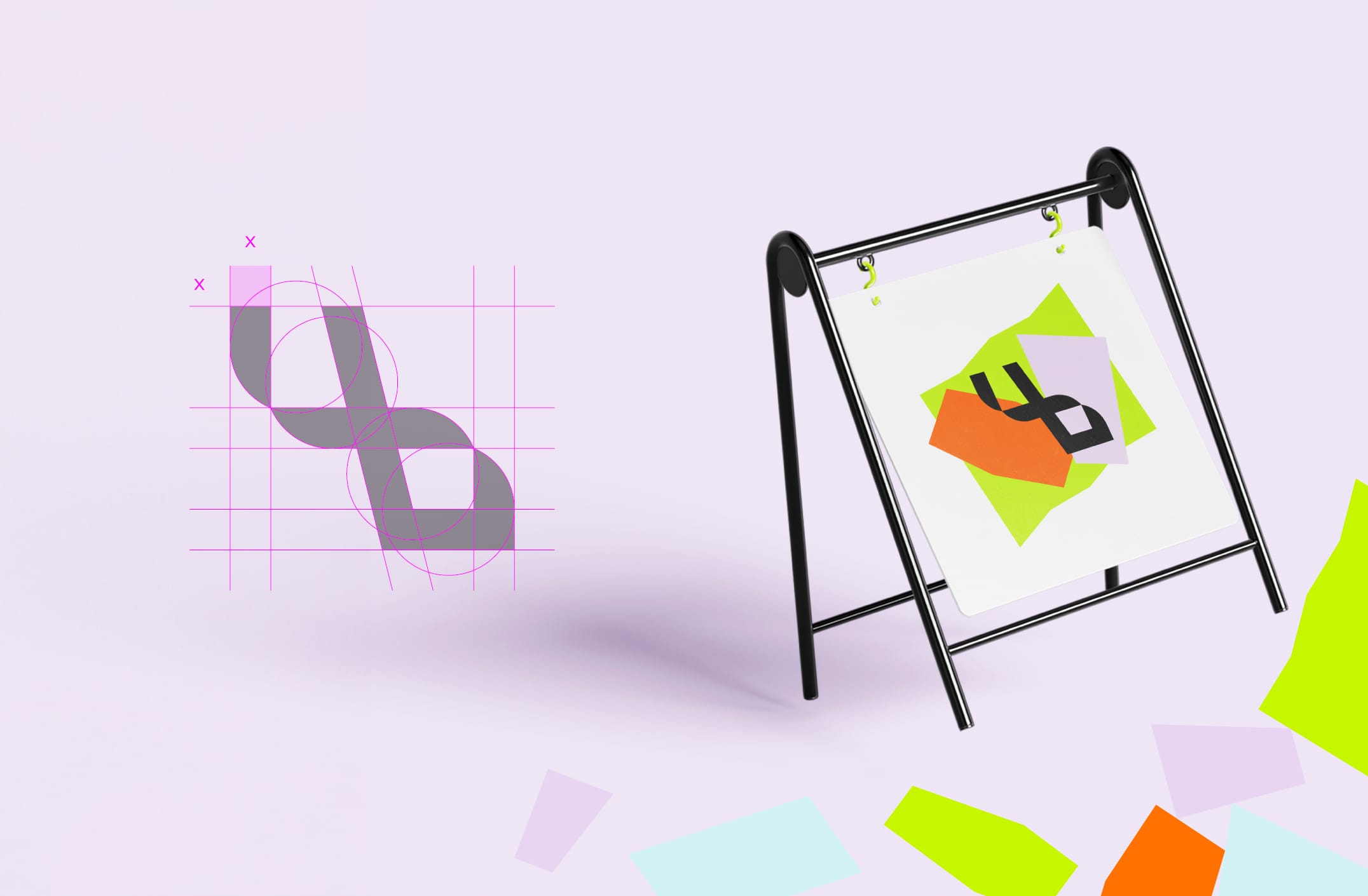
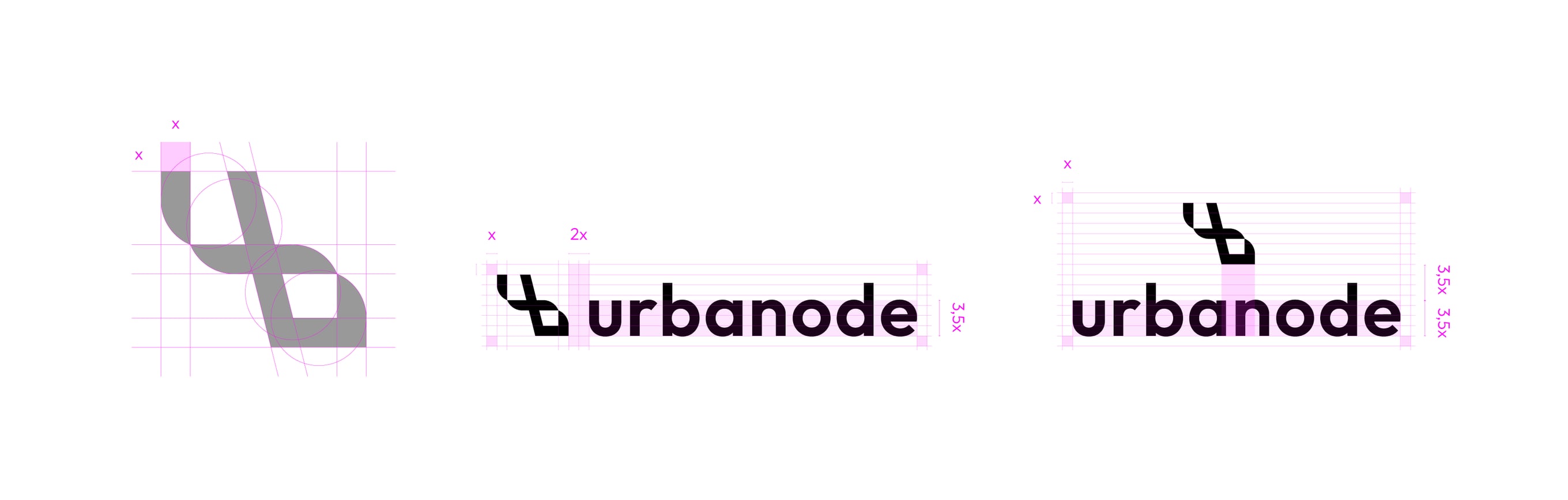
The symbol, the wordmark and three lockups share one construction grid, so the mark holds together from a phone screen to a poster. Shapes cut from the symbol become a set of graphic elements, and a palette of lilac, lime and olive lets each touchpoint feel different while staying clearly Urbanode.
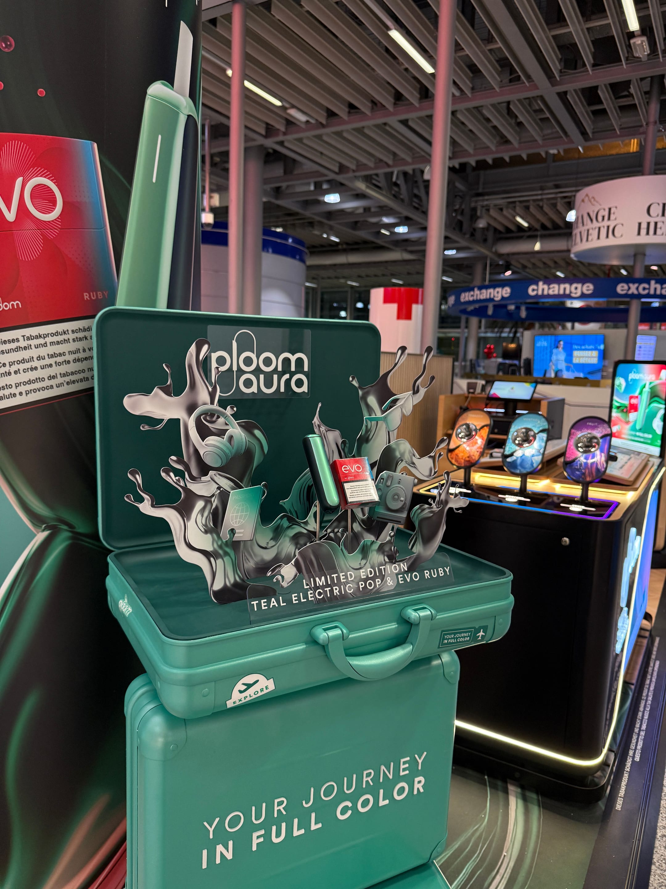
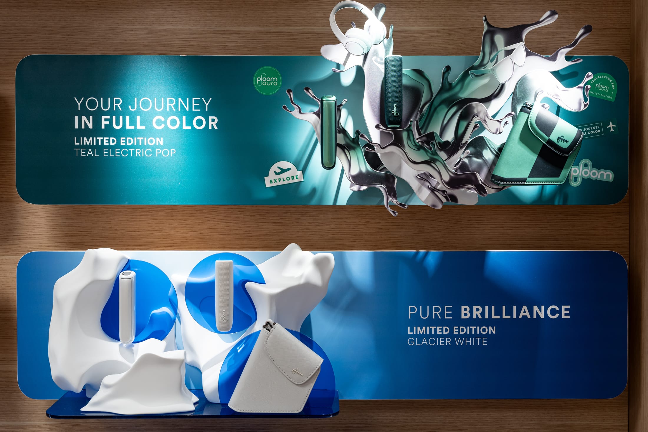
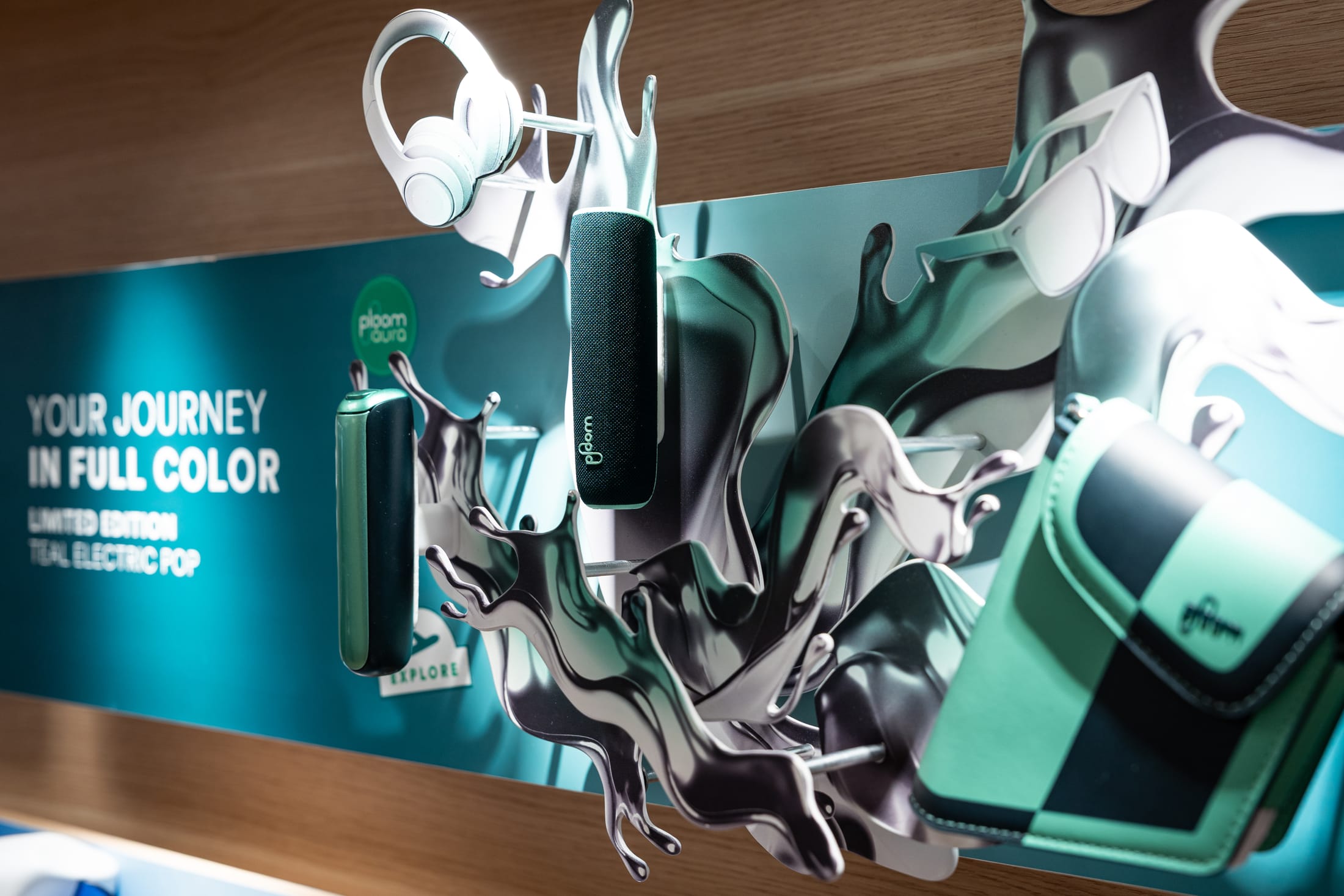
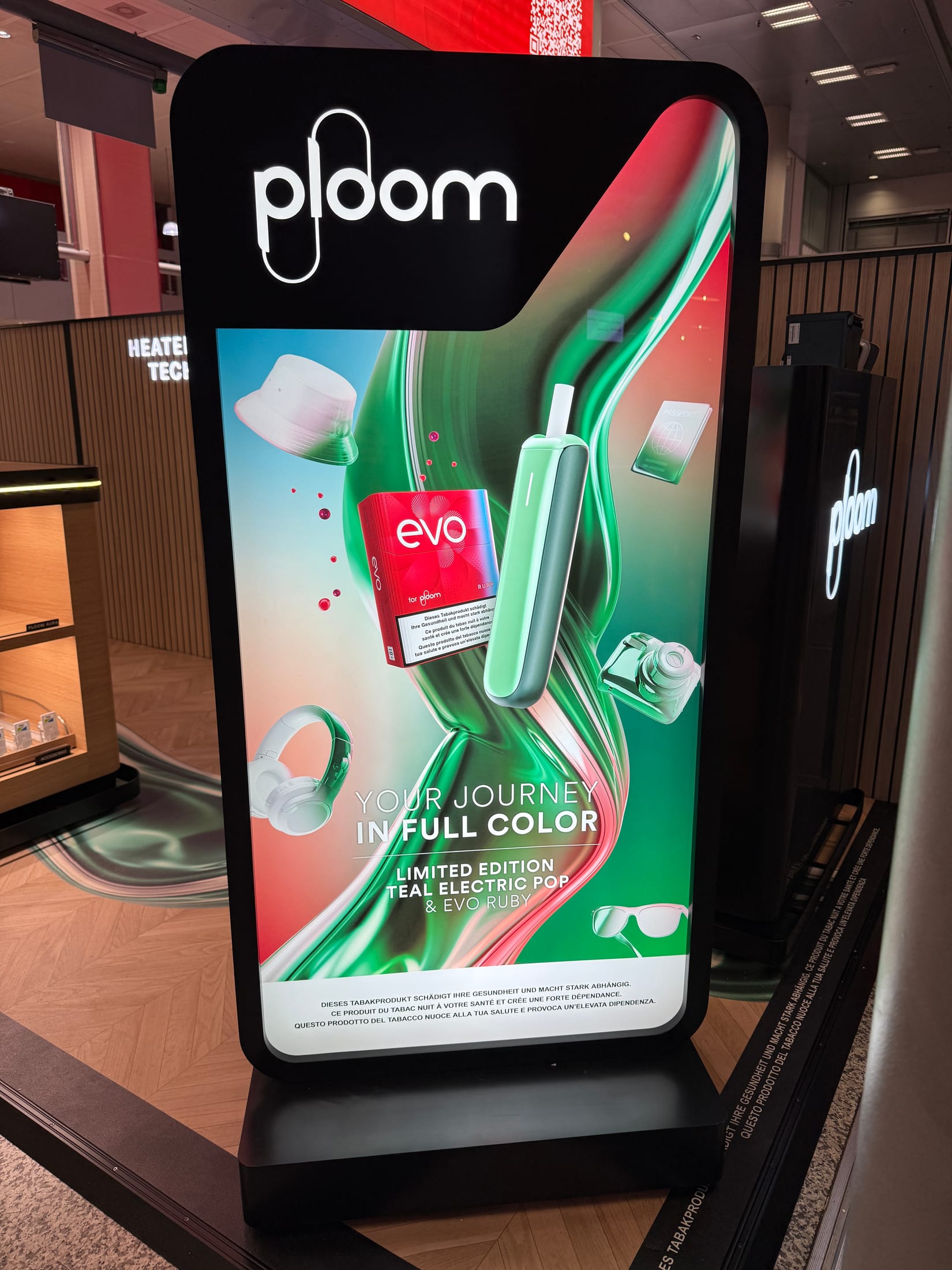
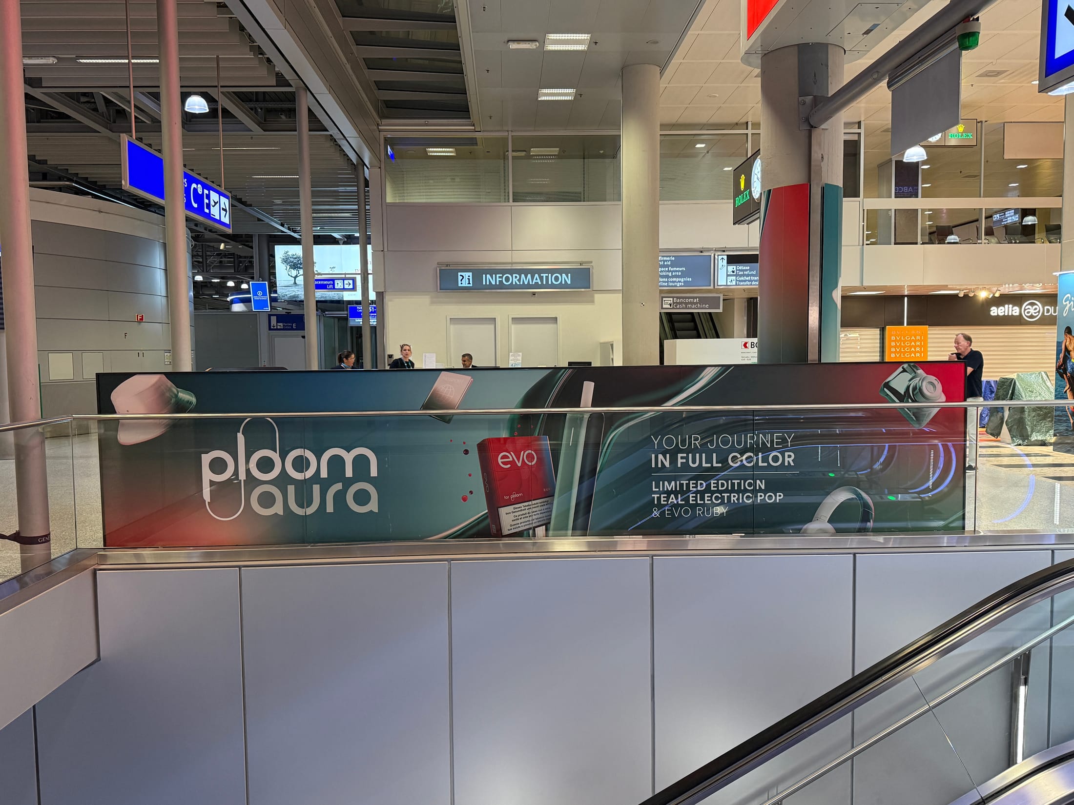
Teal Electric Pop is a limited edition of the Ploom Aura device, launched in airport duty free. The brief was to make a small device feel like the start of a journey, and to carry that idea from the first sketch to the shop floor.
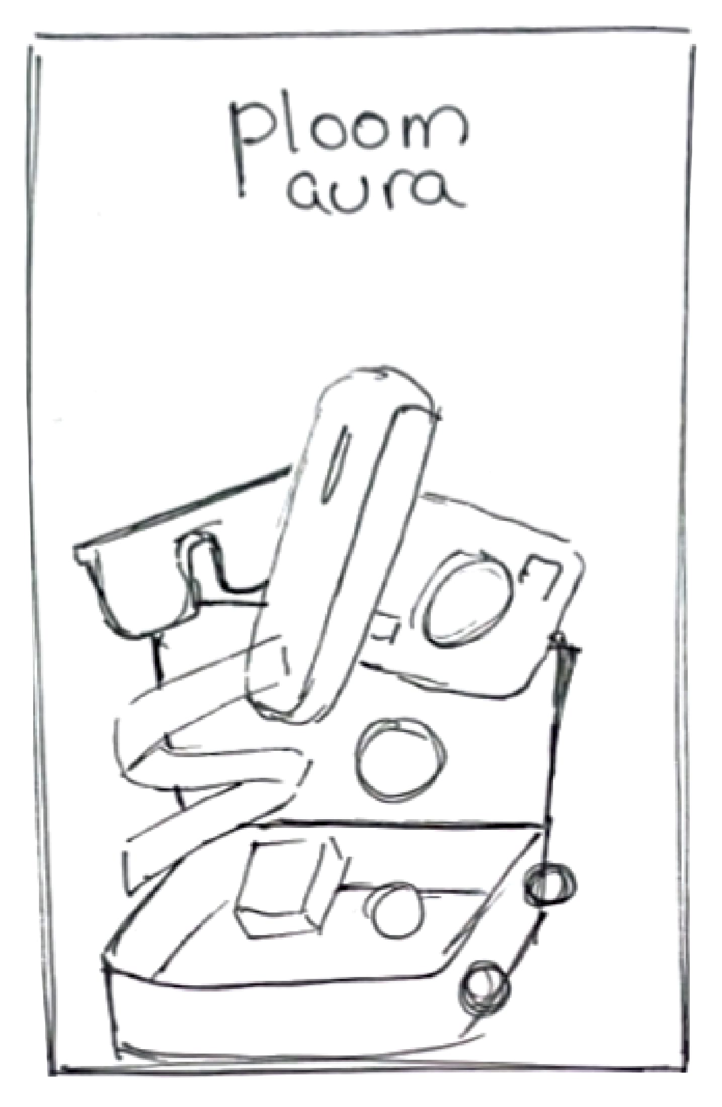
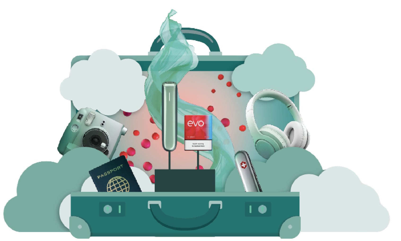
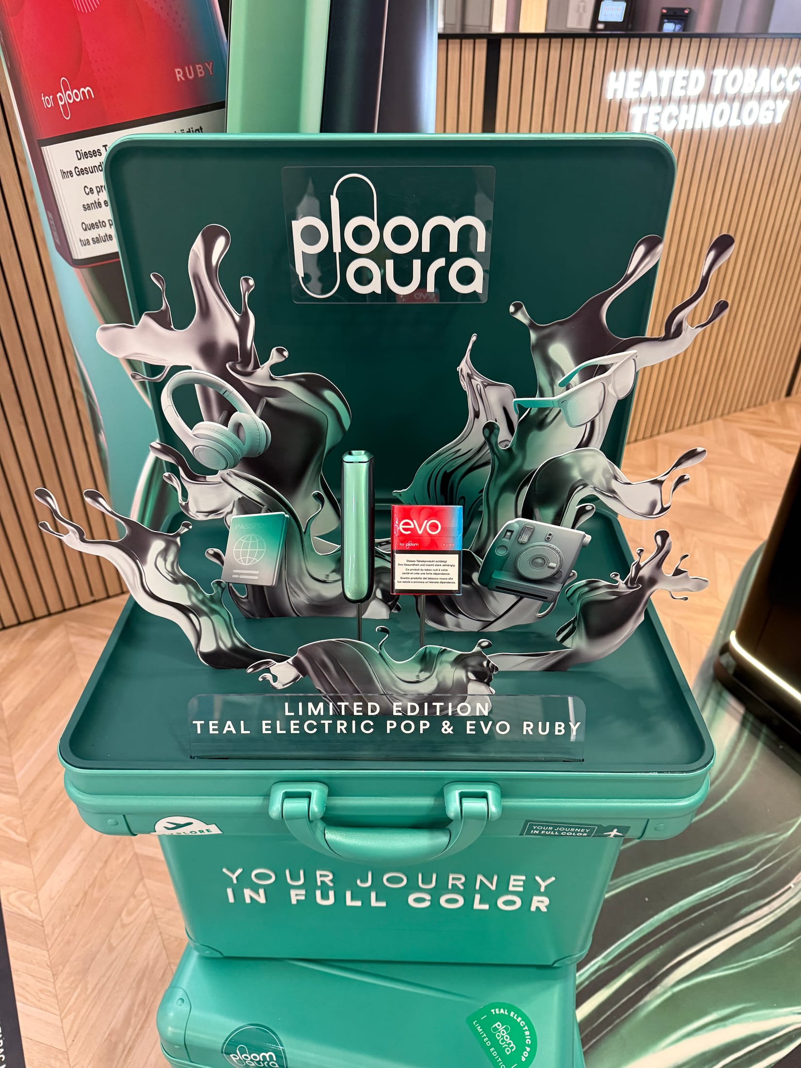
I took the idea from thumbnails to a suitcase sculpture, then art directed the 3D designer with three illustrations that set the composition, materials and colour. The sculpture became one key visual that works at every size: a kiosk with a lit flavour counter, light boxes and a balustrade banner. It later joined the Ploom stand at TFWA 2026.
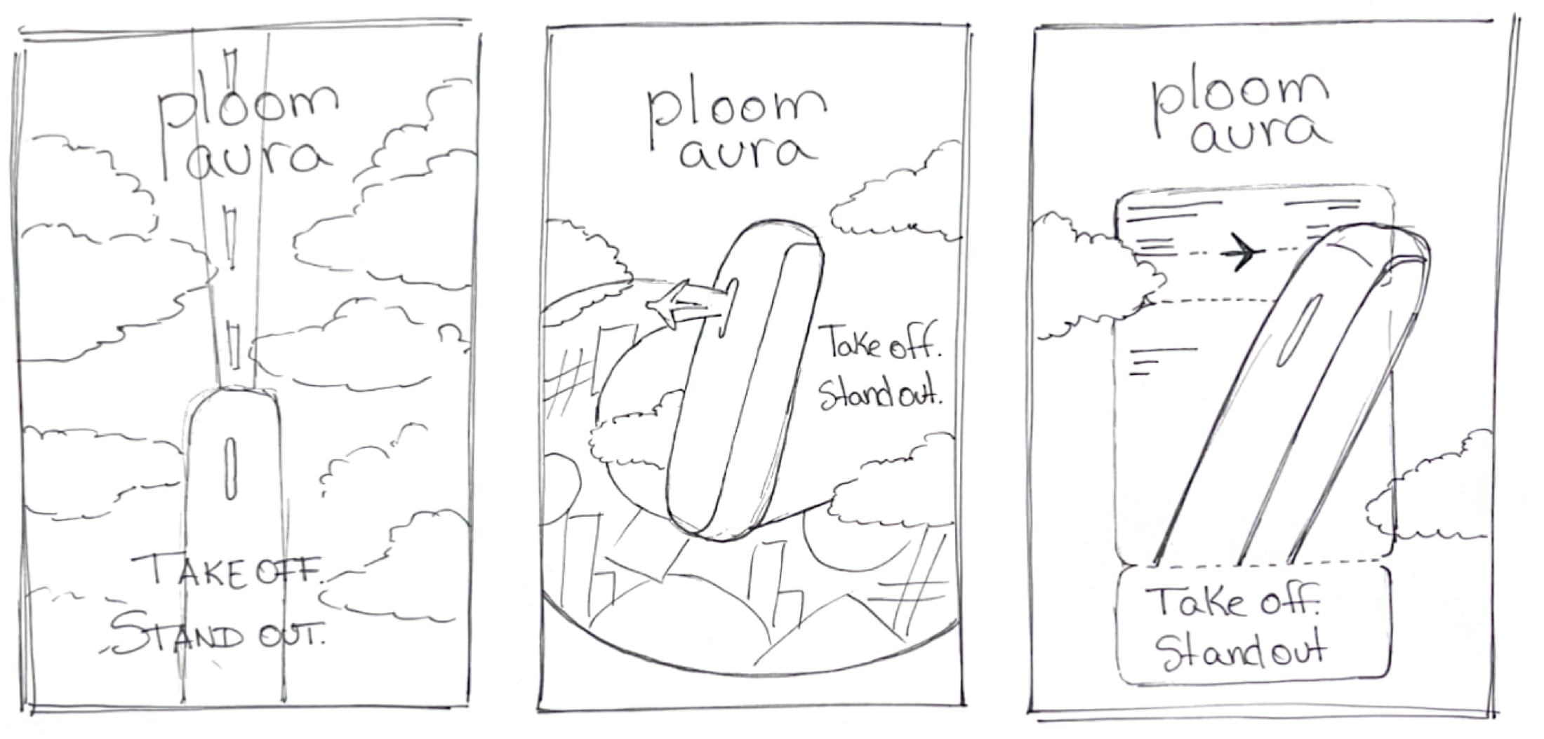
Quick thumbnails tried the device as a rocket, a plane and a boarding pass. The idea that stuck was an open suitcase, packed with what a traveller carries, with the device bursting out of the top.
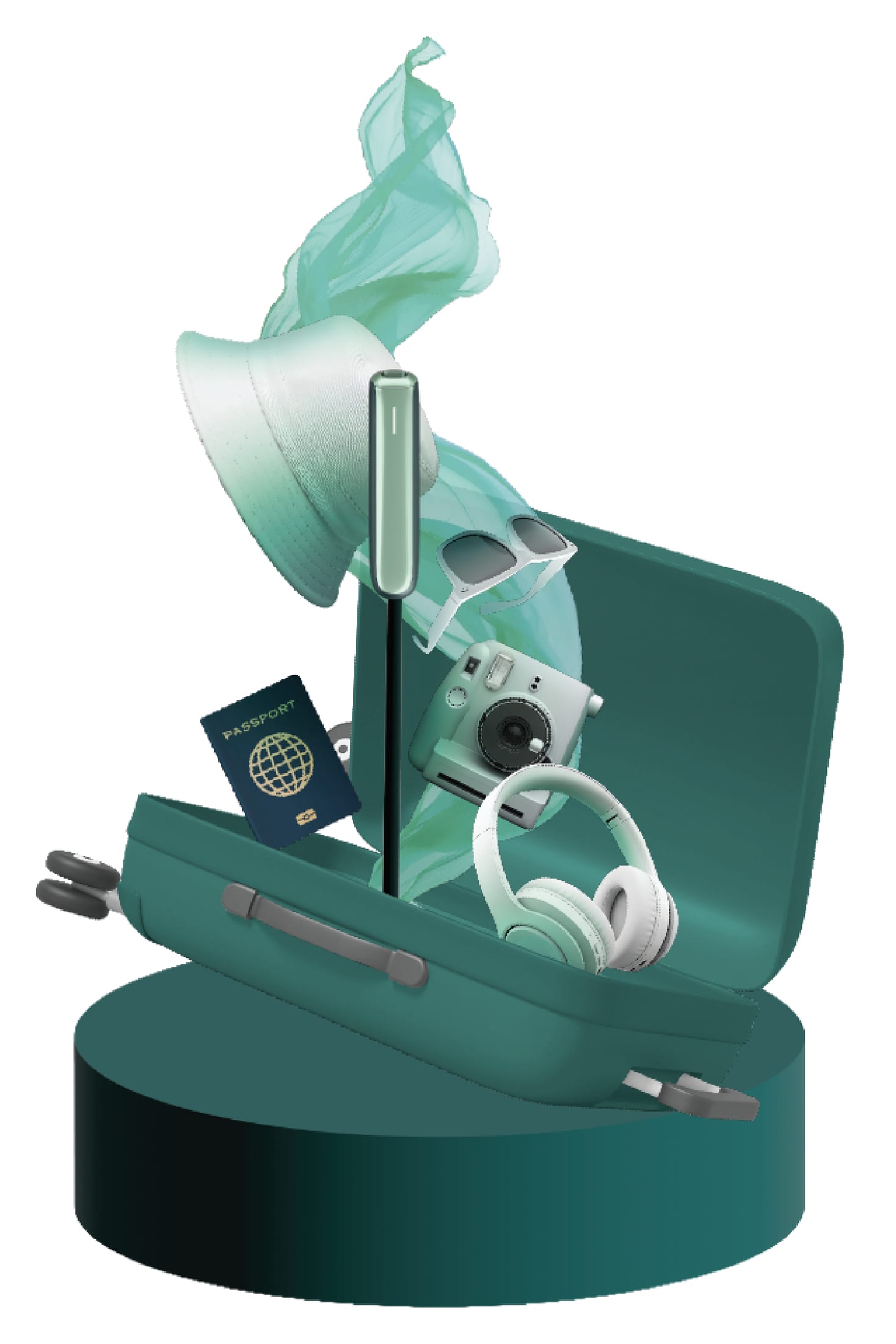
The suitcase was taken three ways: a sculpture on a plinth for the shop floor, a flat illustrated stack for print and screens, and a chrome version for the Glacier White edition. Each was checked for scale, colour and how the device, headphones and passport sit inside the case.

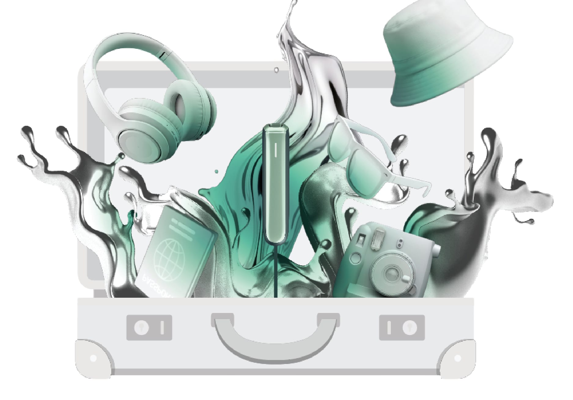
The sketch, the concept illustration I used to brief the 3D designer, and the real display, installed.
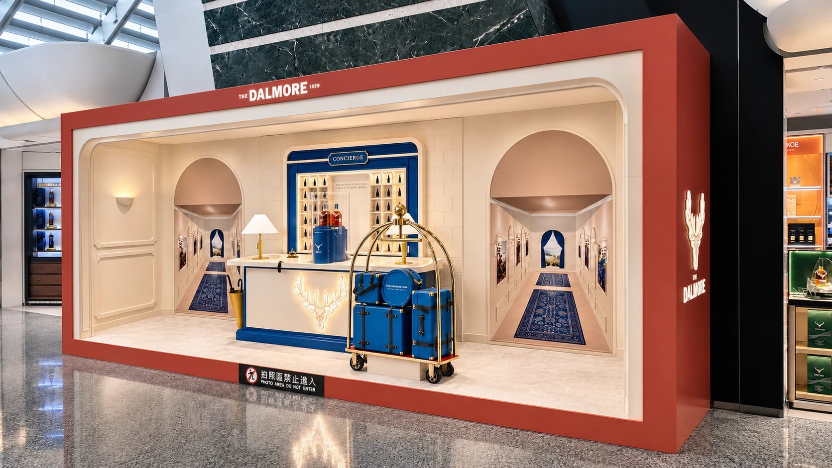
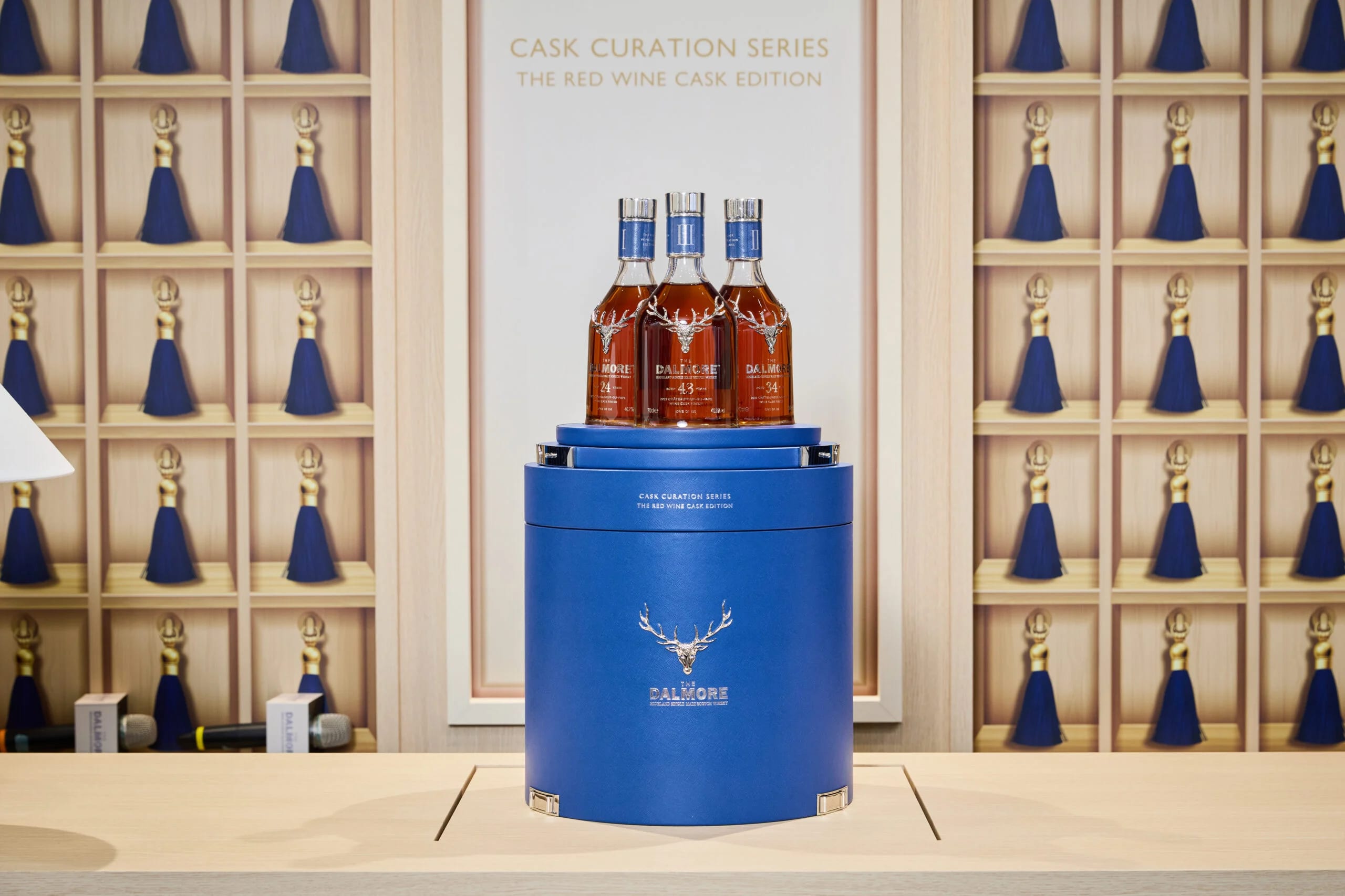
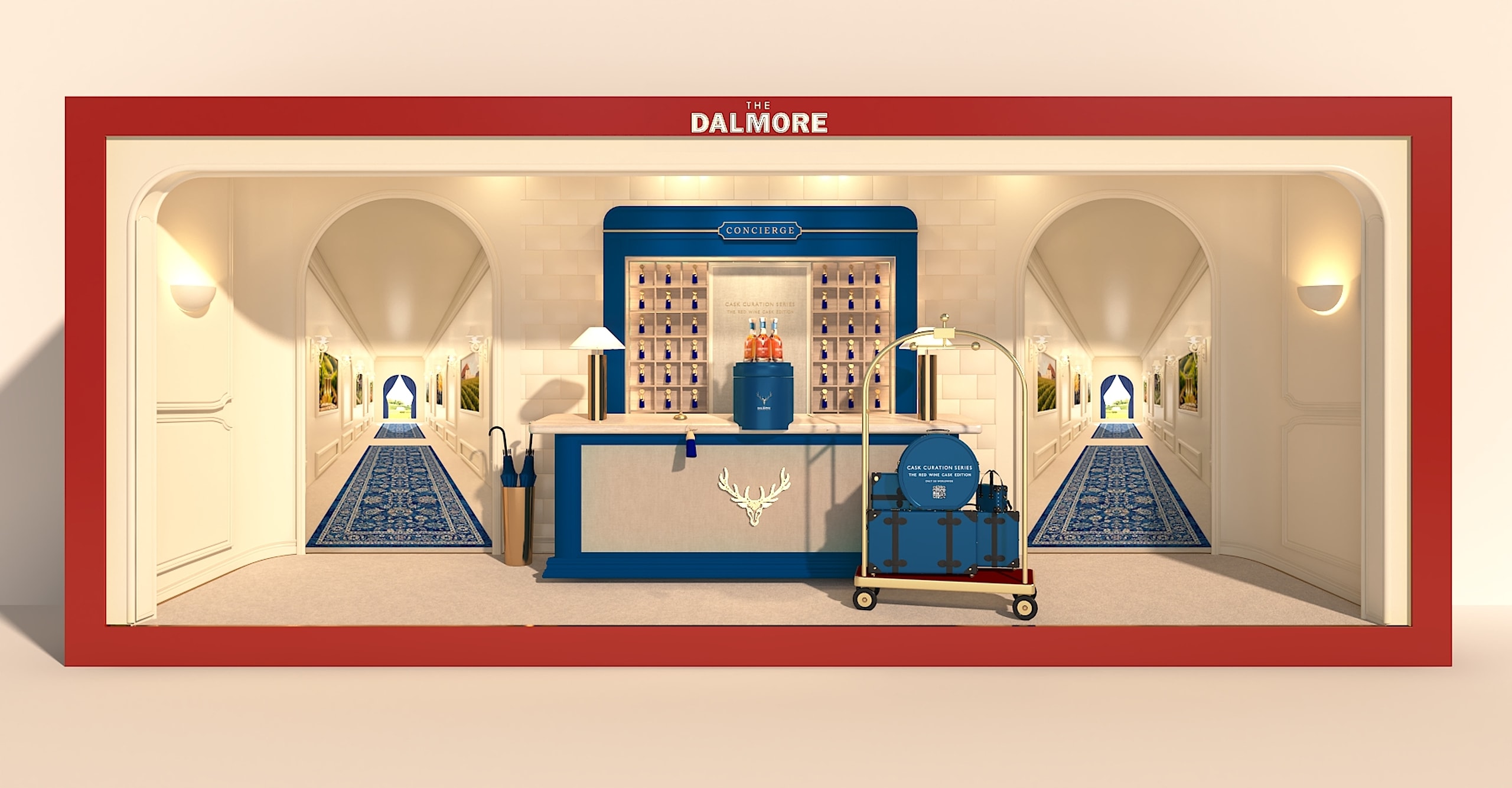
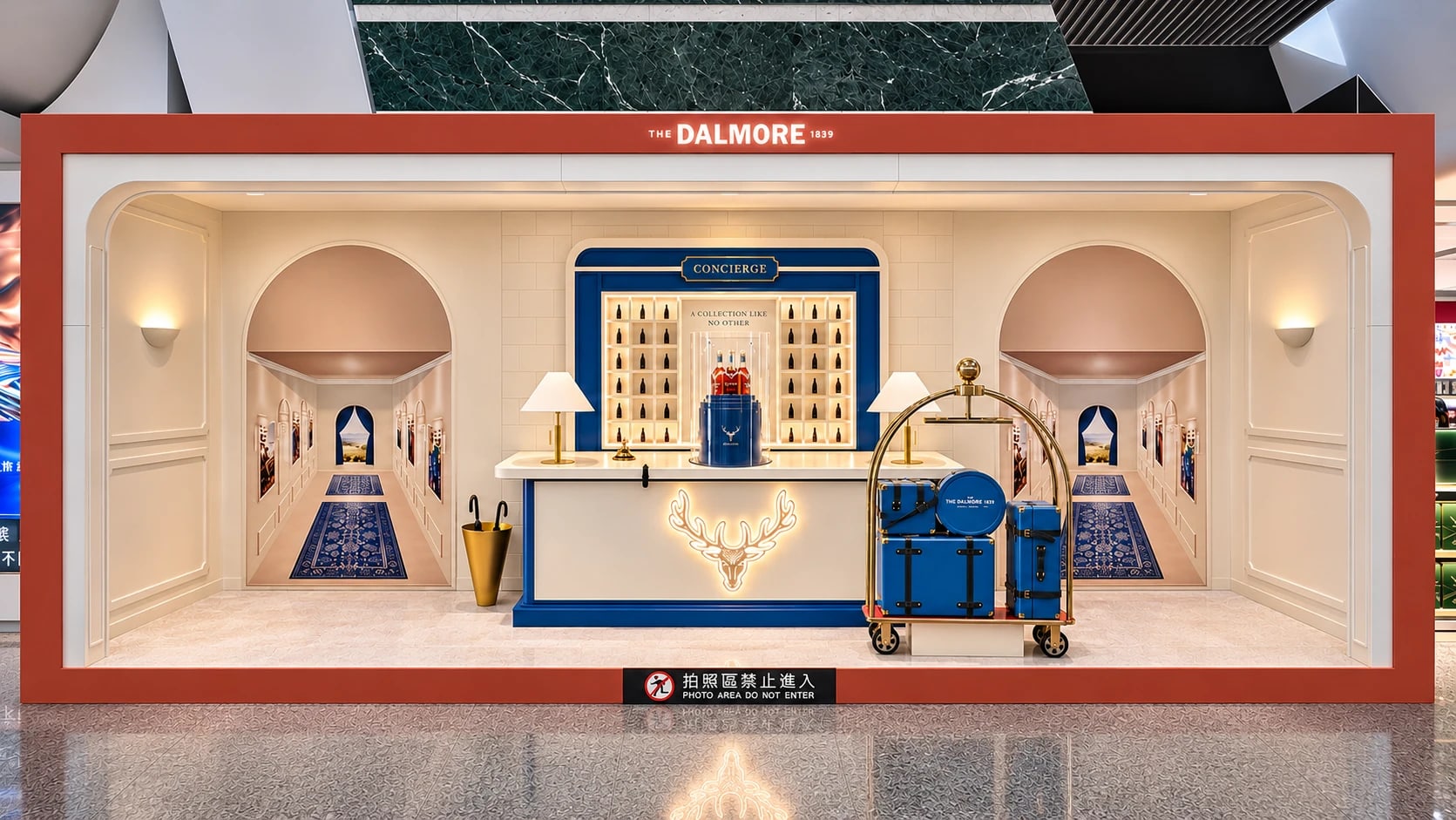
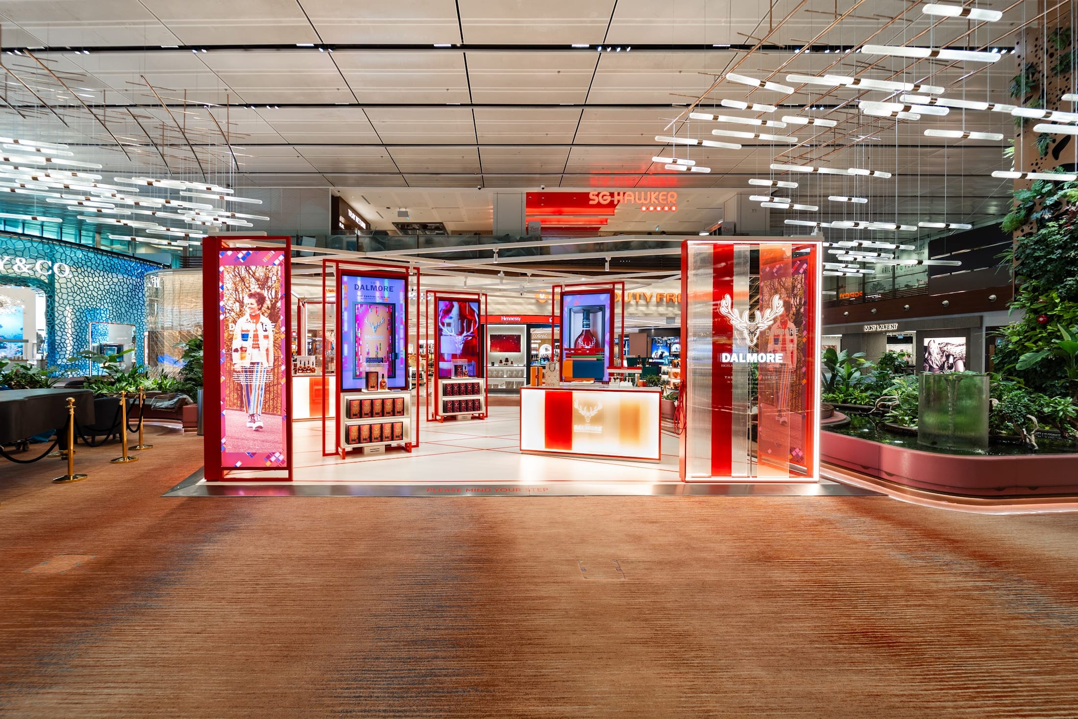
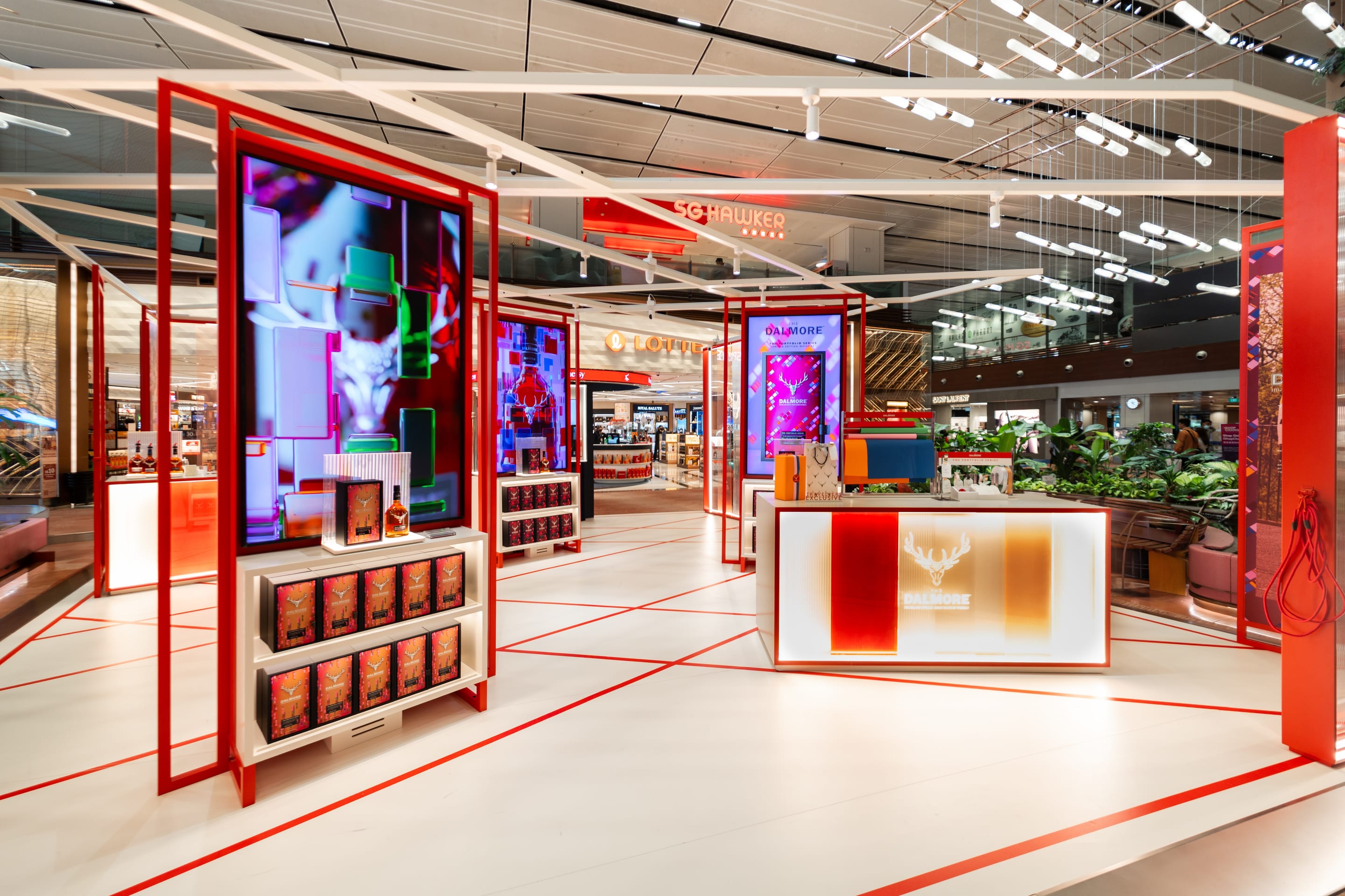
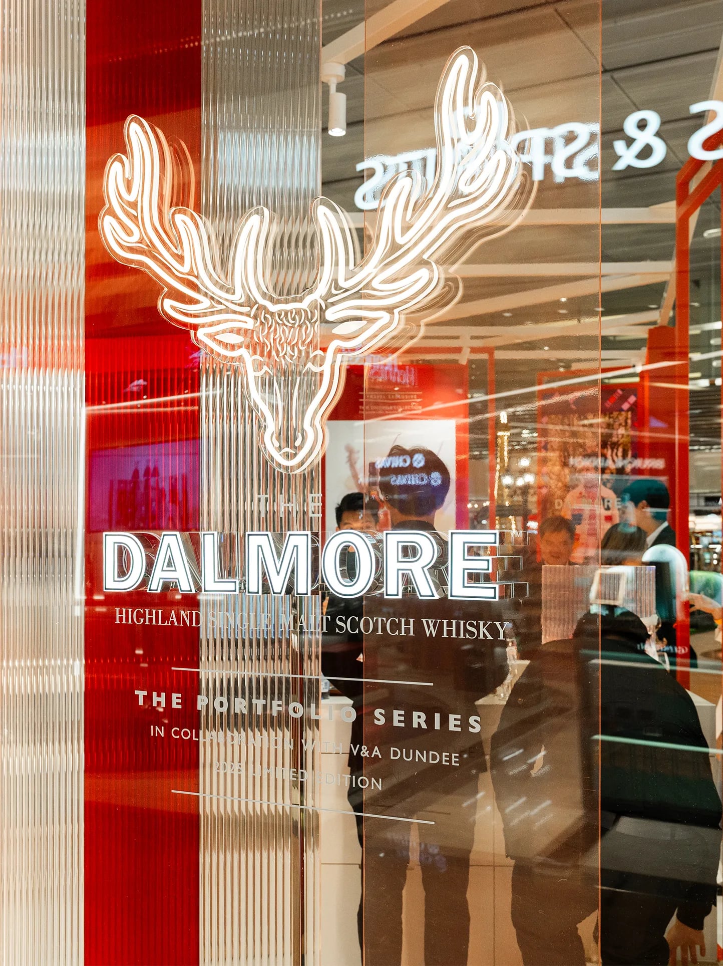
Cask Curation 03 is The Dalmore’s Red Wine Cask Edition. Its lapis blue case takes its cue from luxury luggage and the long voyage of the casks. The brief was to bring The Dalmore’s Shop Window concept to a large window in Everrich’s public area at Taoyuan Airport Terminal 1.
My concept turned the window into the lobby of a French château, with a long corridor that invites travellers to step inside and begin the voyage. A bell trolley, cases and arched doorways tell the travel story, and the bottles sit in a lit cabinet at the heart of the scene.
The window was built and installed as designed. Its corridors hold their depth from the side too, so it reads for travellers coming from either direction.
The Shop Window concept was built on the packaging story: a lapis blue case inspired by luxury luggage, and a red wine cask from Châteauneuf-du-Pape. The brief was to extend it to the airport’s big window and create the illusion of a three-dimensional space behind the glass, one a traveller takes in while walking past.
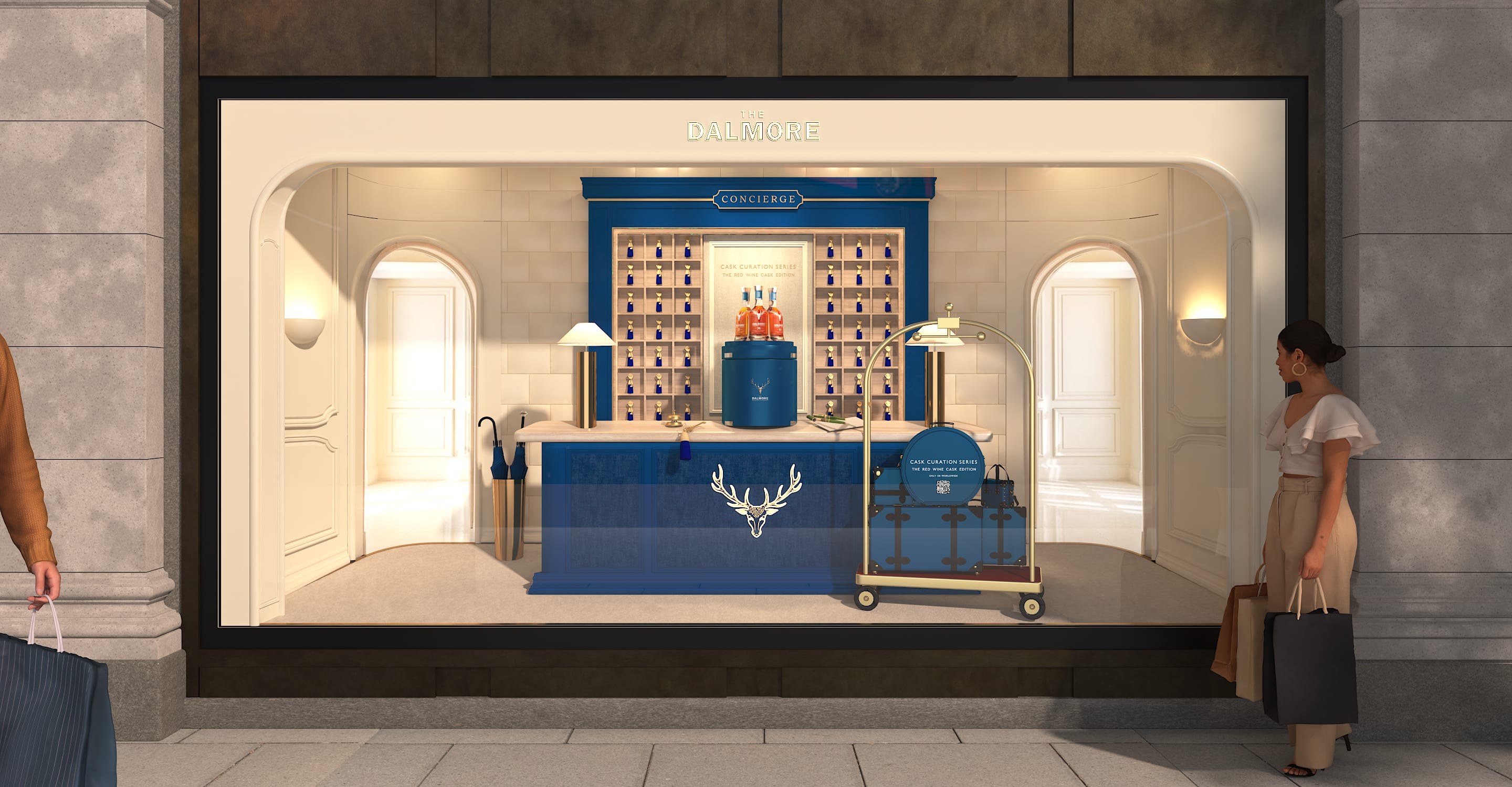
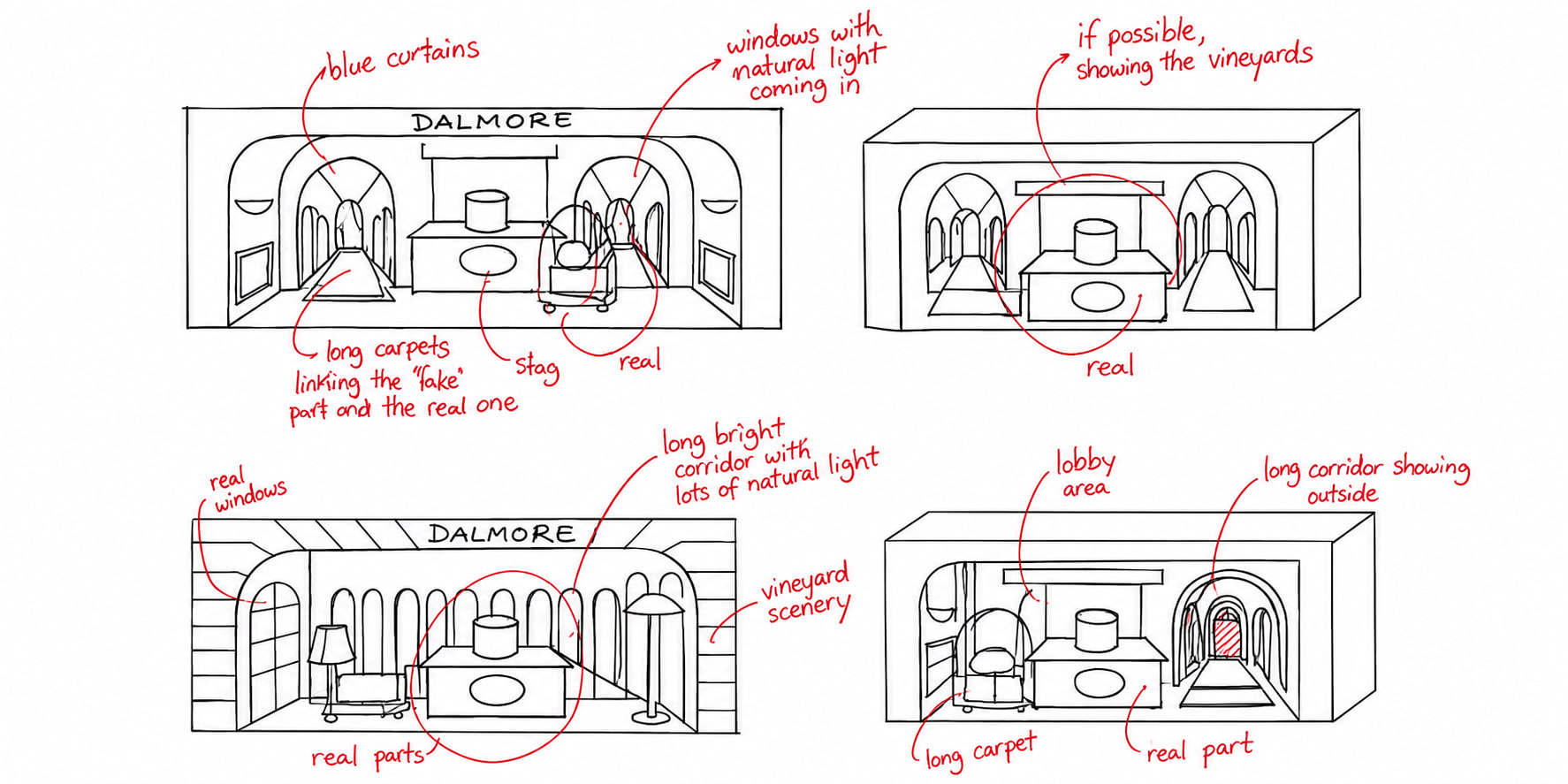
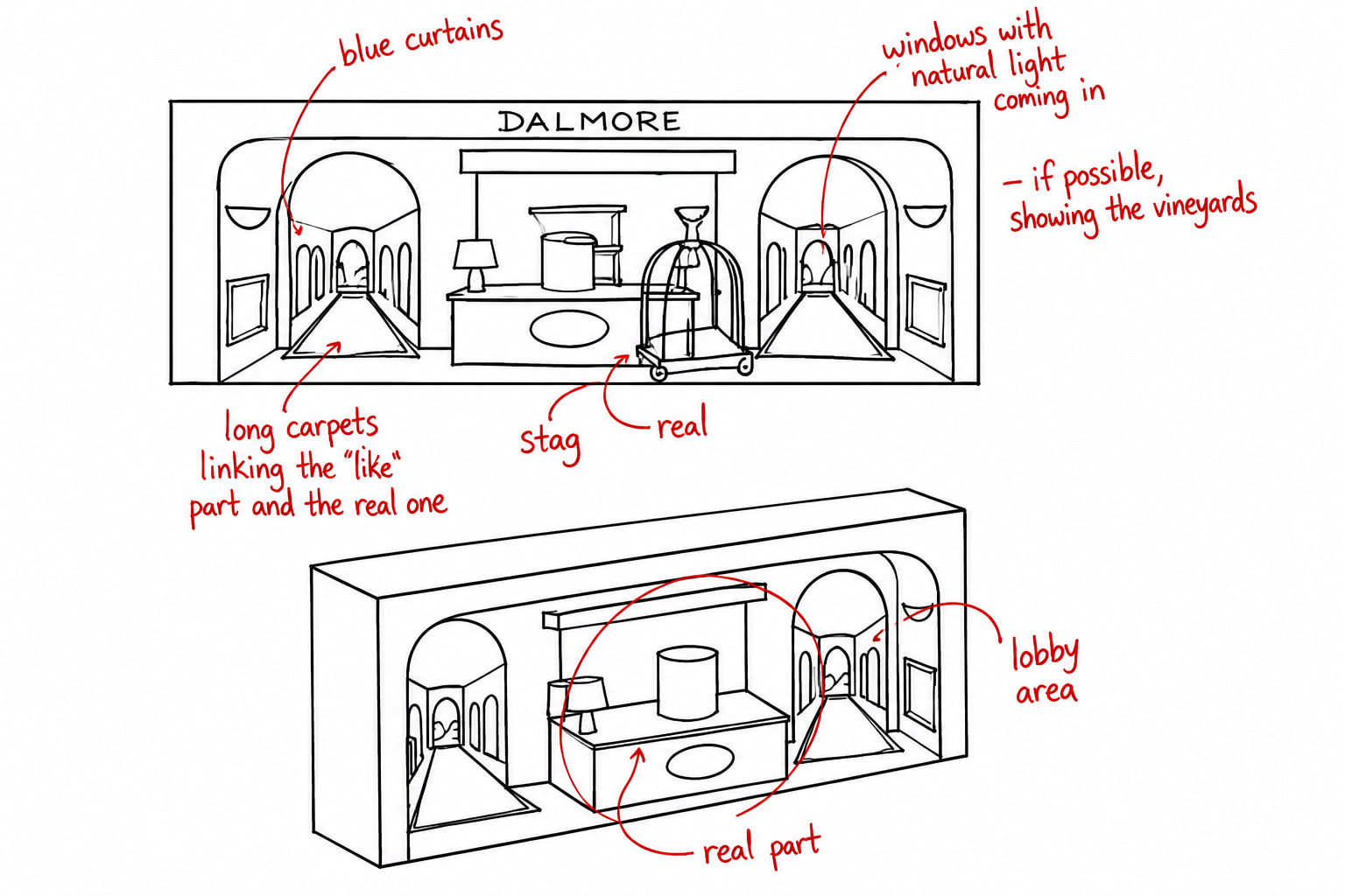
I sketched the window by hand first, deciding what would be real and what would be printed. A real desk, stag, trolley and cases sit at the front. Behind them sit printed corridors, with windows letting in natural light. Long carpets link the printed part to the real one, so the eye travels straight down the corridor.
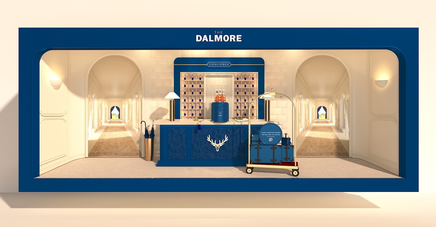
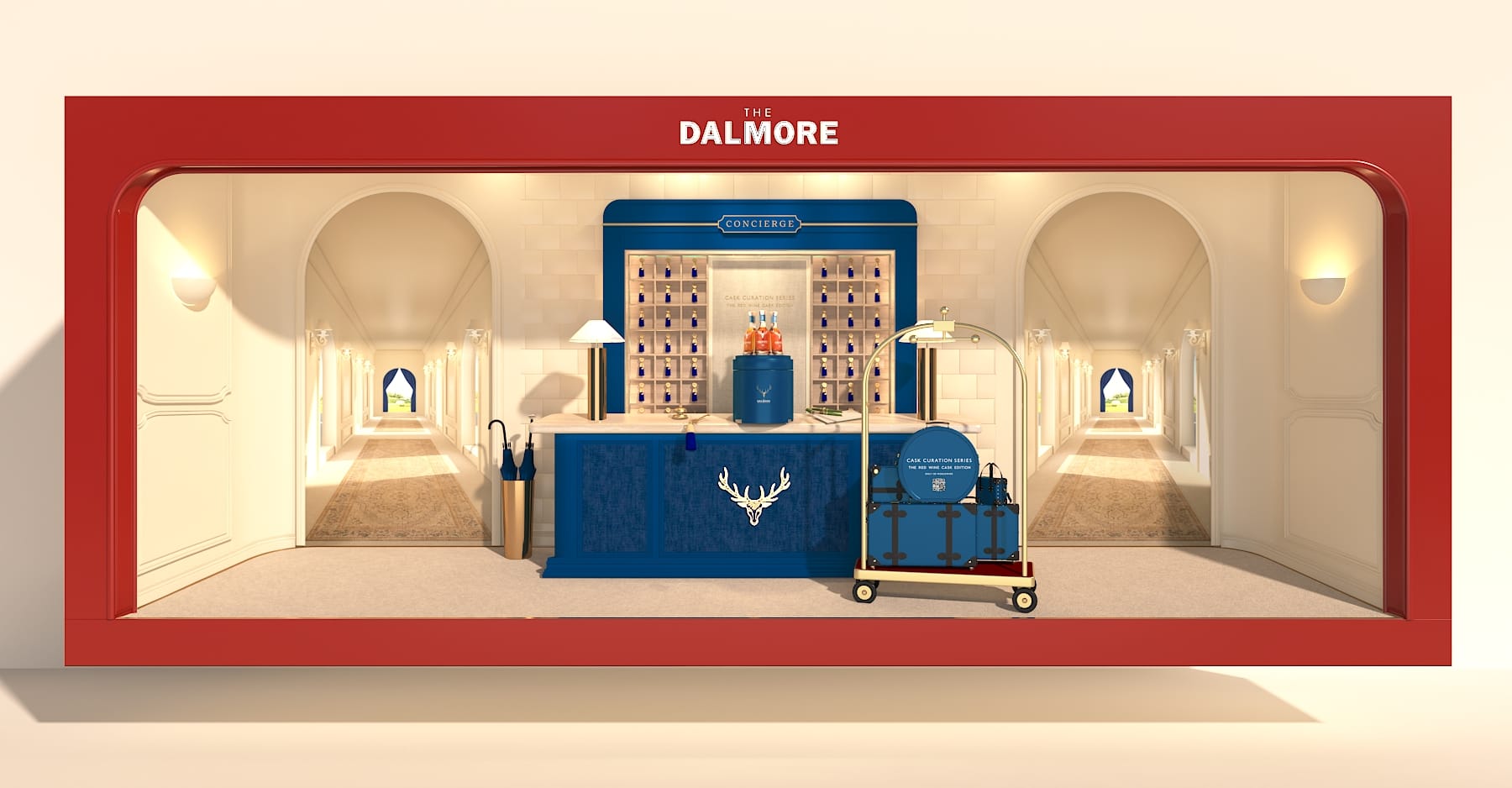
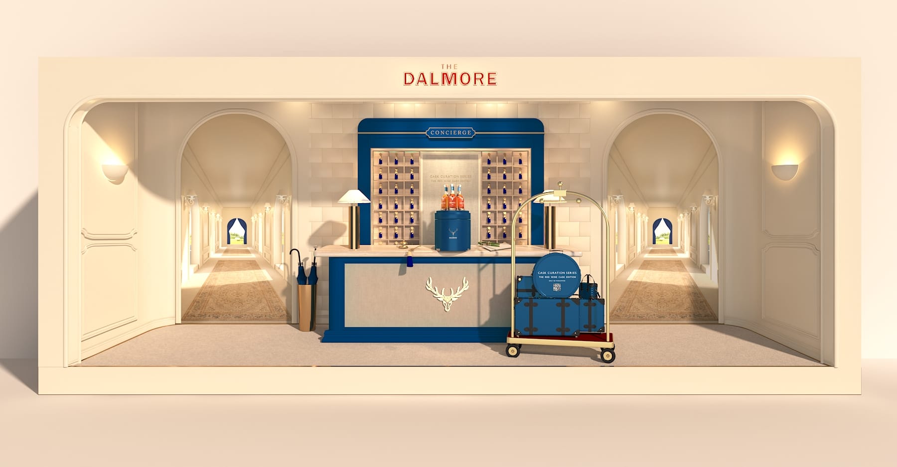
Three colour routes were tried in 3D, with the château lobby as a freestanding box framed in lapis blue, Dalmore red or a quiet cream. Red was chosen: it holds its own in a busy terminal and makes the blue case inside glow. The final render fixed the details for production: carpets, trolley, cases and the lit cabinet.
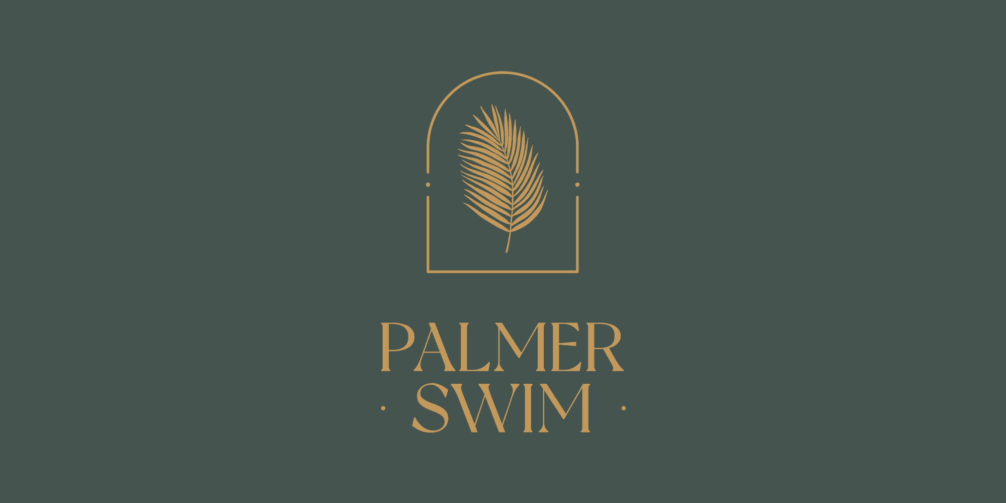
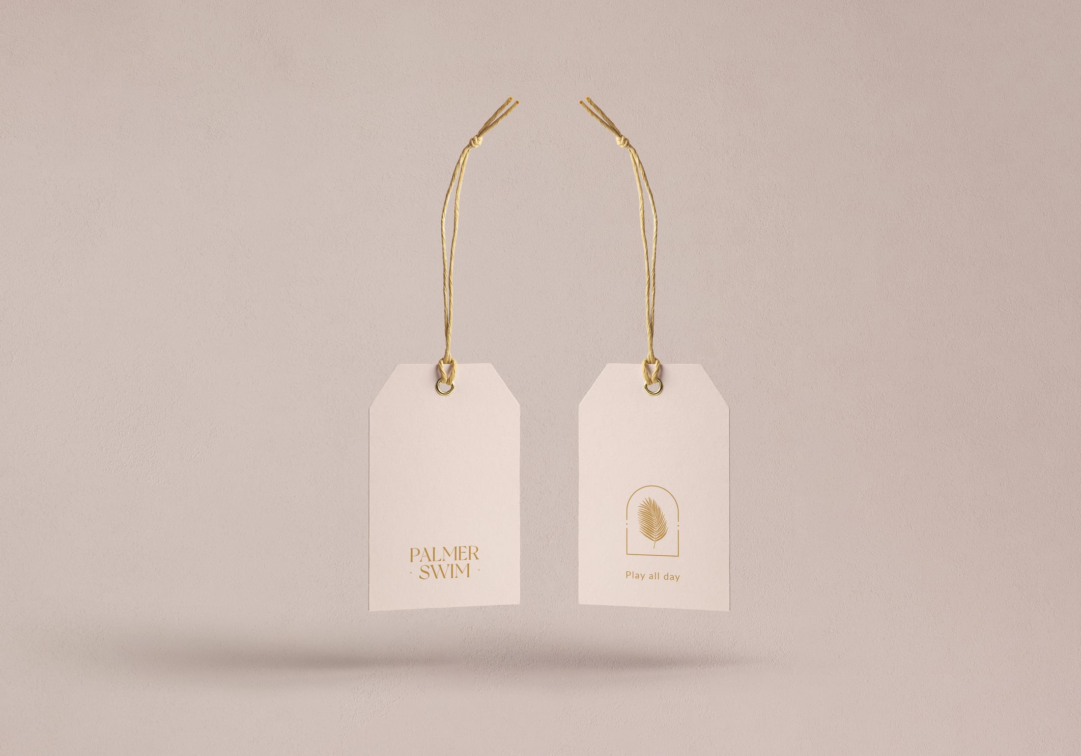
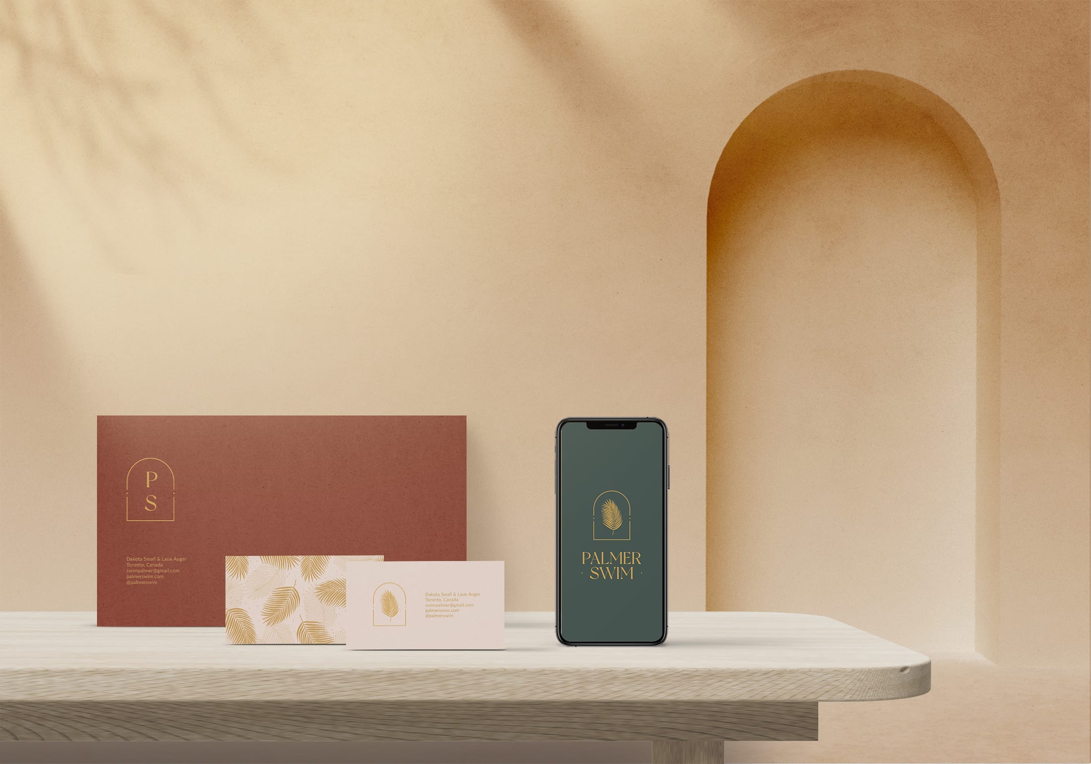
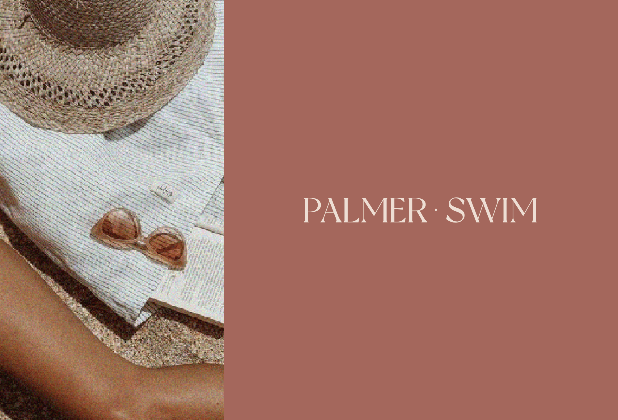
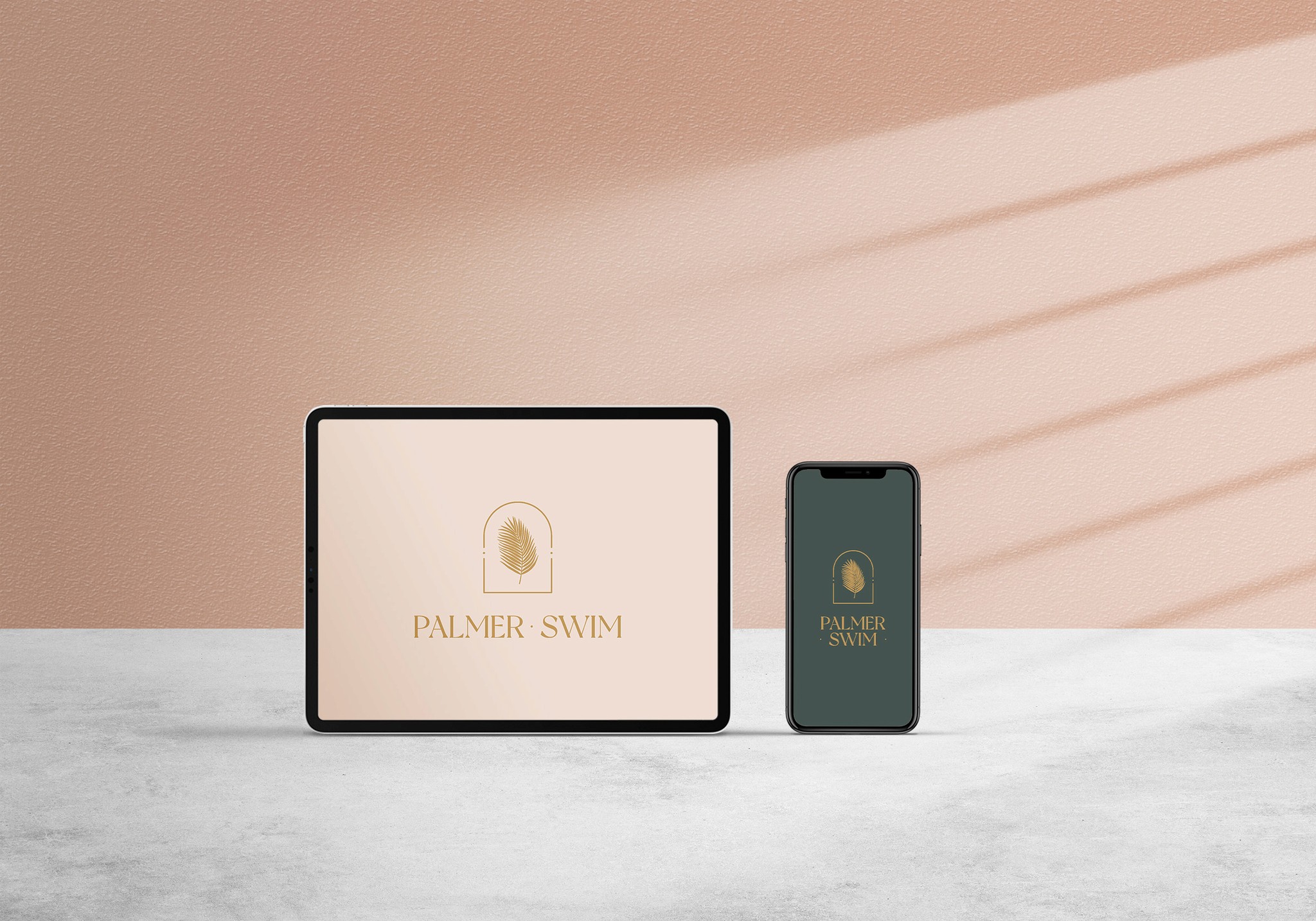
Palmer Swim is a Toronto swimwear brand started by two travel-loving best friends, made for everything from morning pool sessions to late-night dips. The brand needed an identity that felt relaxed and modern, and that worked just as well on a swing tag as on the website.
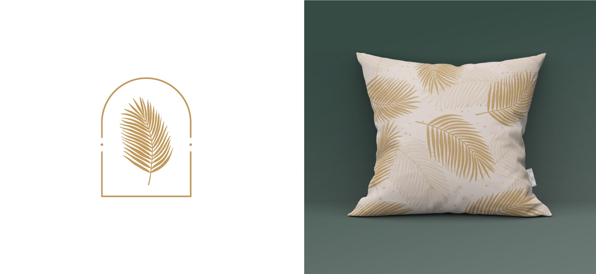
I built the identity around a palm leaf, the classic way to stay cool on a hot summer day, and an arch. Together they carry the brand’s values: modern, free and sensual.
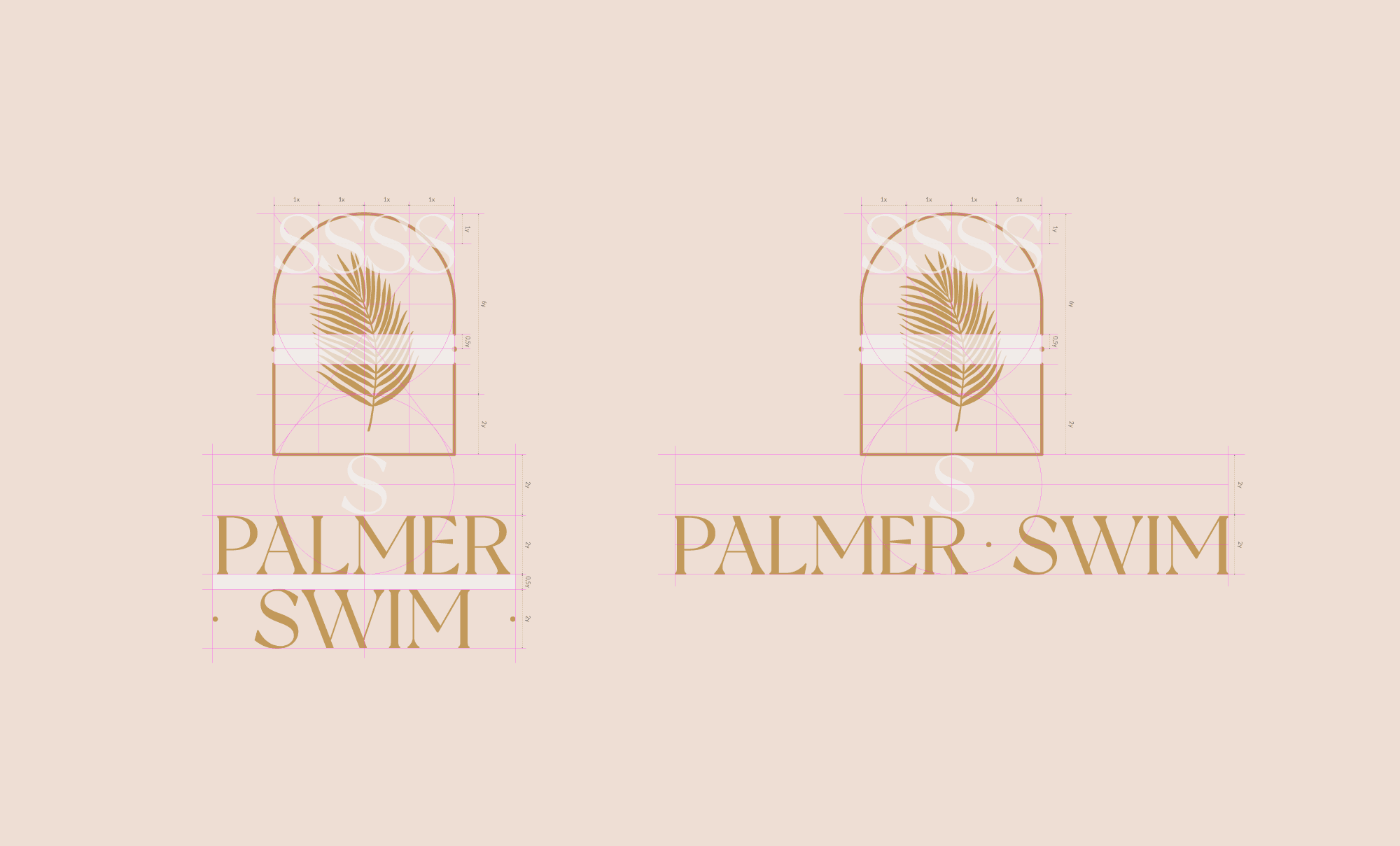
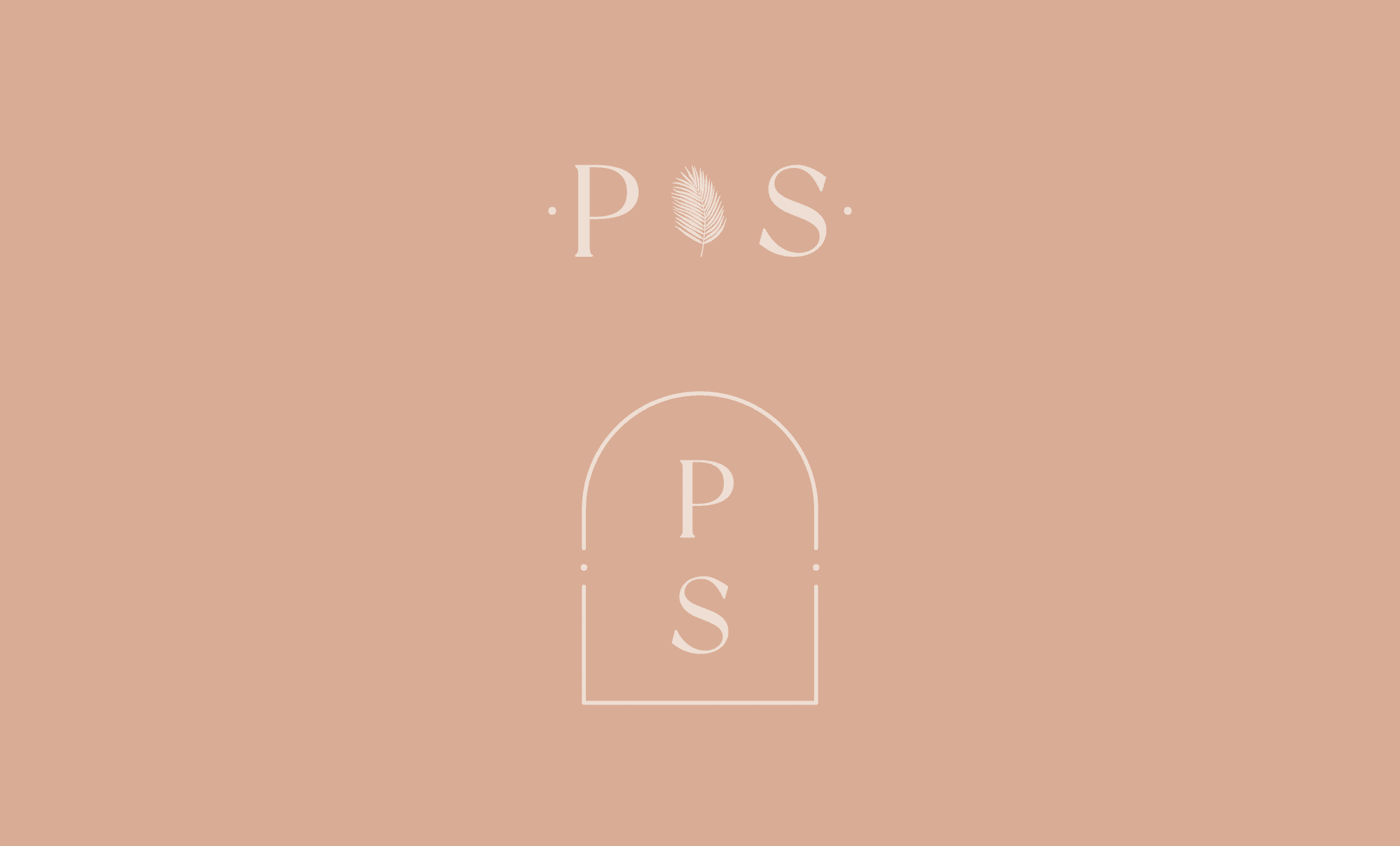
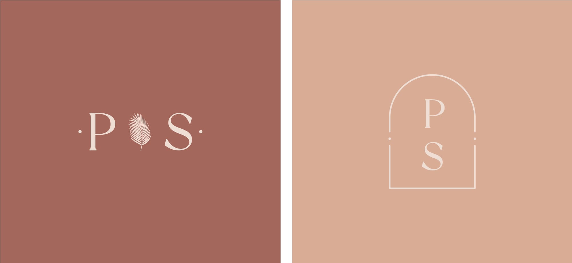
The system has a primary logo, a vertical logo, variations and P·S secondary logos, so the brand stays consistent at any size and on every touchpoint.
The palm-and-arch logo comes as a primary logo, a vertical logo and horizontal variations, with P·S secondary logos for small spaces.
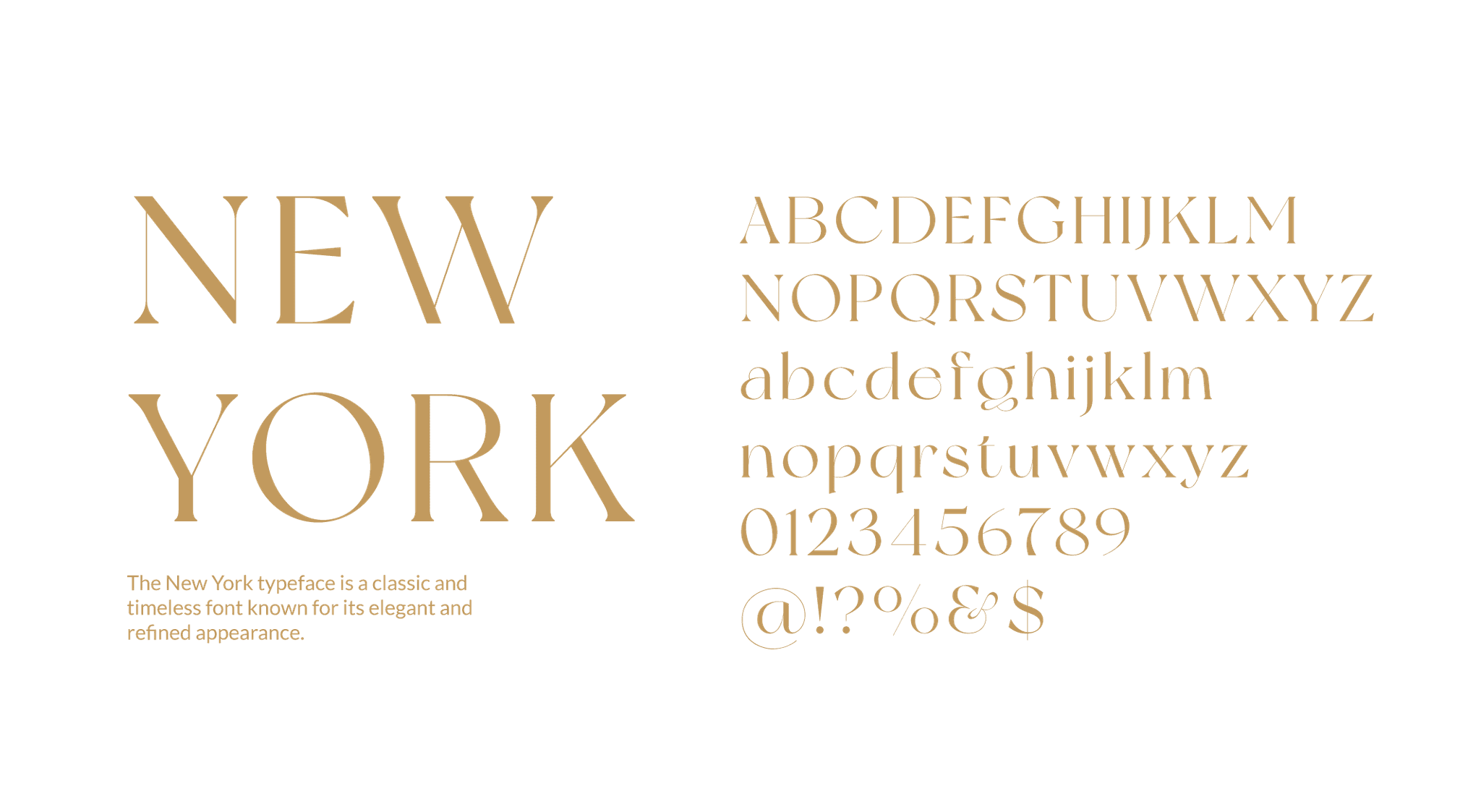
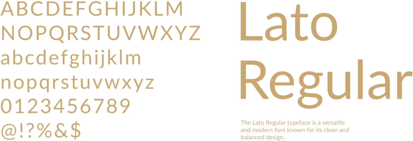
New York, a classic display serif, gives the brand its elegance. Lato keeps the supporting text simple and easy to read, from swing tags to the website.

2024–now · United Kingdom
Senior Designer / Art Director
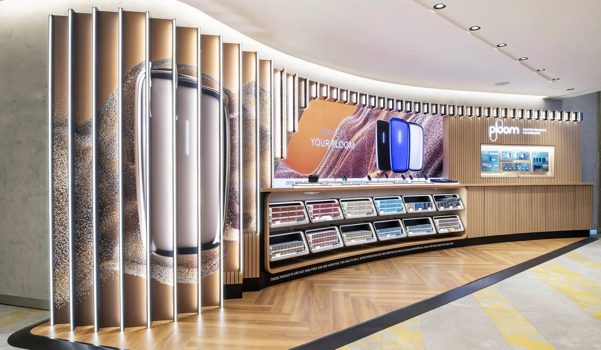
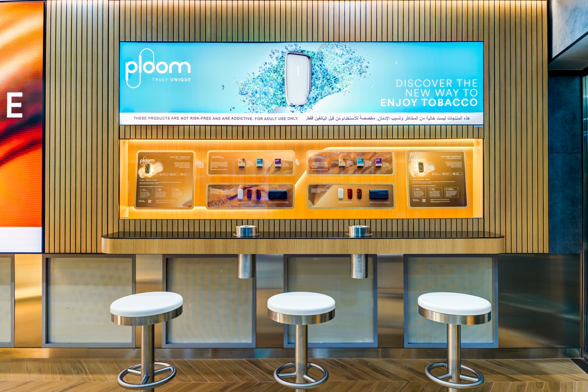
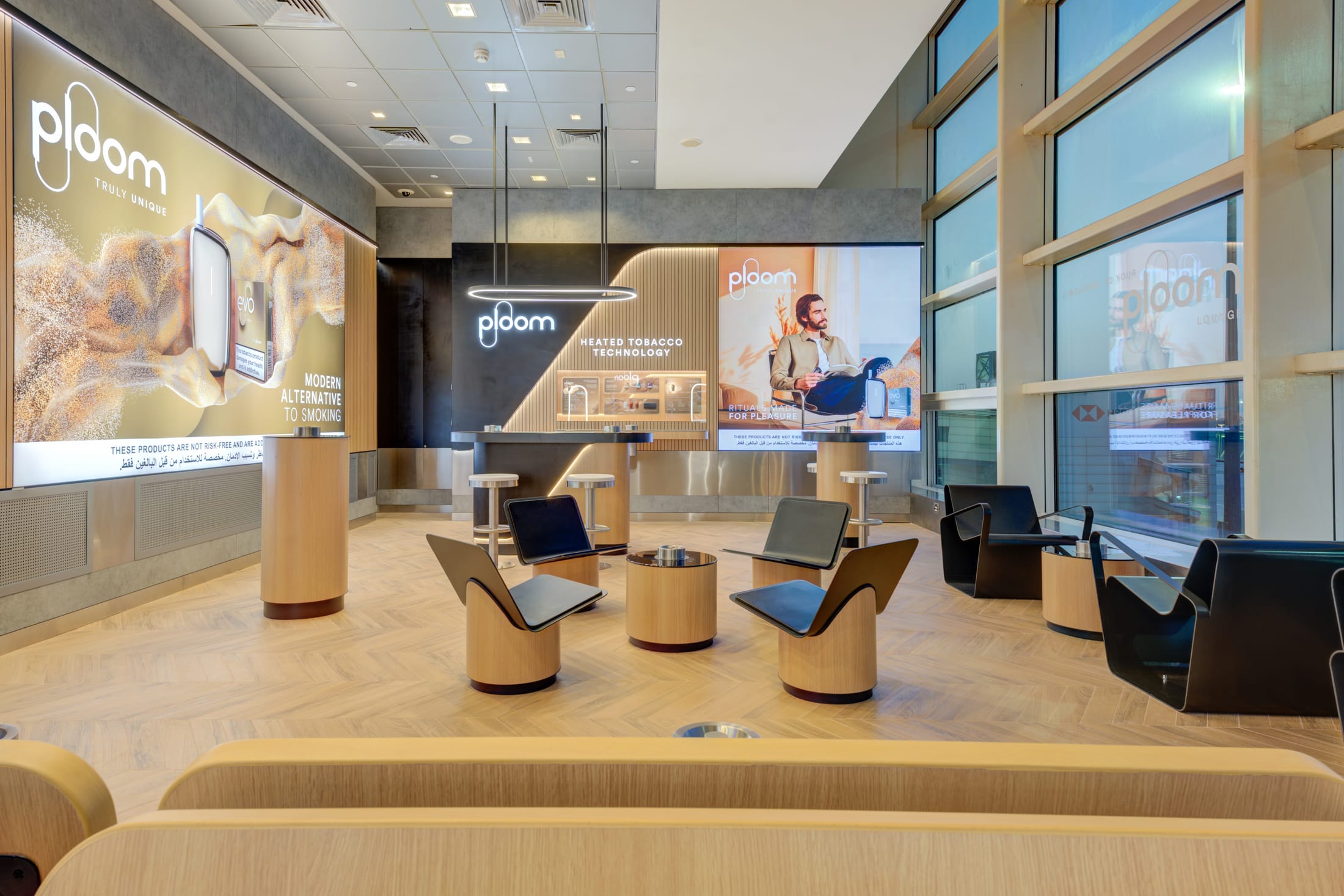
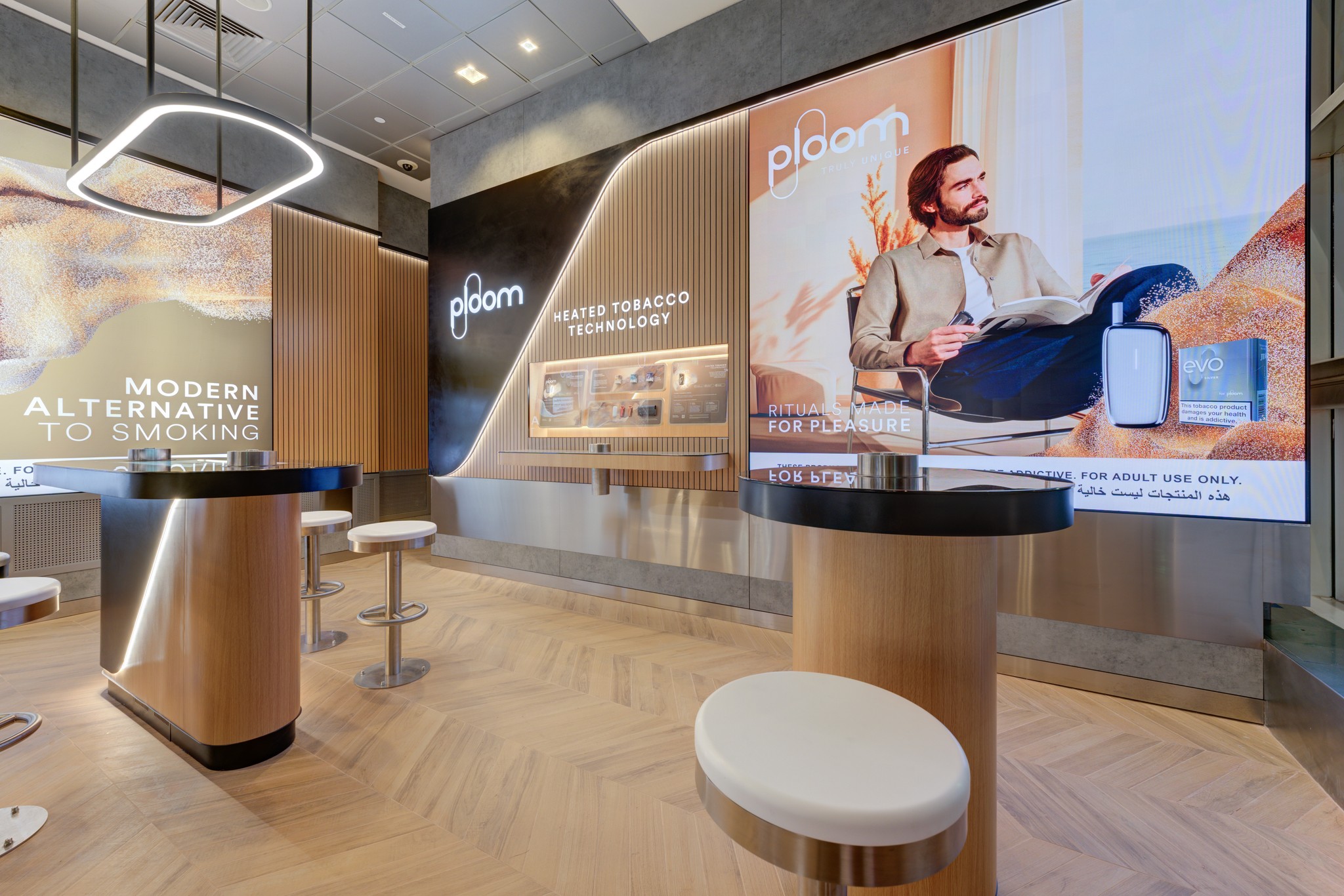
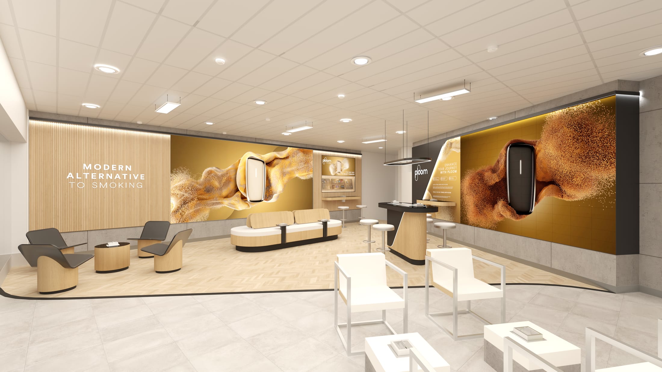
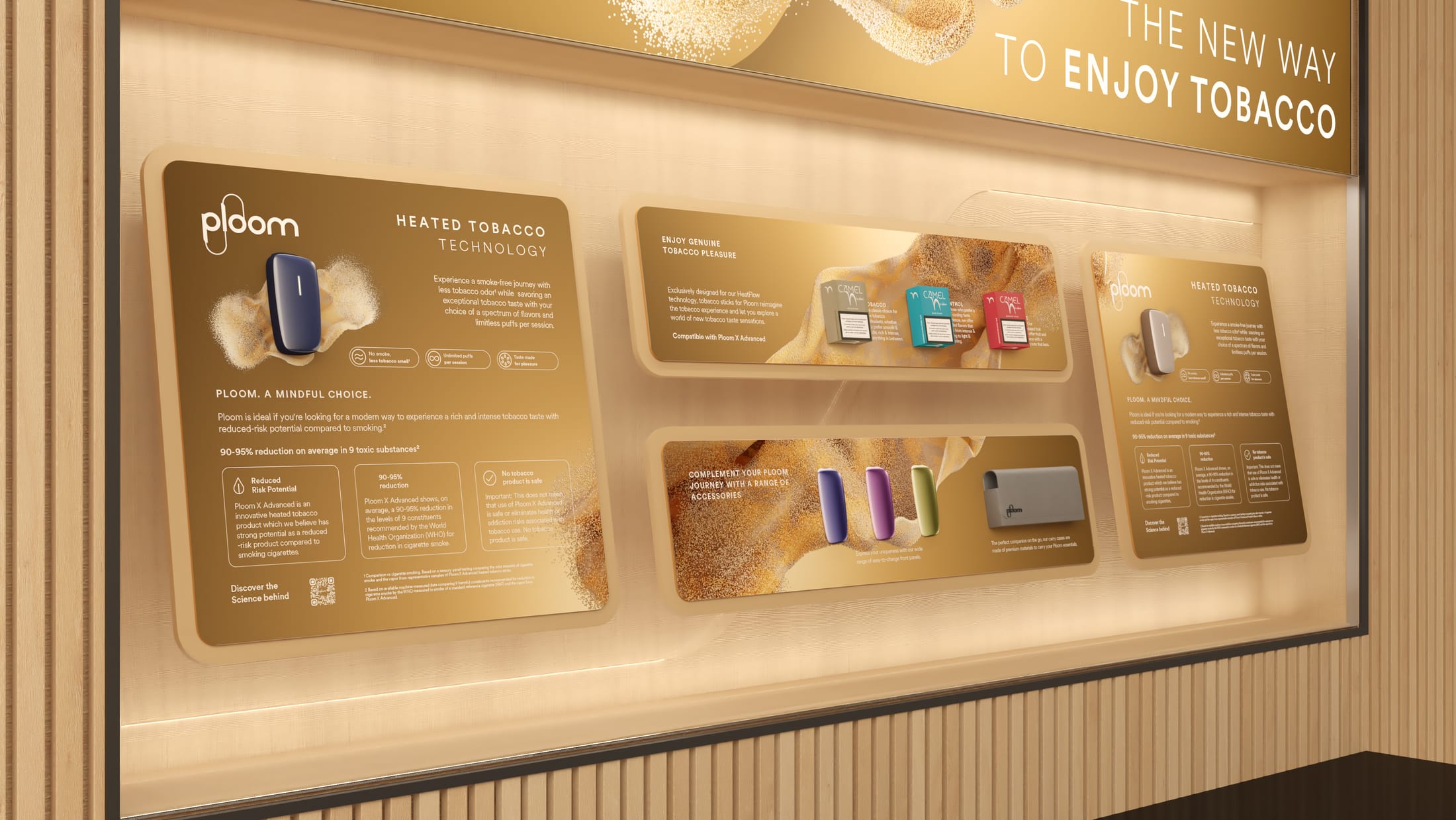
I art direct and design graphics and sensory displays for travel retail.
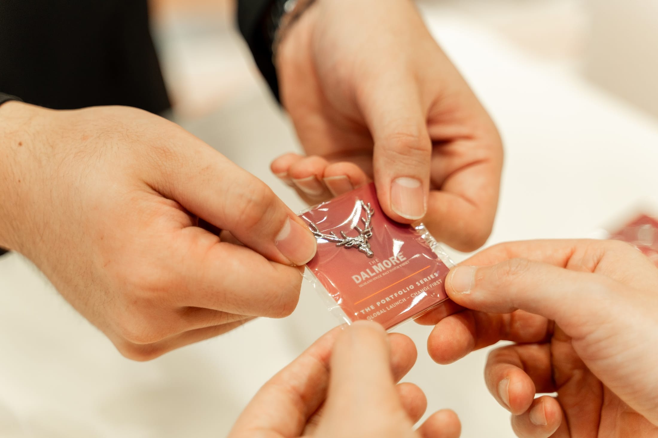
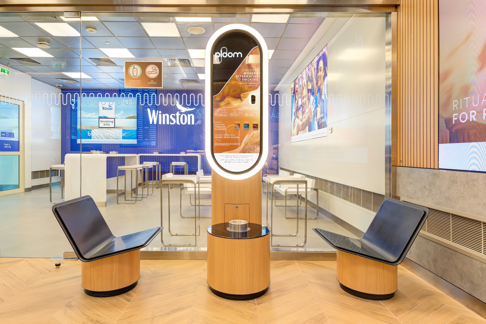
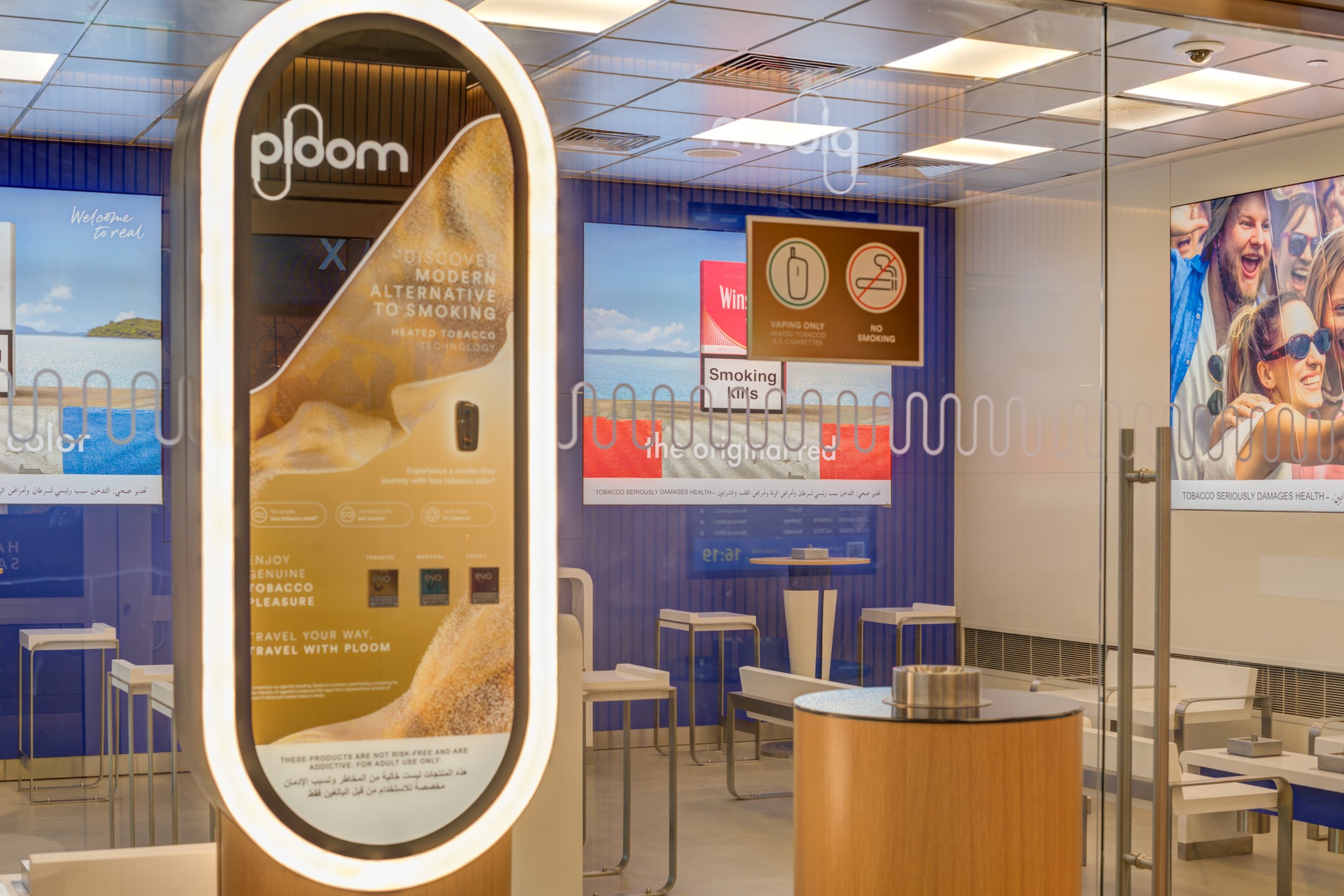
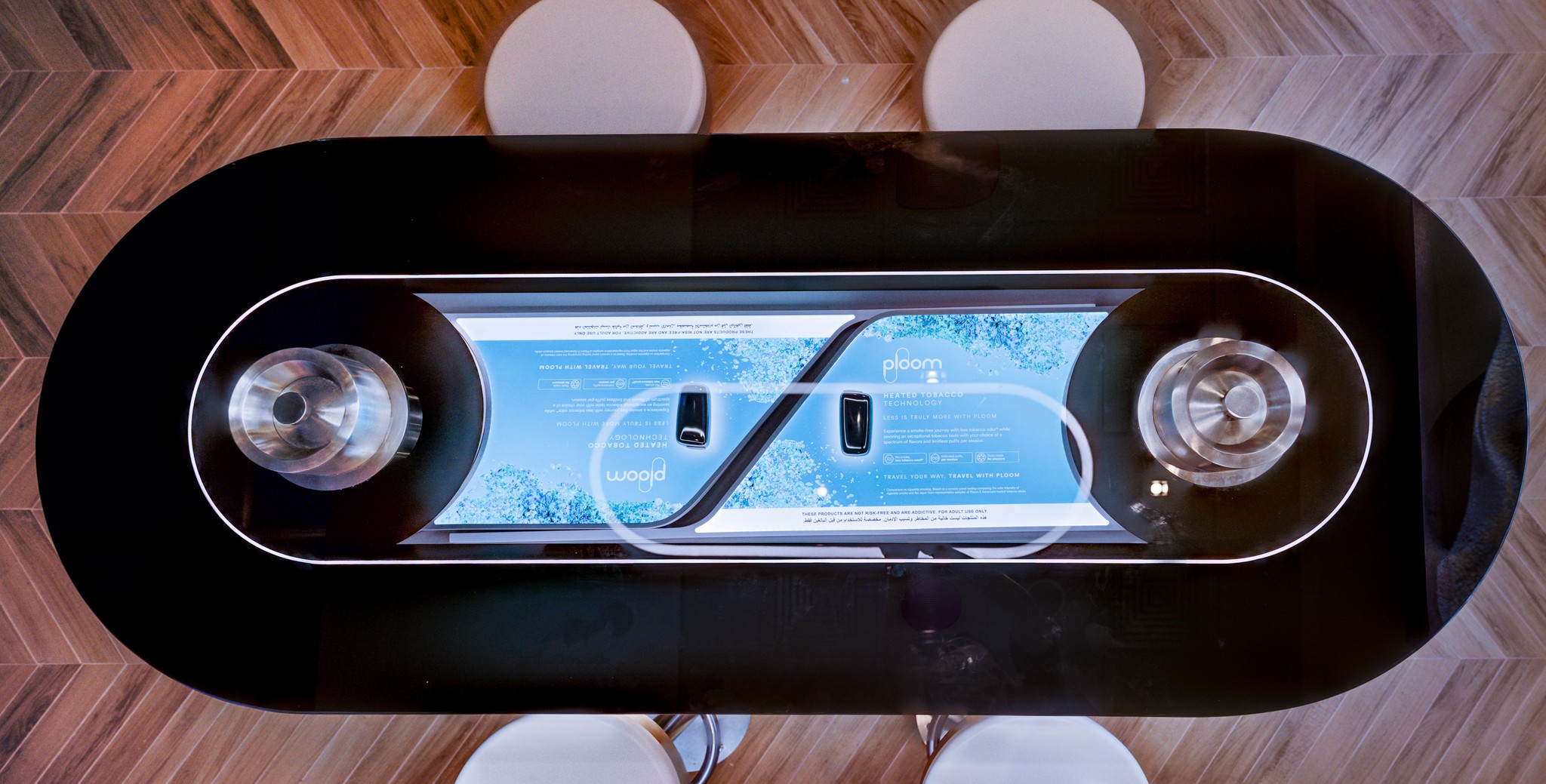
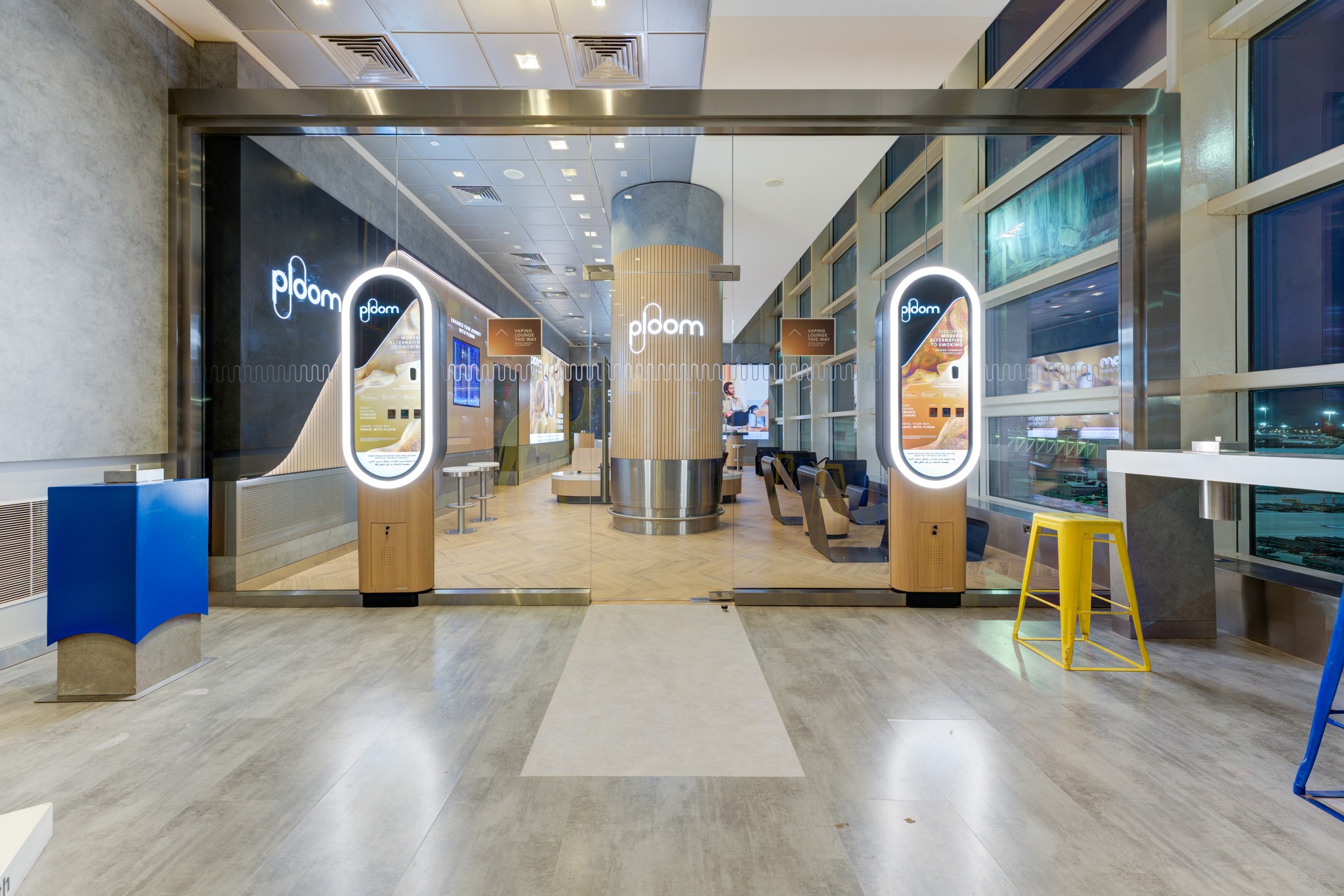
Recent work includes Ploom at TFWA 2026, the Ploom Teal Electric Pop launch, The Dalmore’s Cask Curation window, and Ploom’s airport lounges in Dubai and Zurich. I use AI tools for ideation and to visualise ideas early, before work goes into 3D and production.

2021–2023 · Norway
Designer
I designed packaging, product manuals, digital assets and marketing materials for the Norwegian EV charging brand, and built templates to keep global teams consistent.
In 2023, the Easee Front Cover packaging won the ScanStar packaging competition.
2018–2021 · Italy / Germany
Freelance Digital Designer
Working independently across Italy and Germany, I helped clients shape their visual identities and digital experiences.
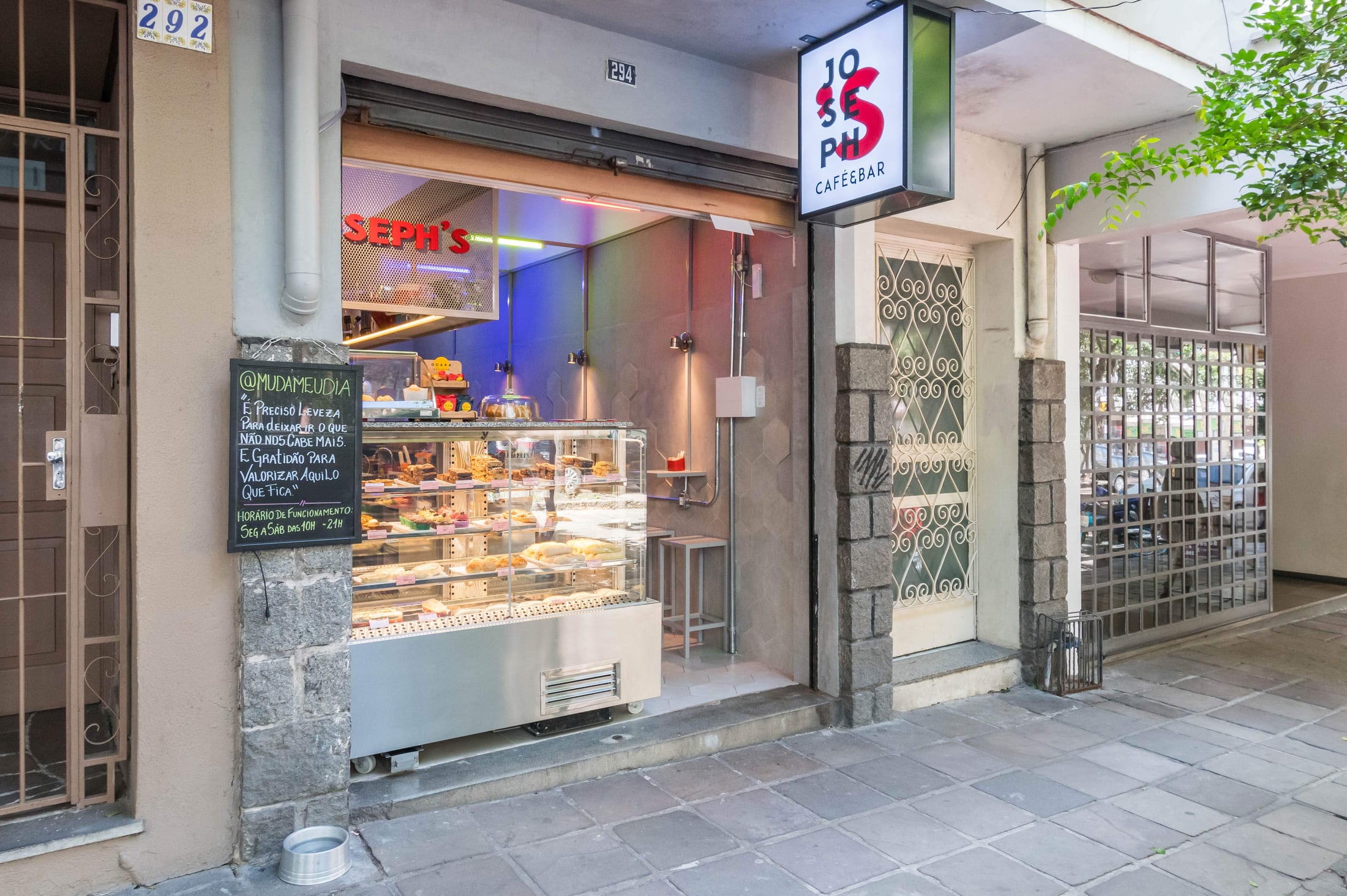
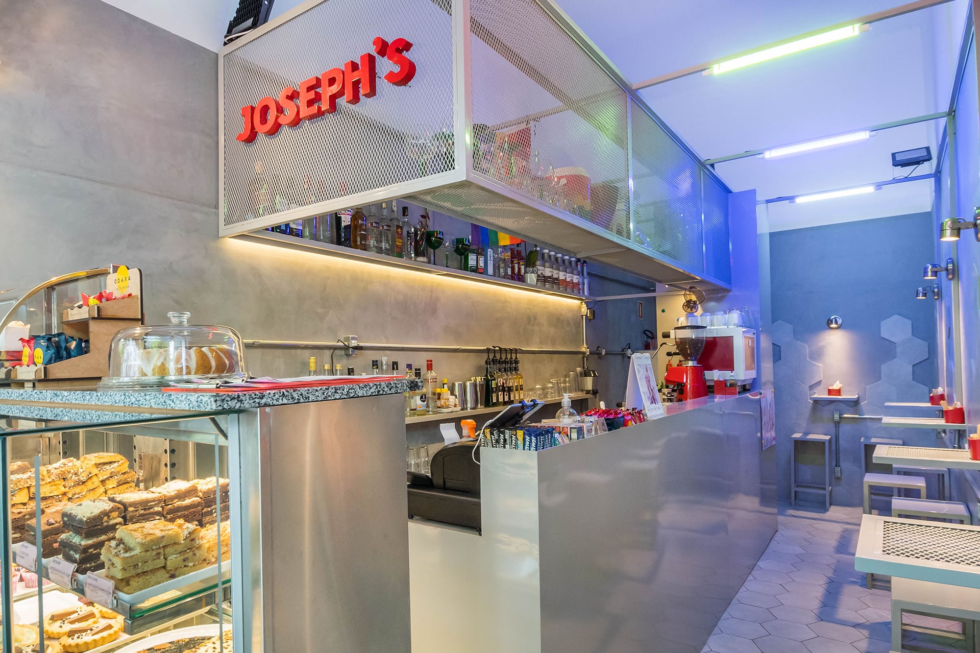
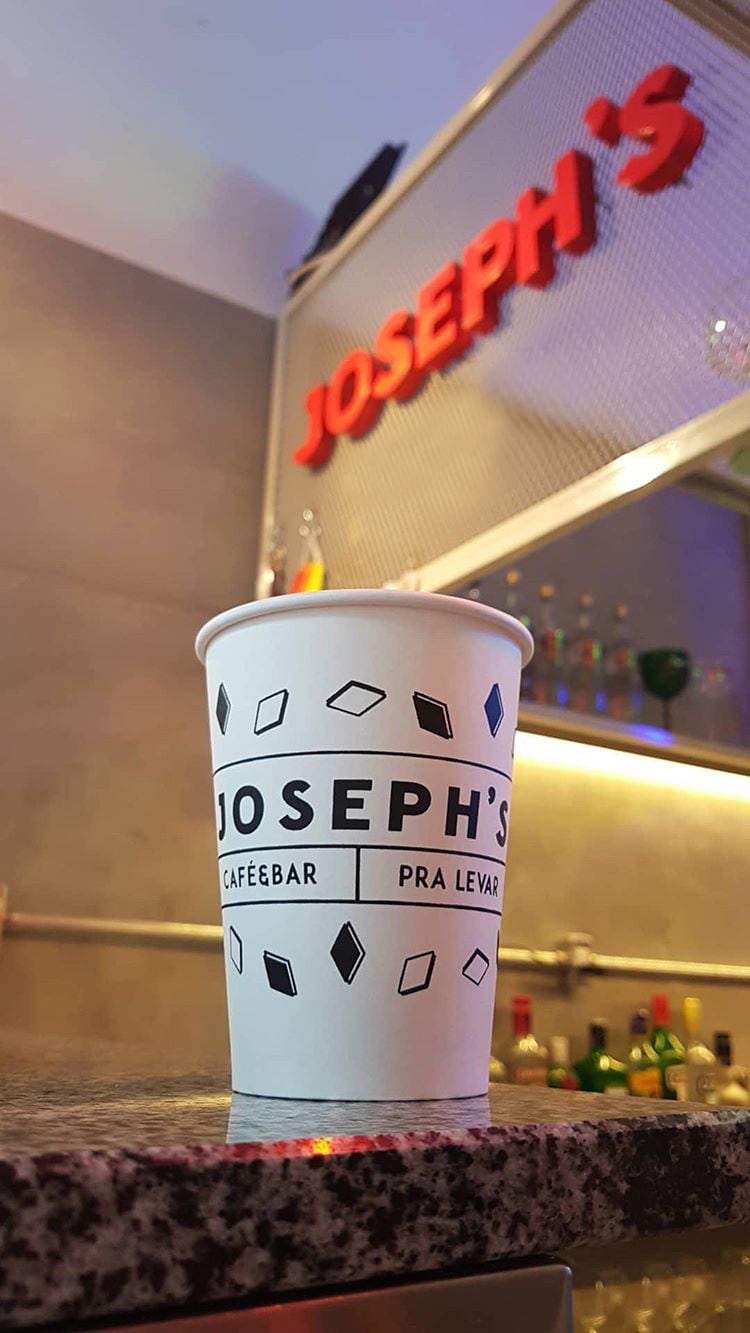
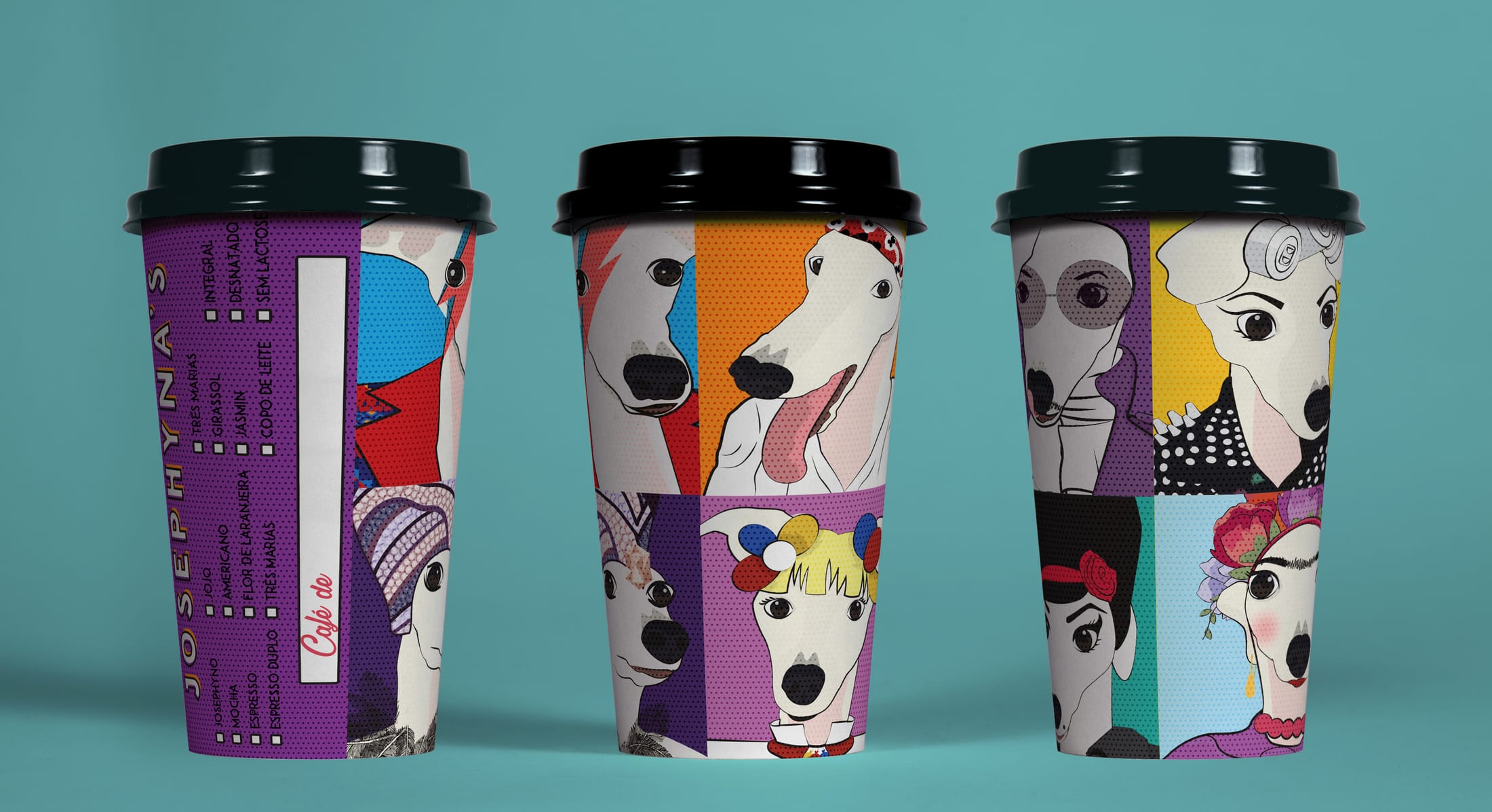
Projects included the identity for Joseph’s, a café and bar in Brazil, and Palmer Swim, an identity for a Toronto swimwear brand built around a palm leaf and an arch.
2016–2018 · Brazil
Co-founder & Designer
I co-founded Mirá Design with Gabriele Morgan Pereira in Brazil.
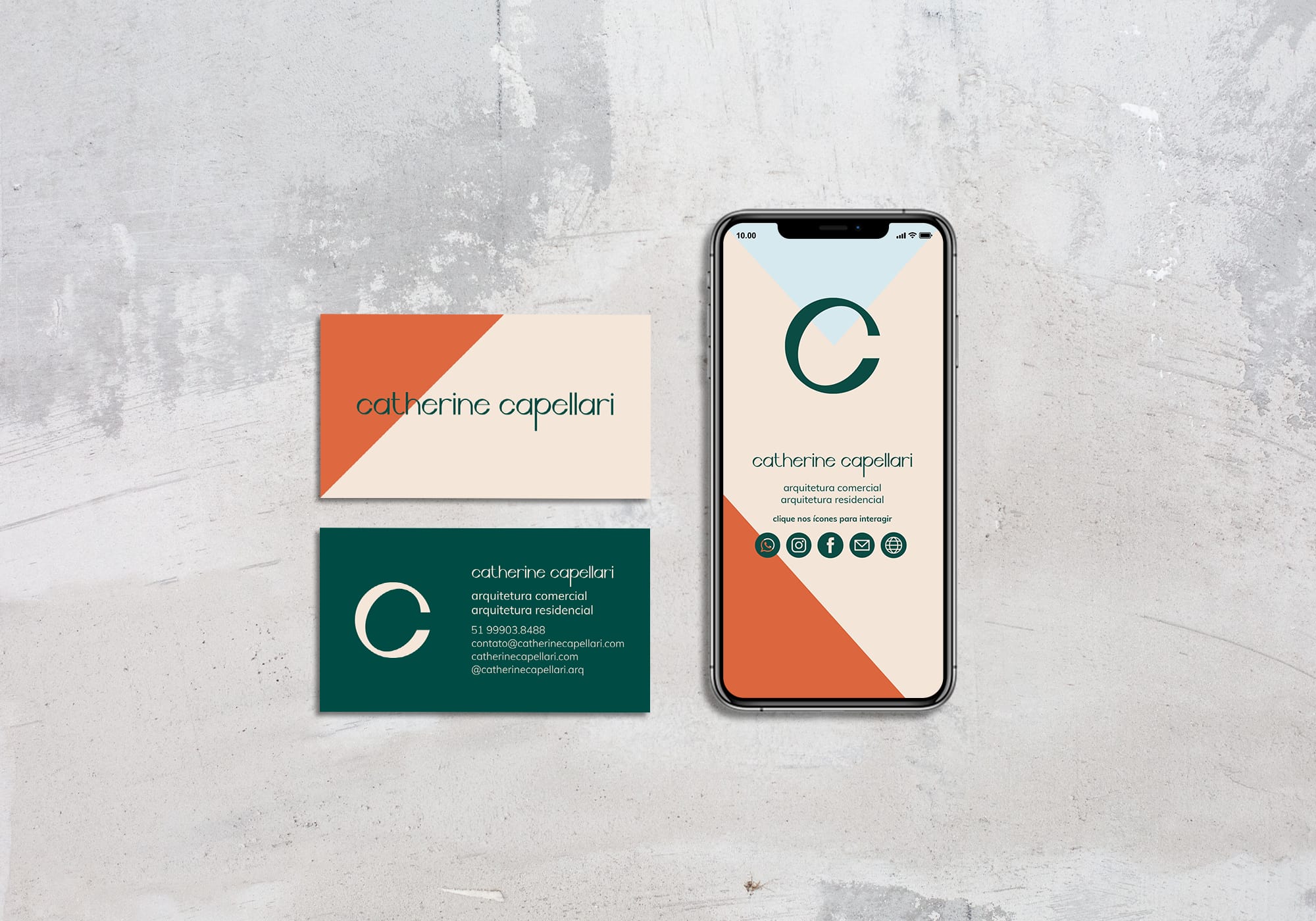
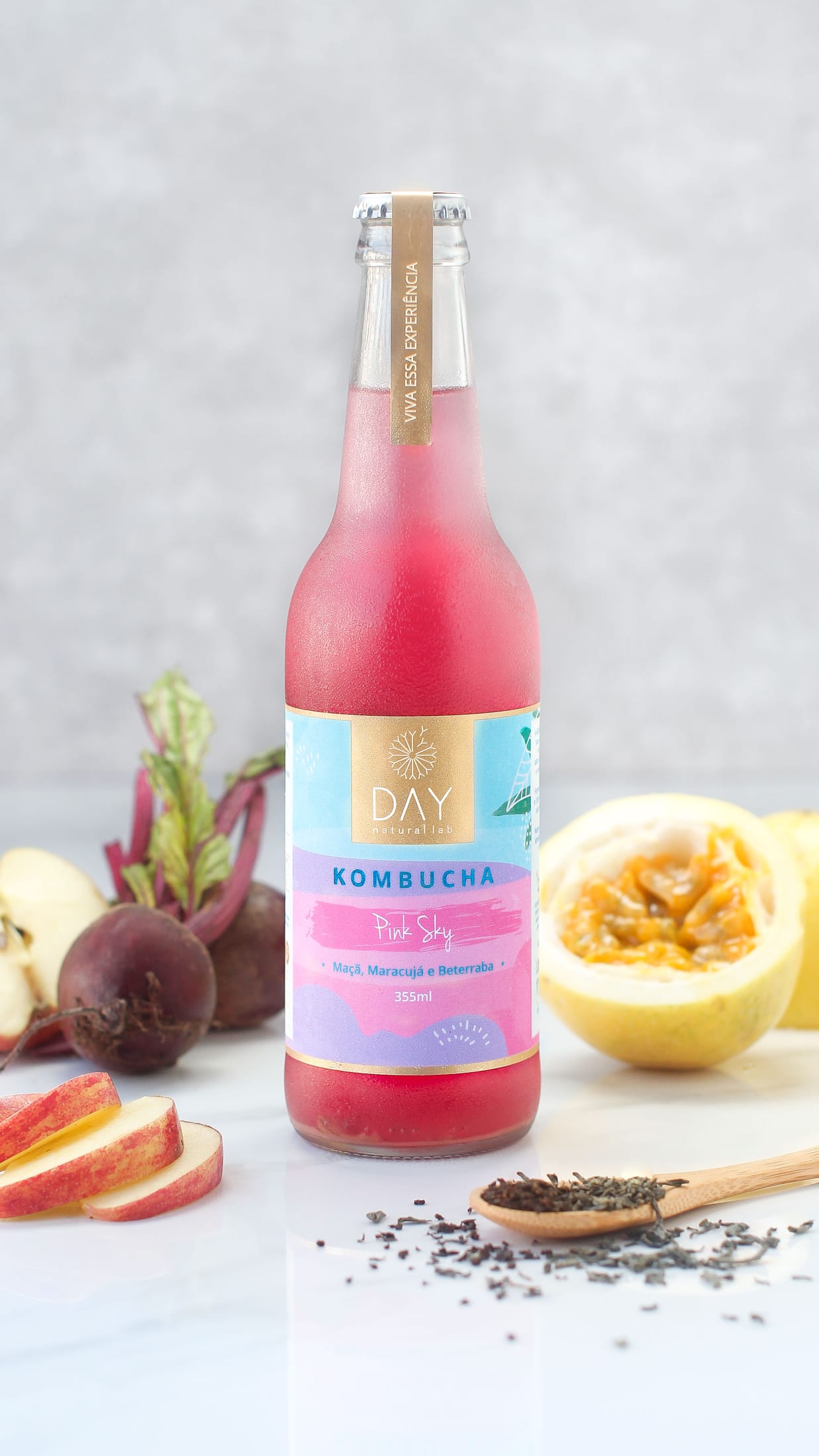
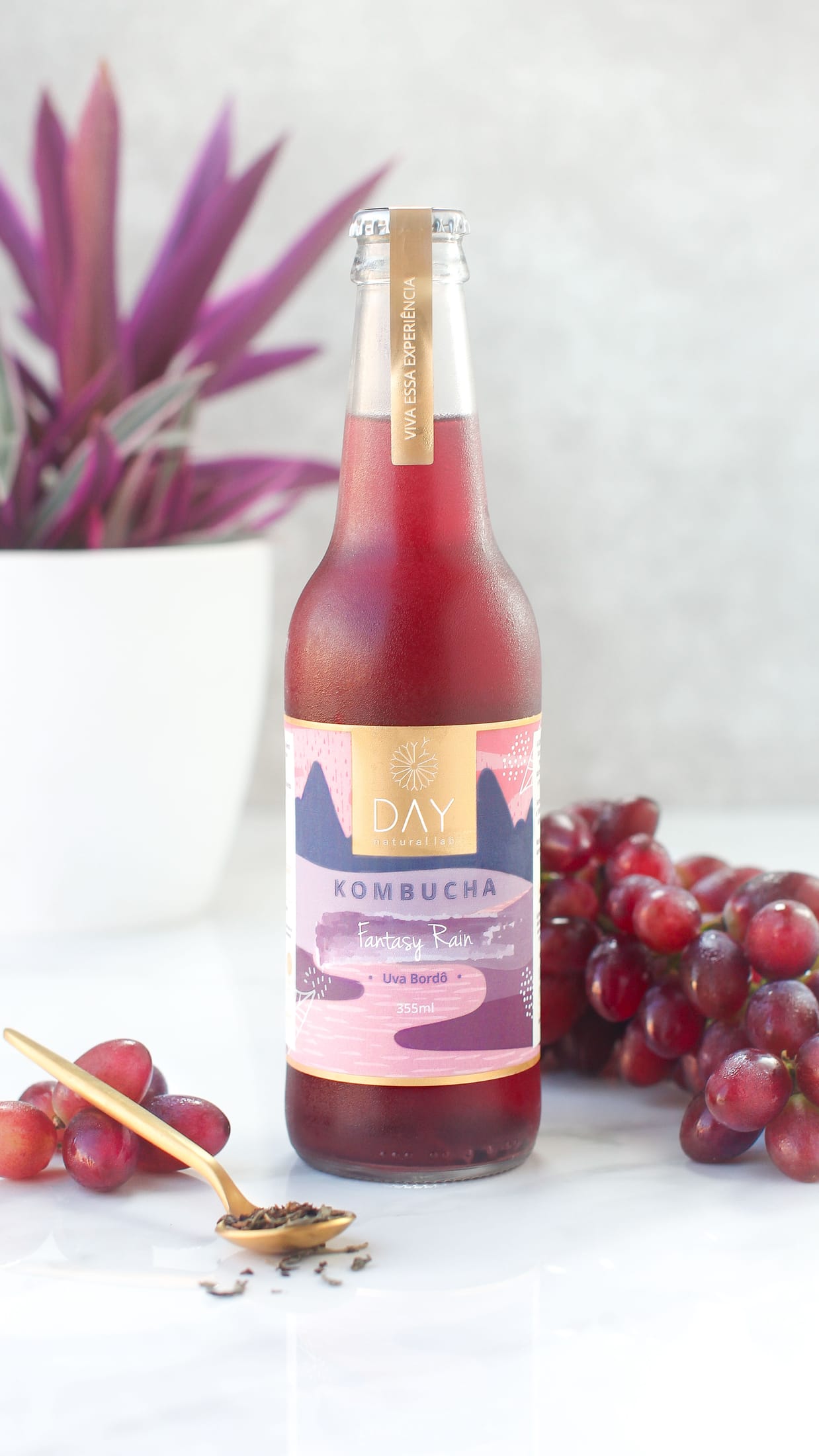
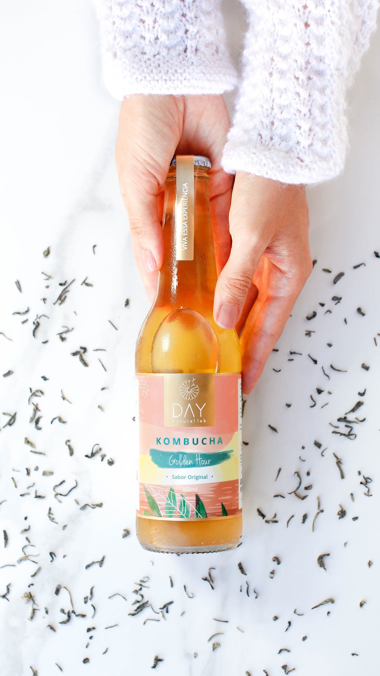
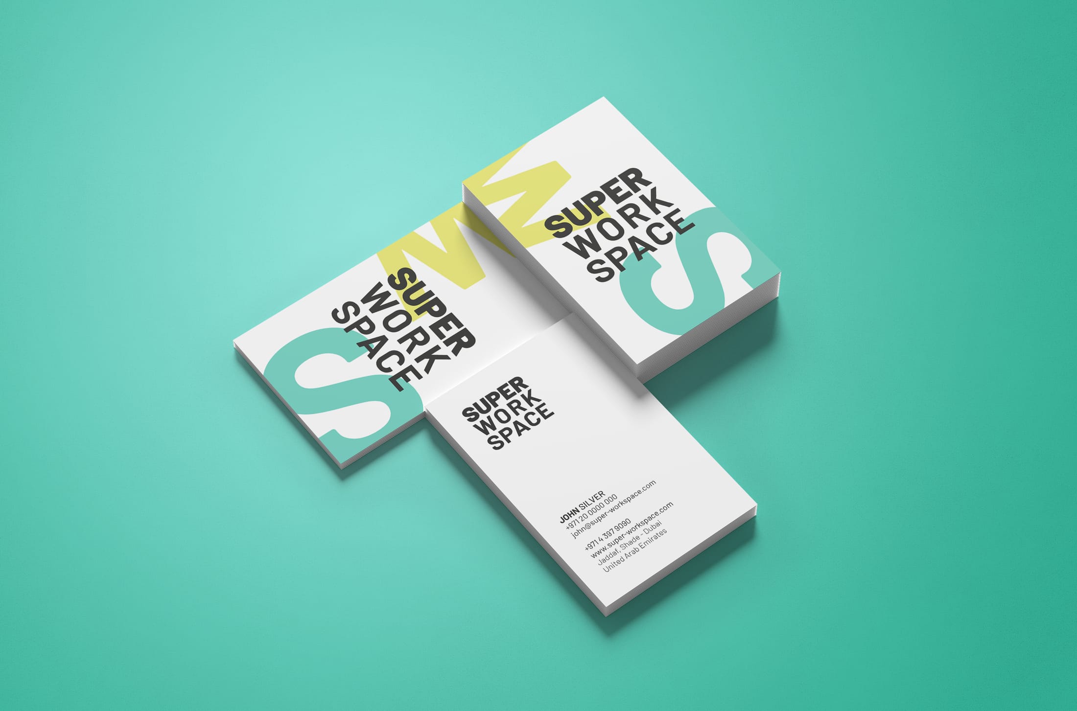
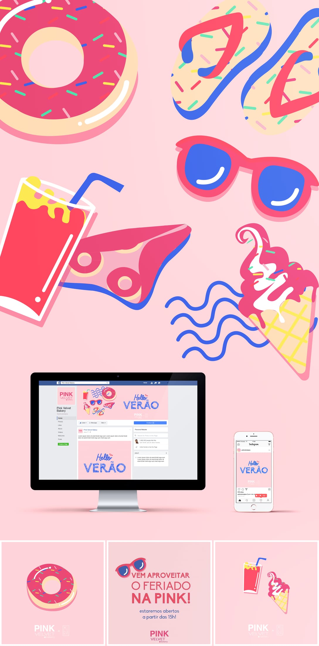
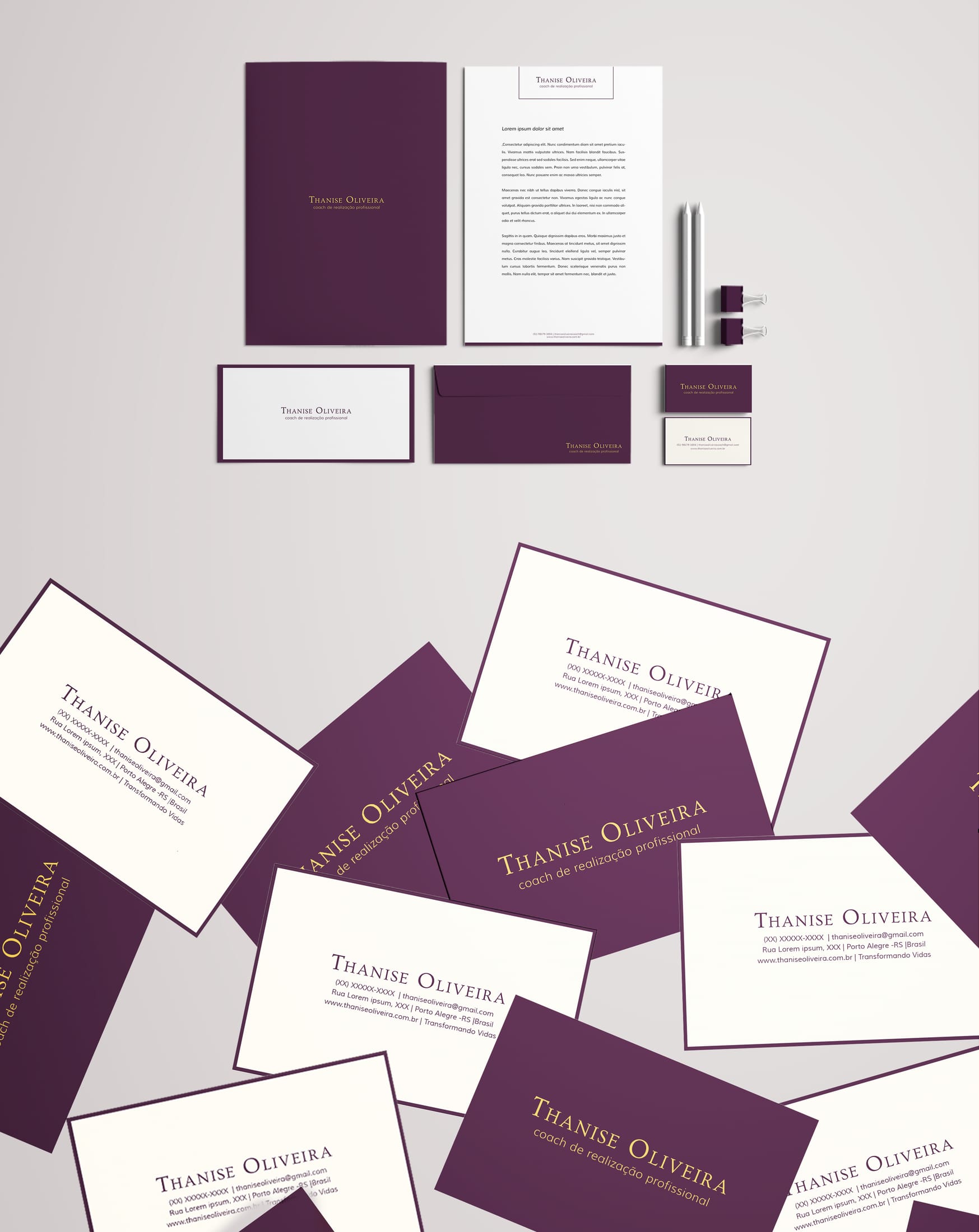
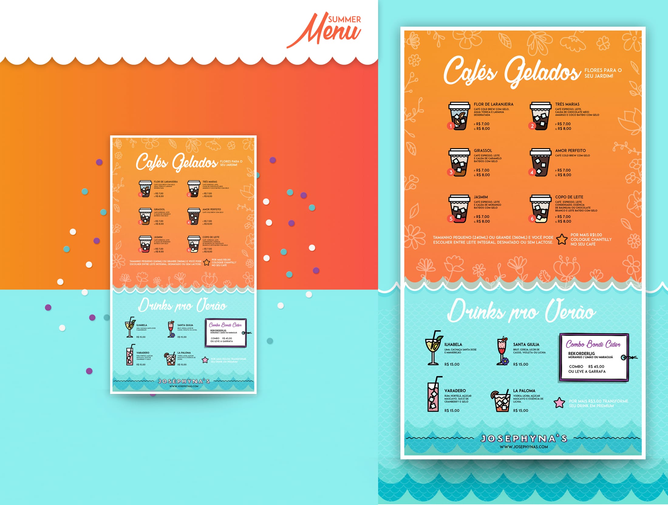
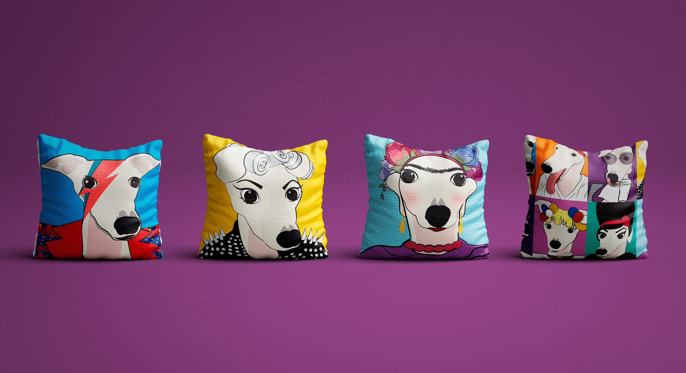
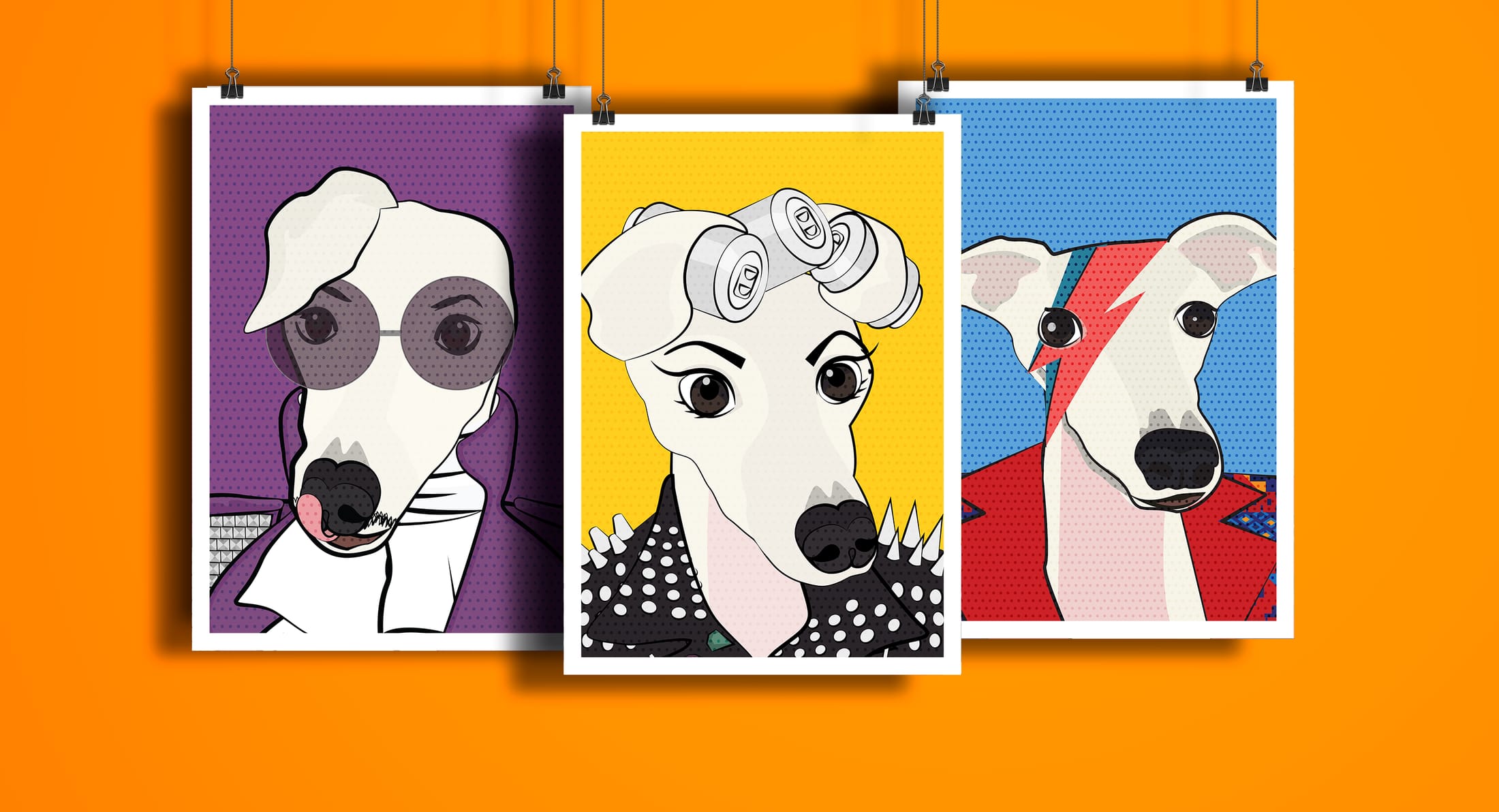
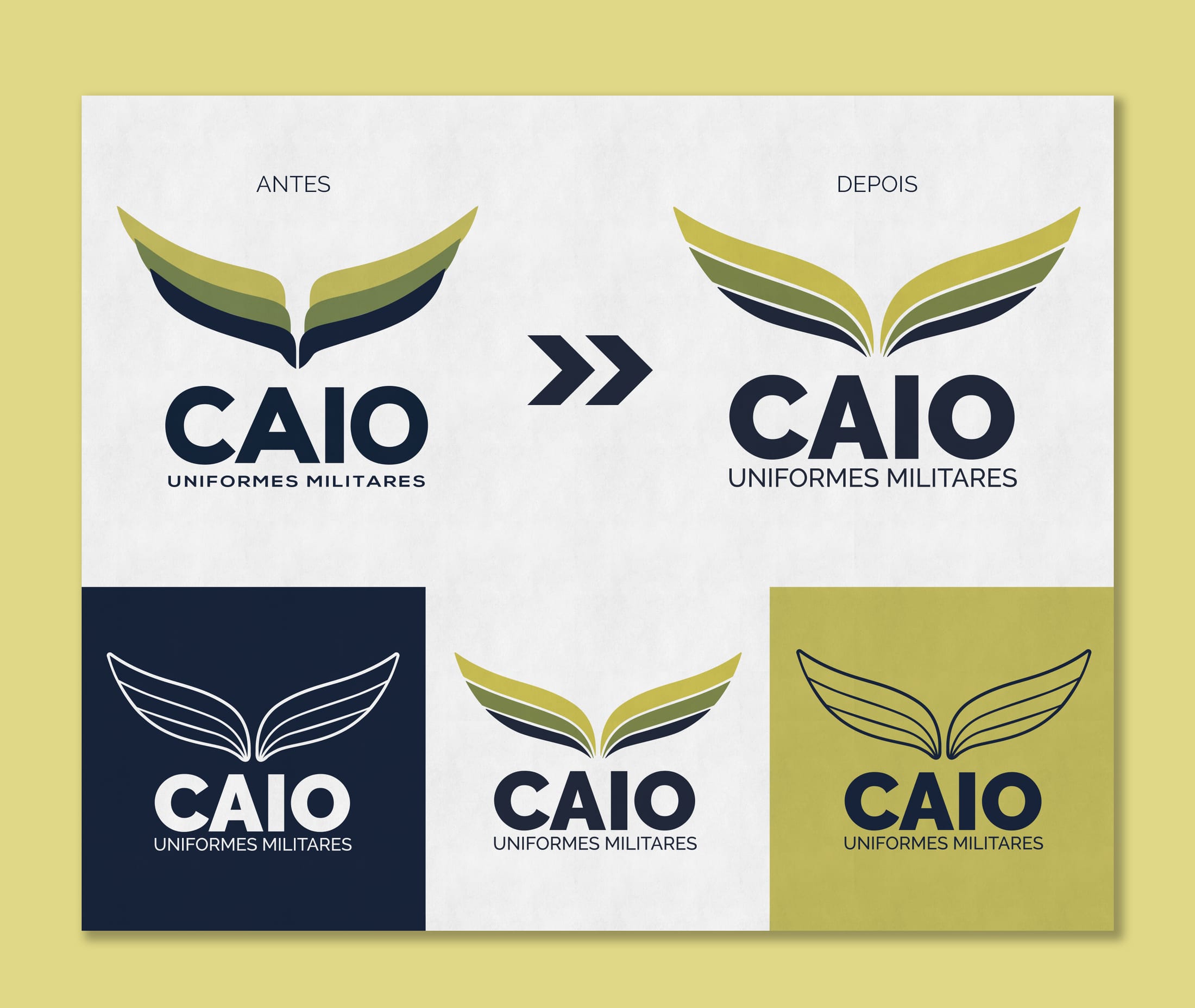
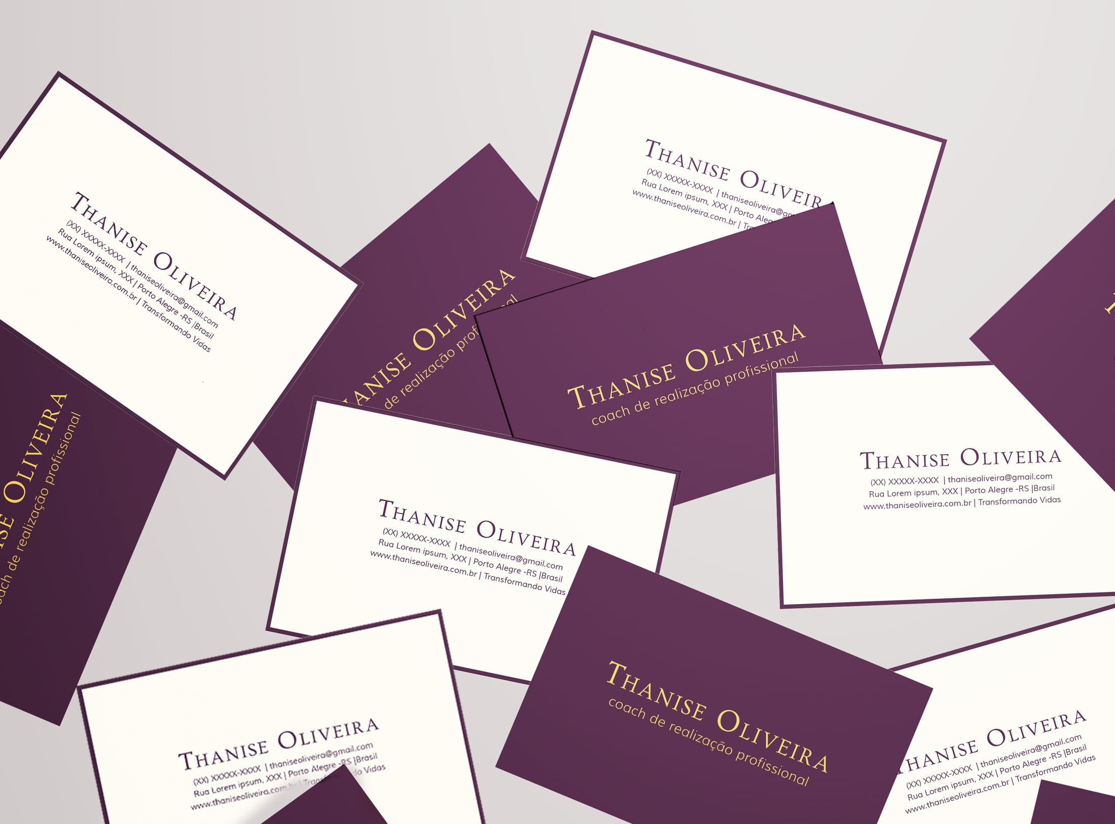
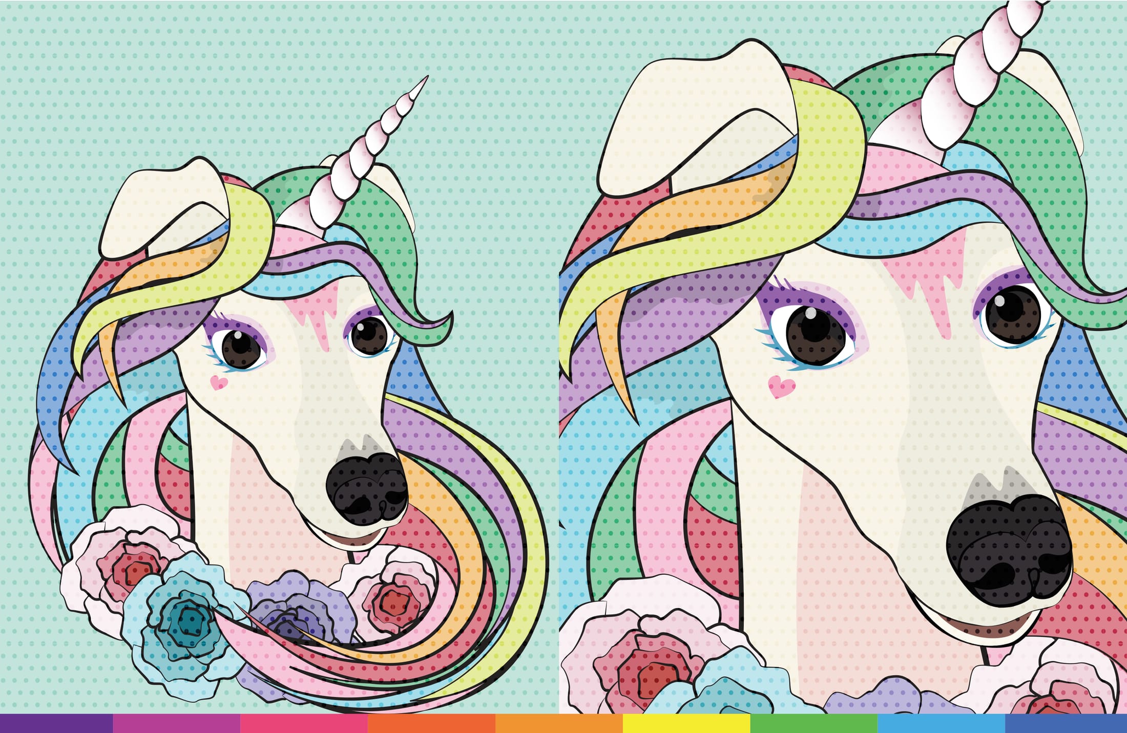
Together, we built a collaborative graphic design practice, creating identities, stationery and menus for clients such as Josephynas and Thanise.

2015–2016 · Brazil
Environmental Graphic Designer
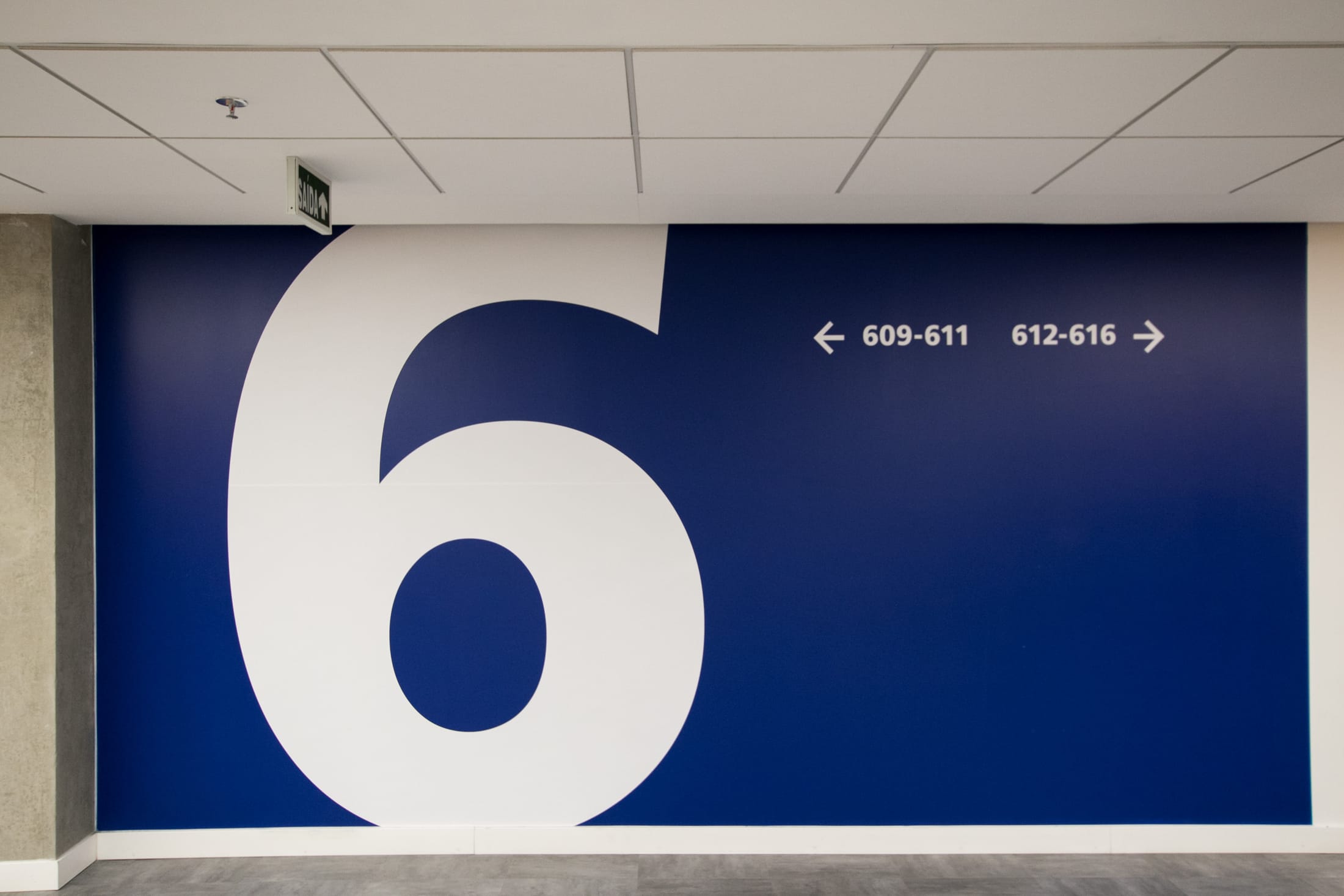
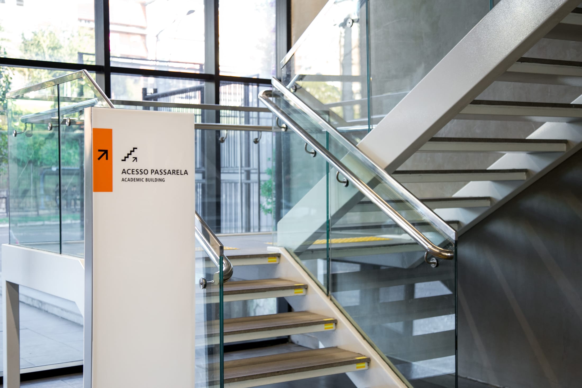
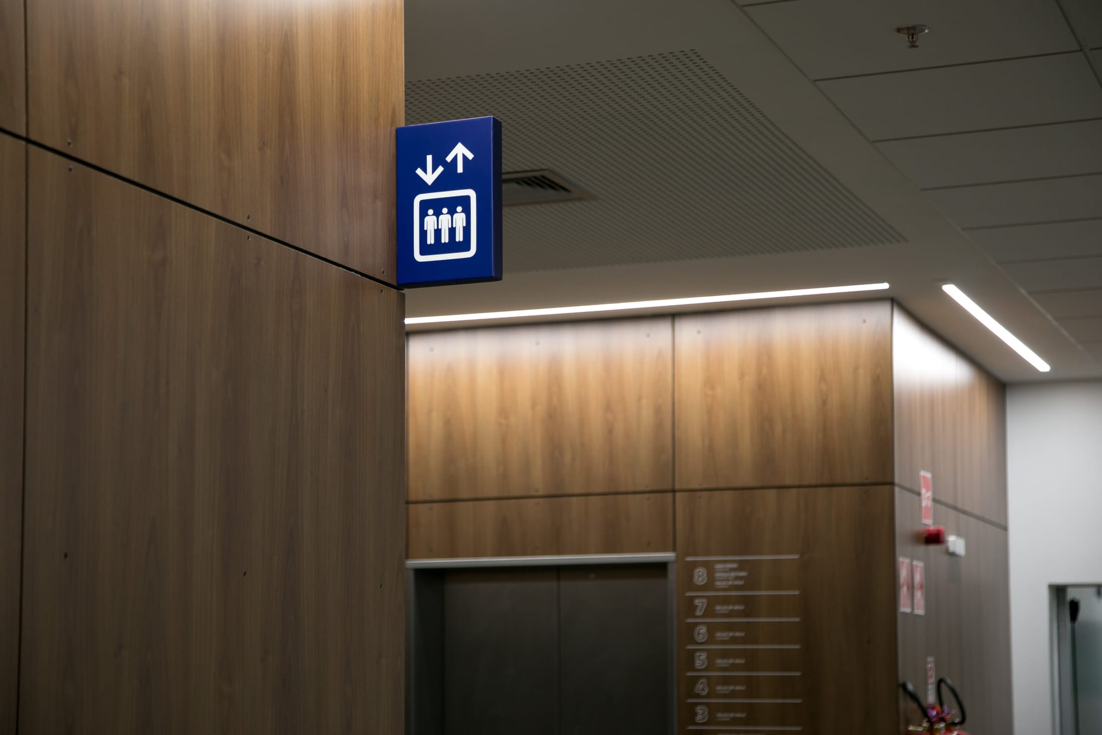
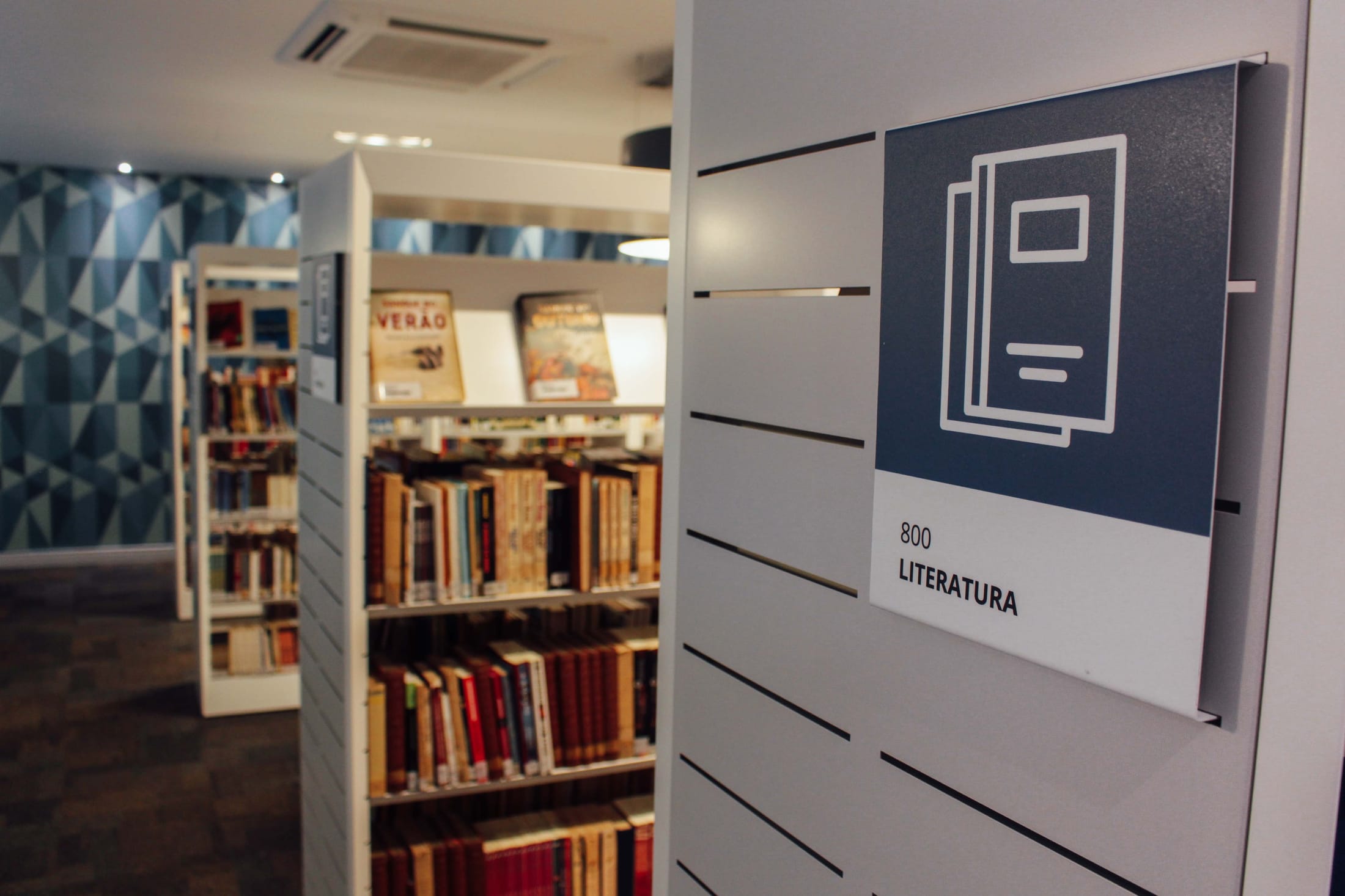
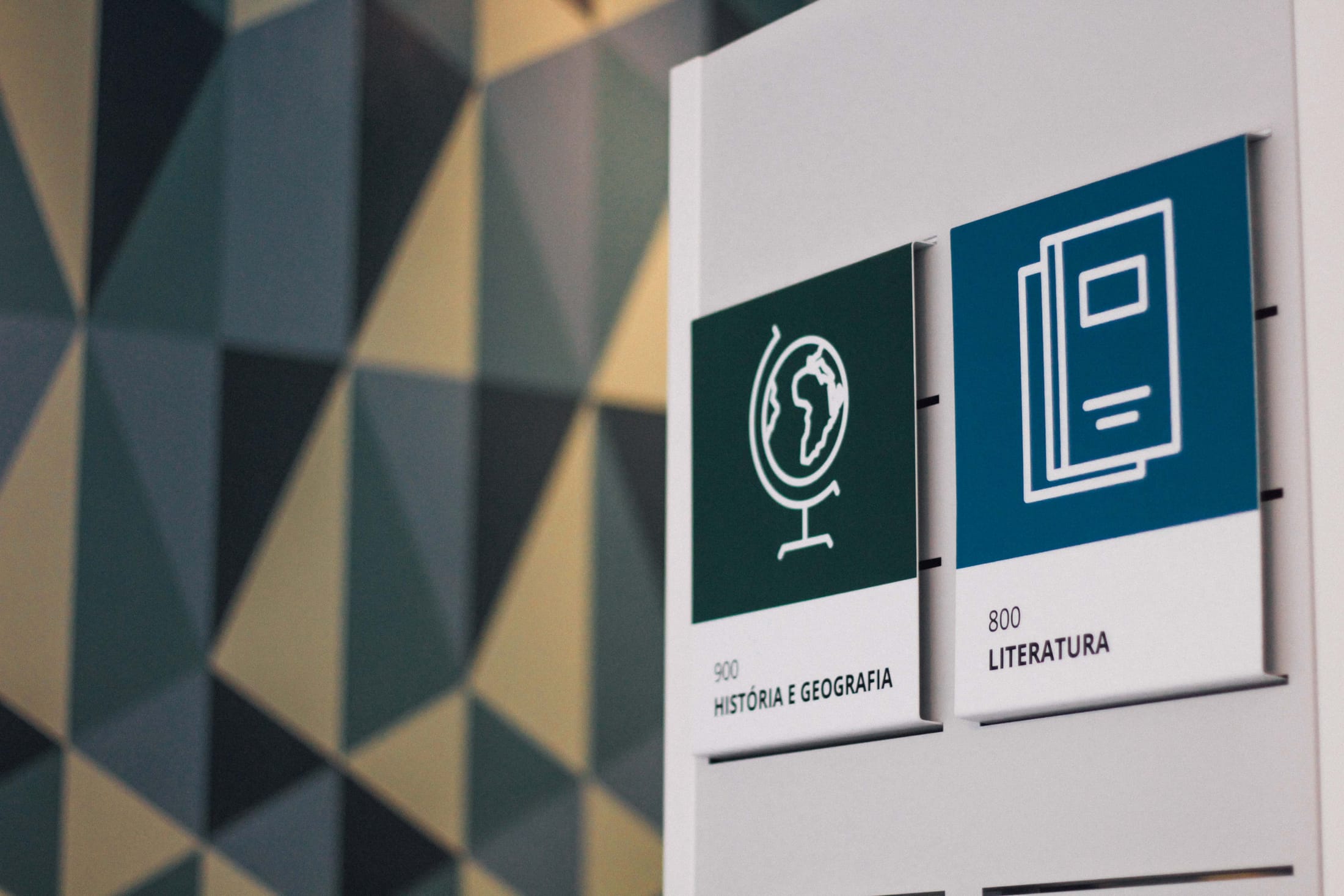
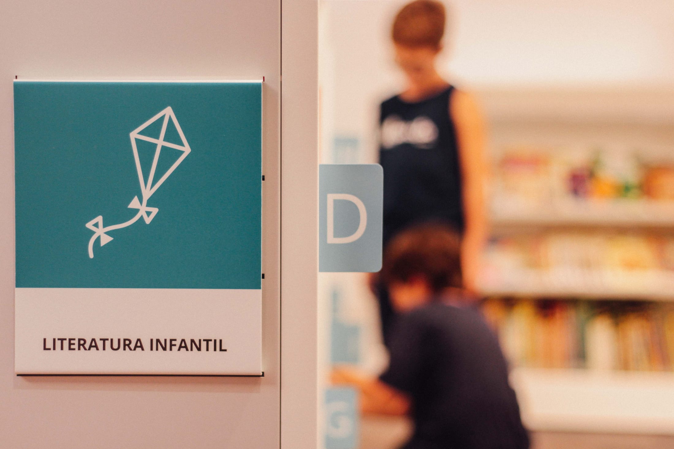
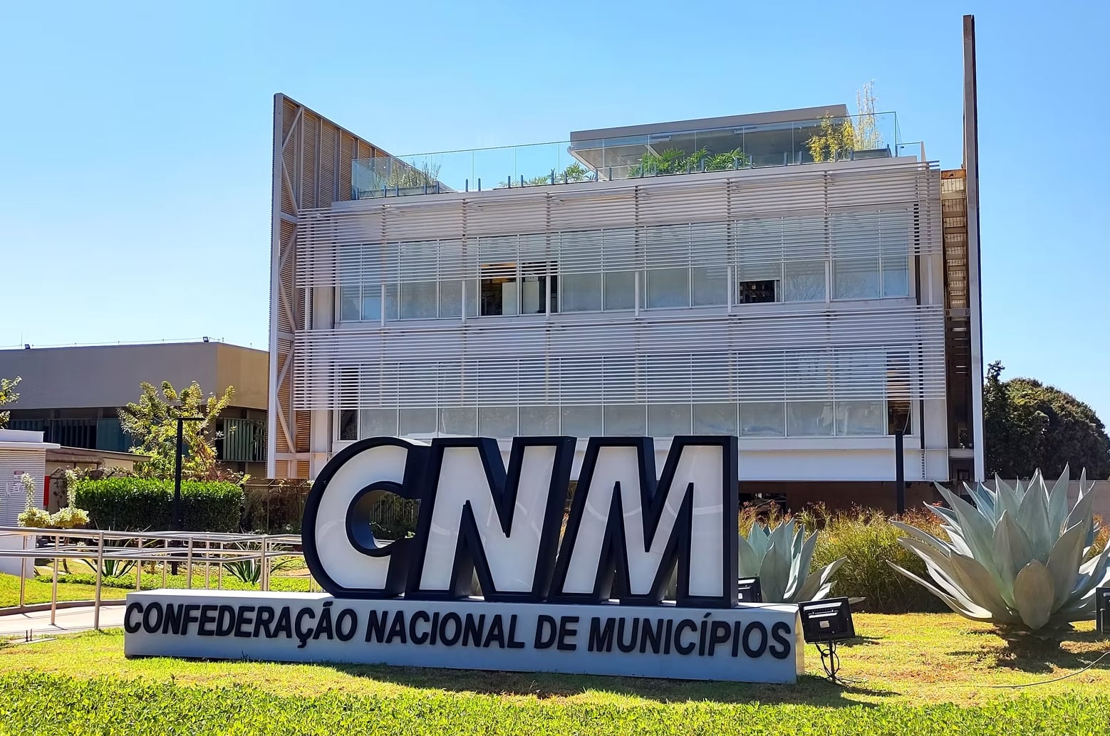
At Sceno, I worked in environmental graphic design, bringing visual identities into physical spaces.
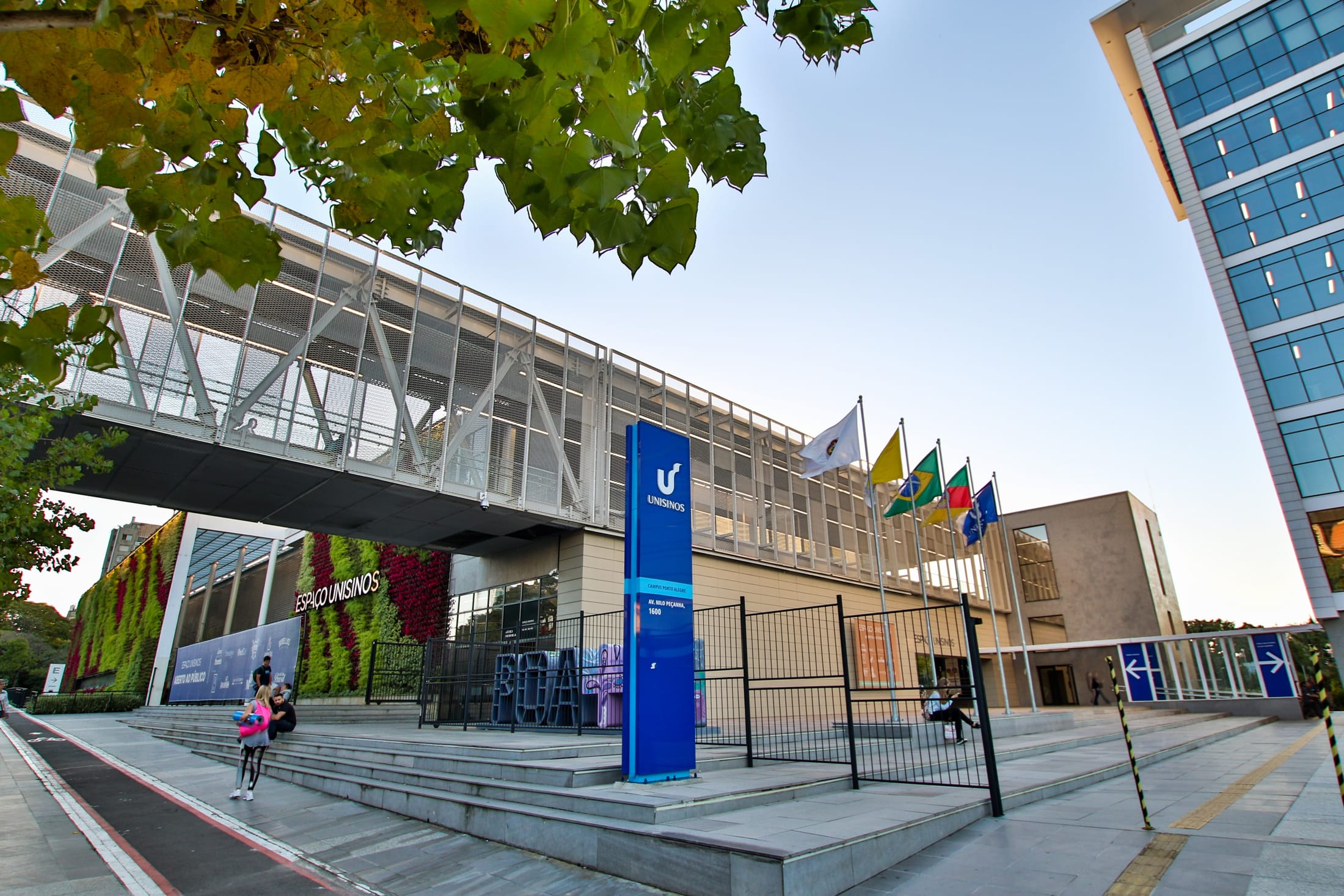
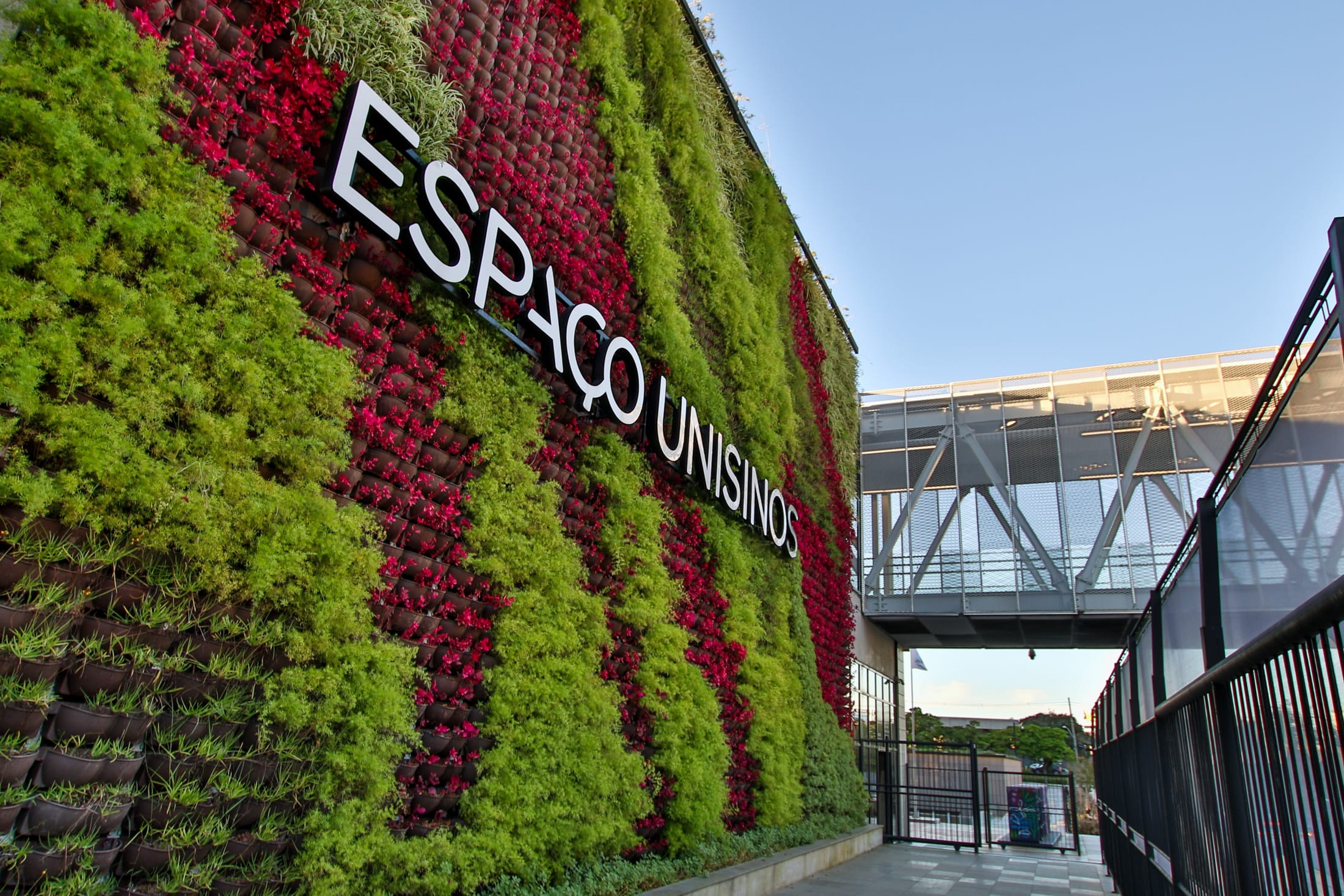
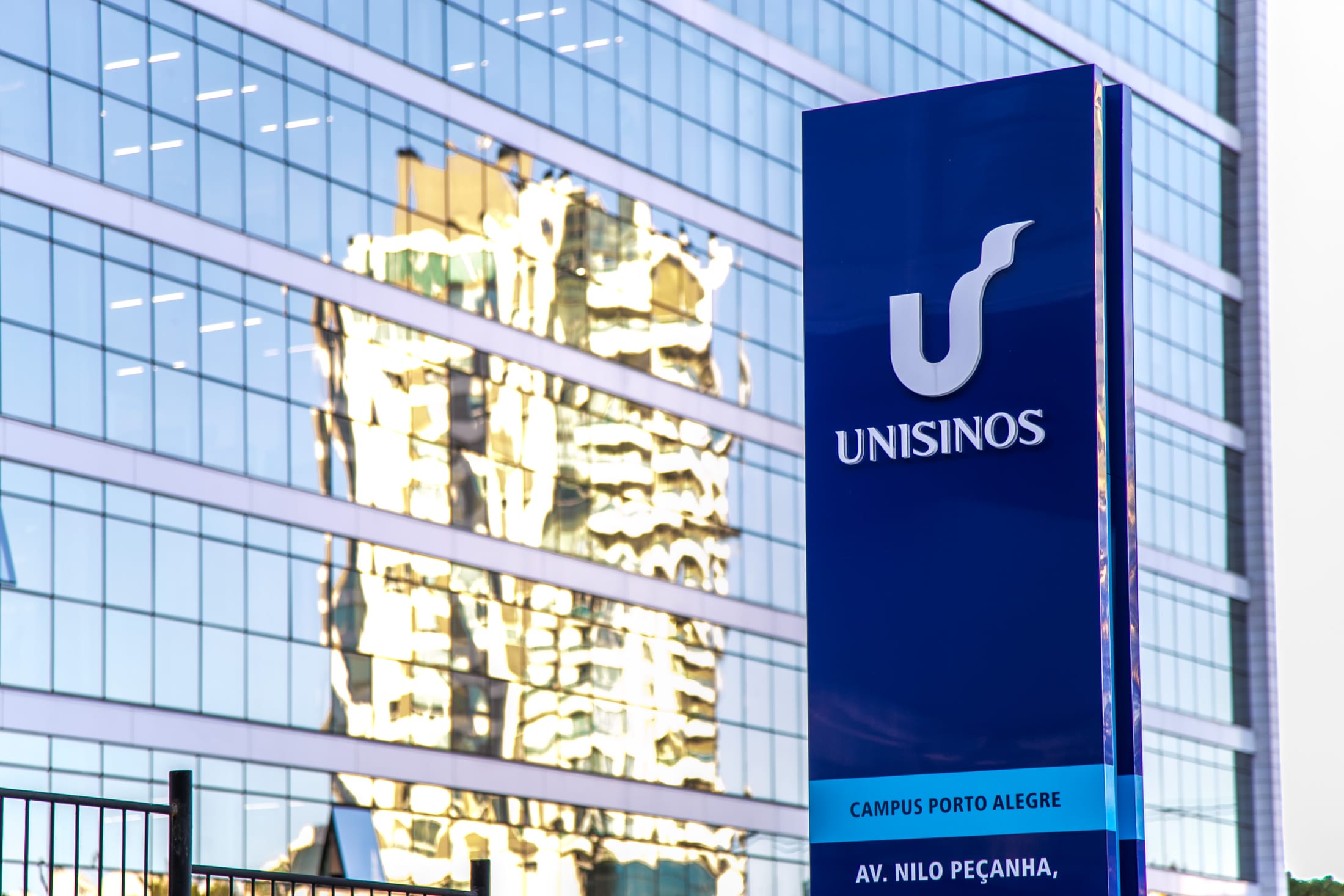
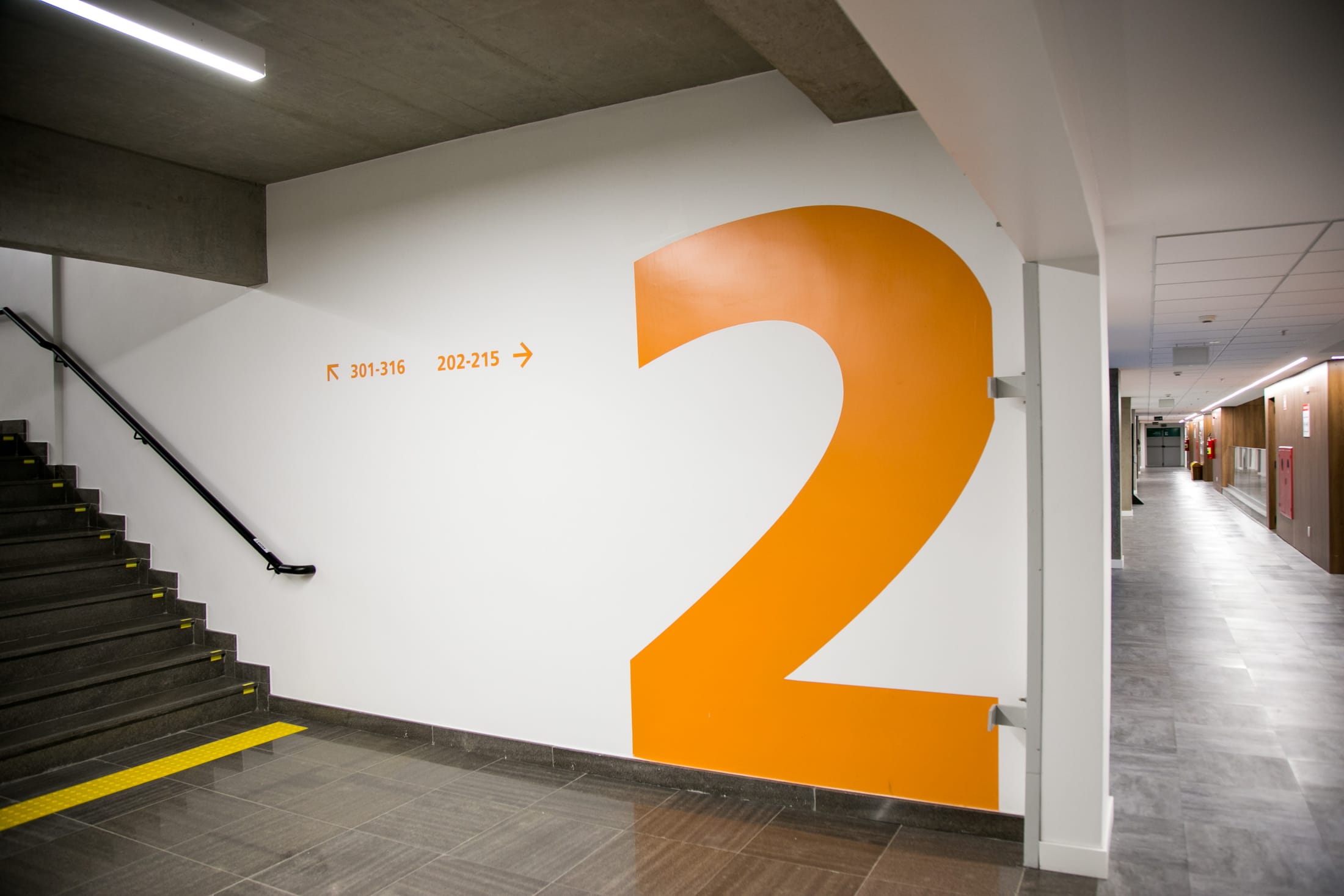
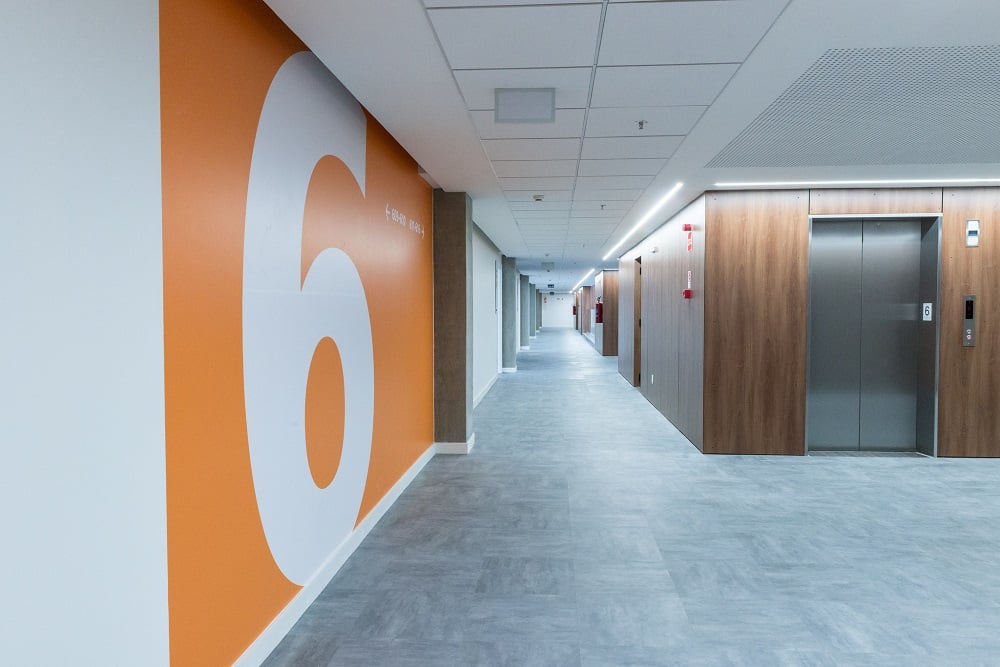
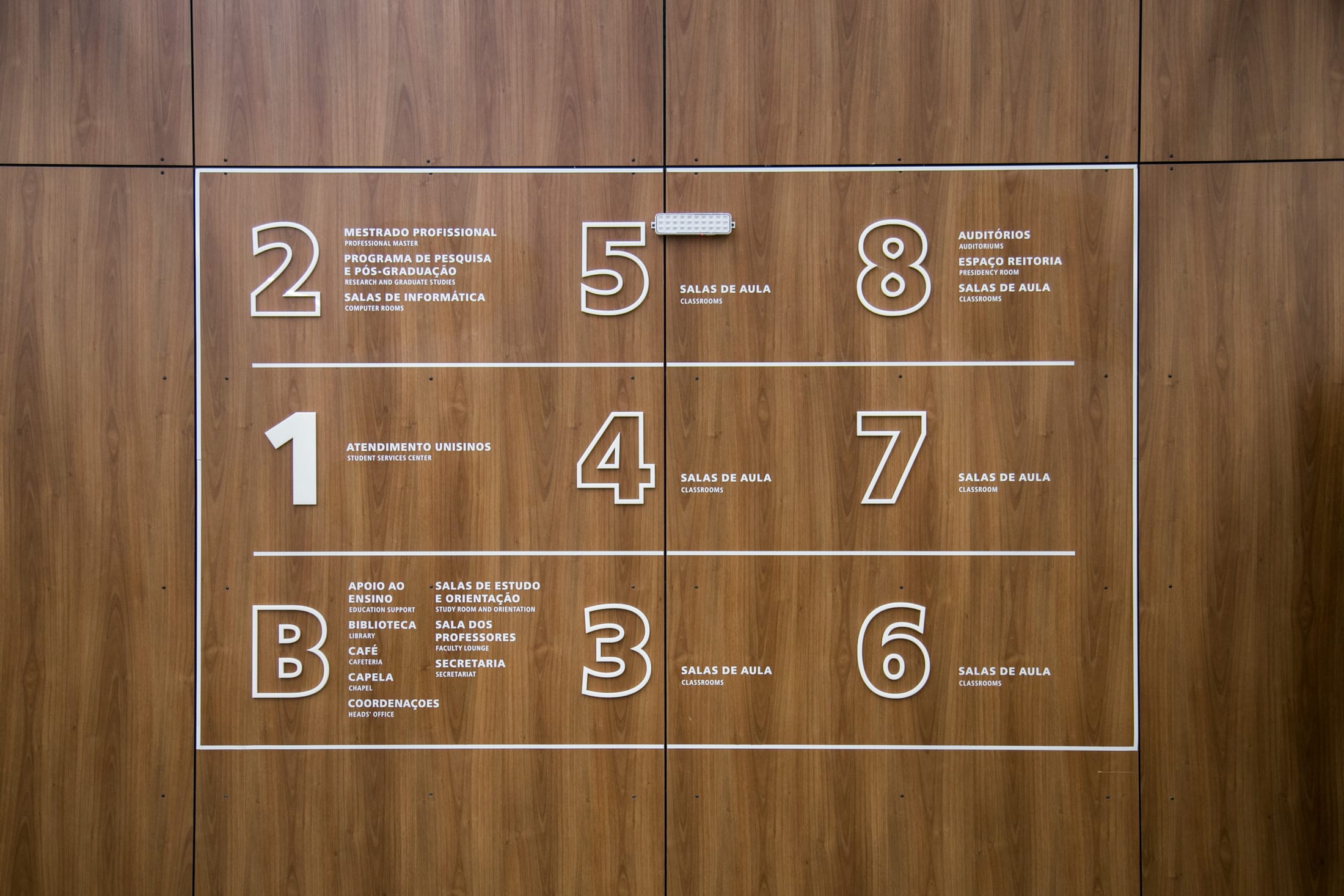
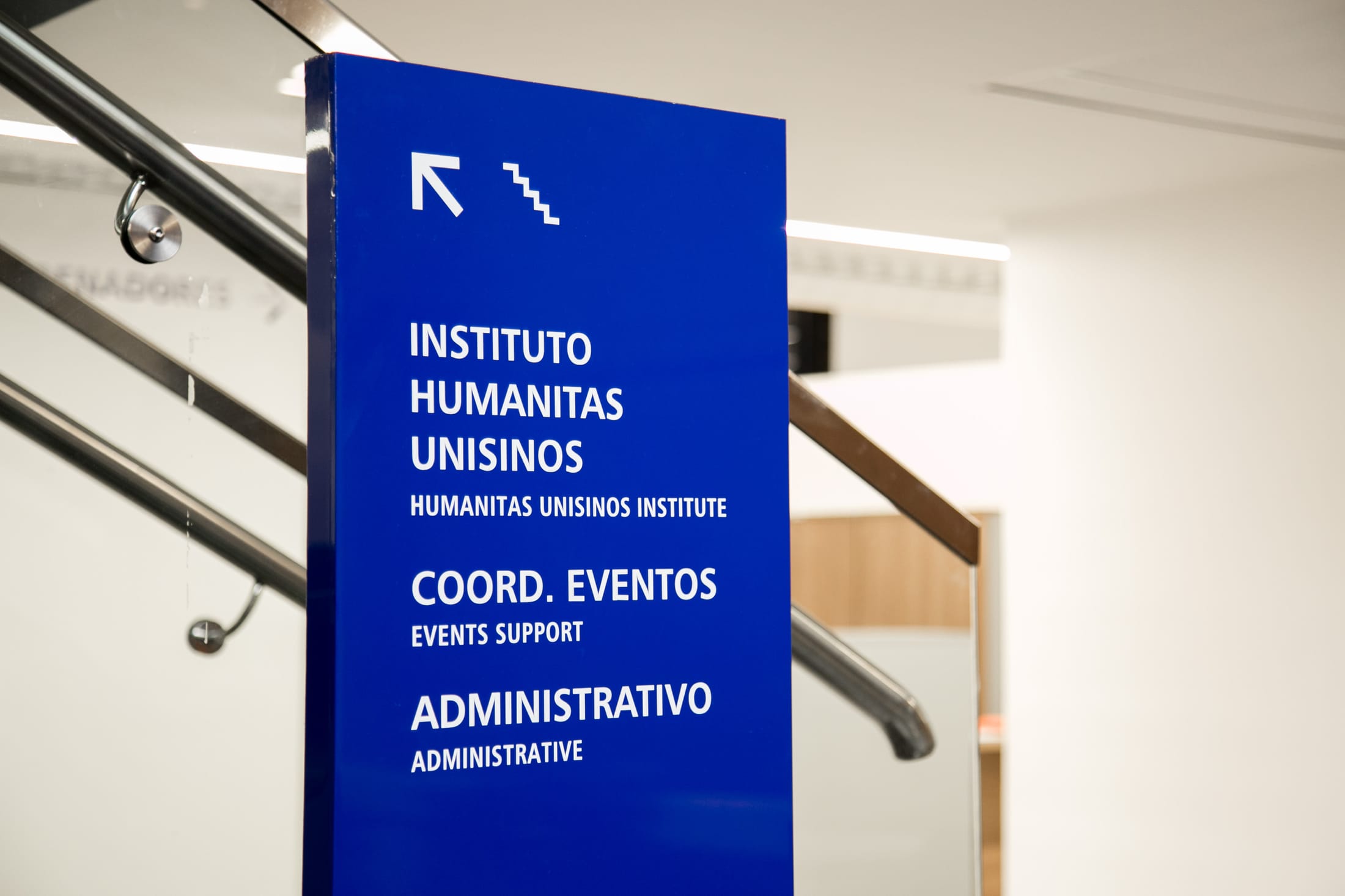
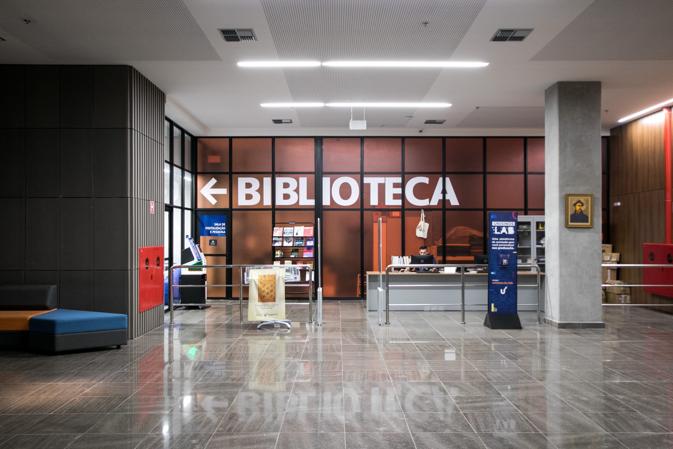
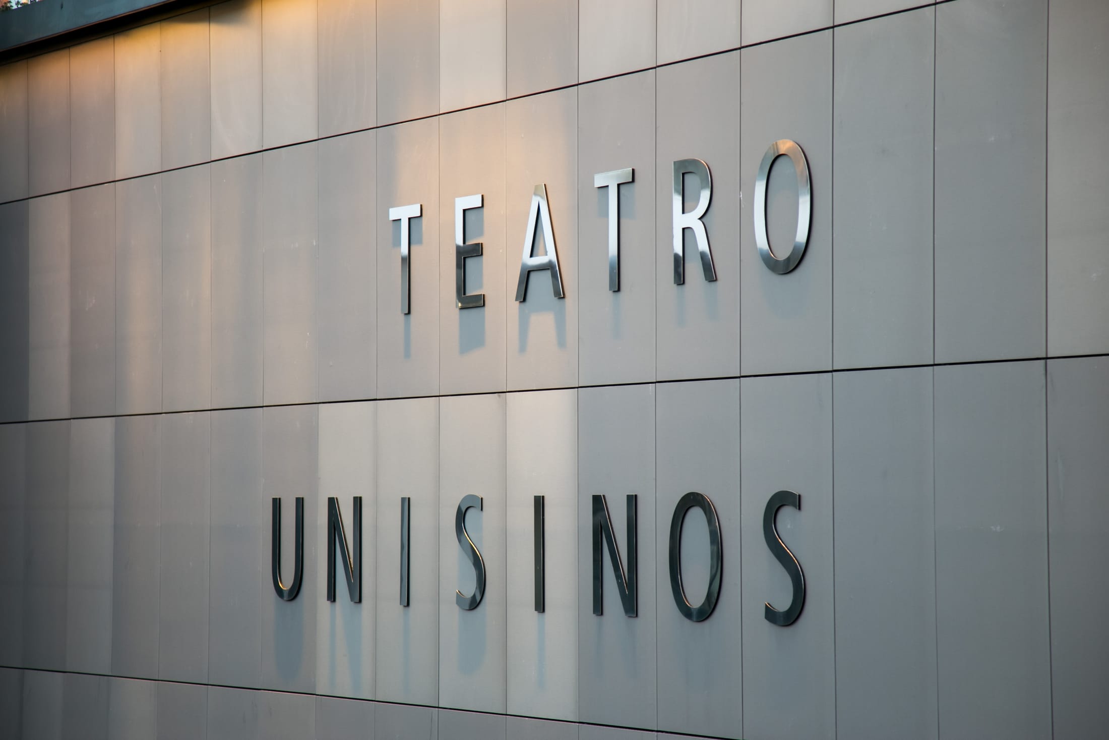
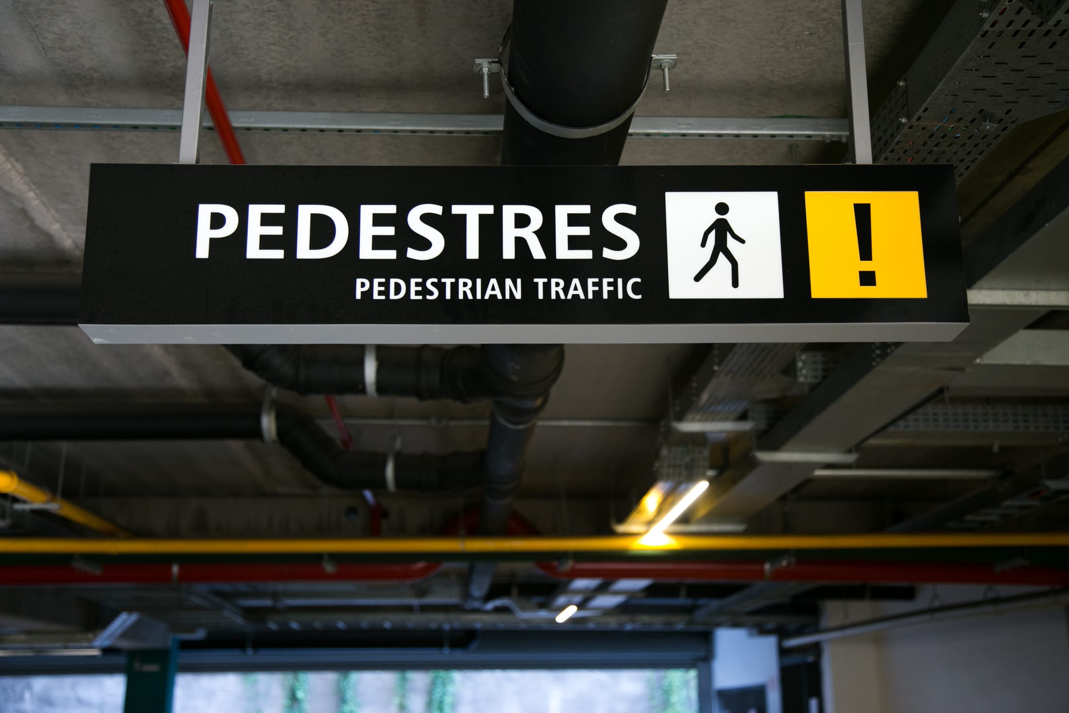
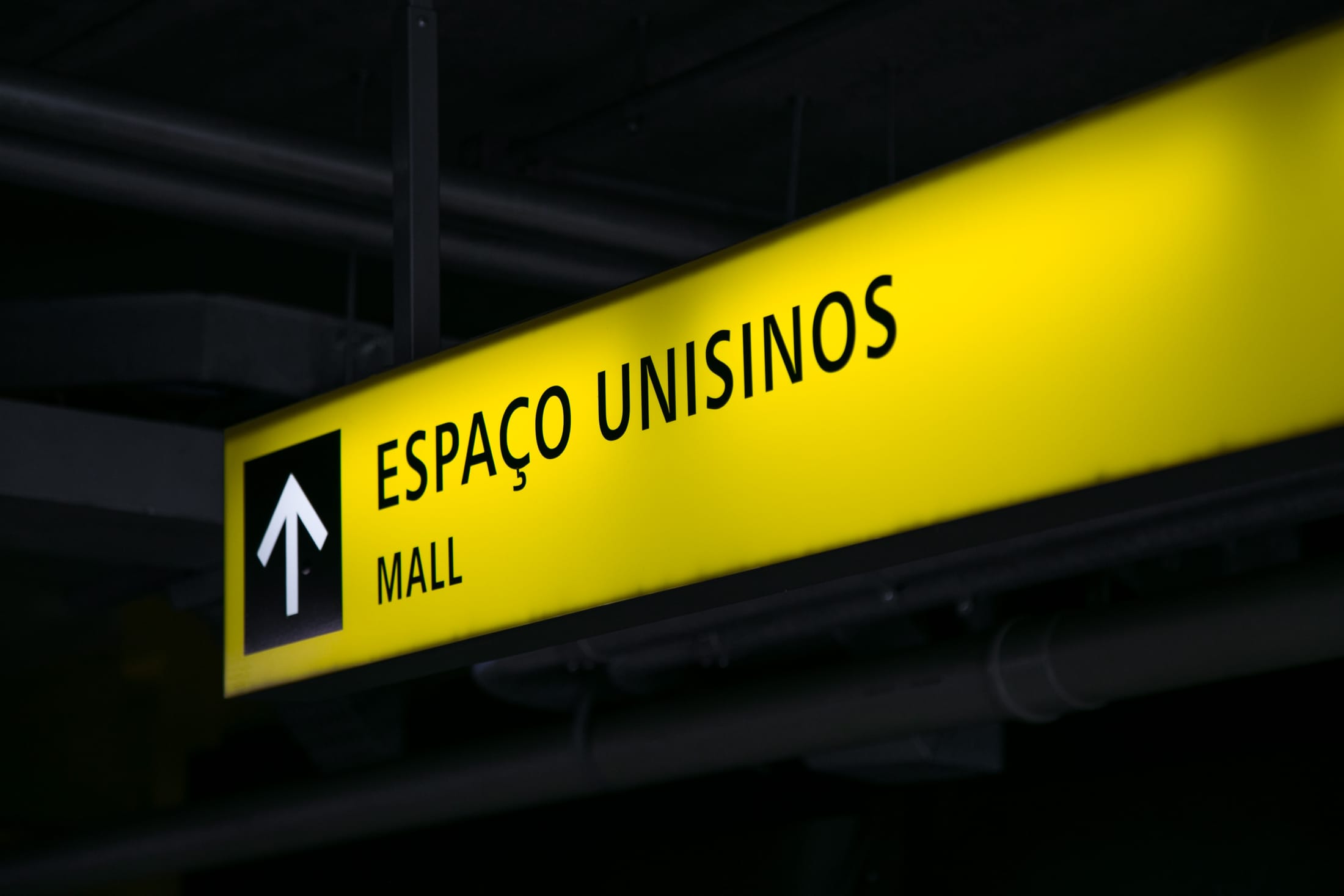
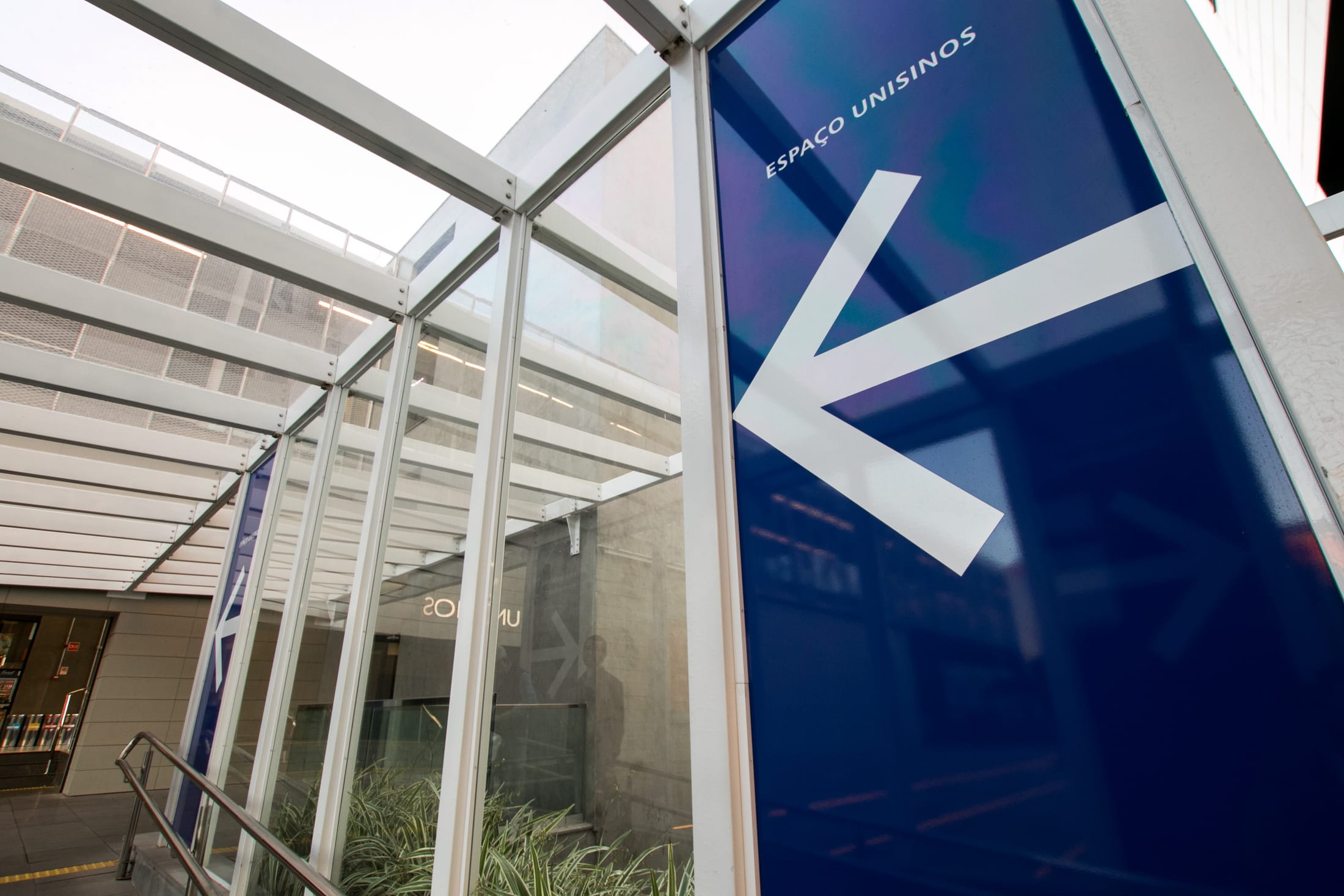
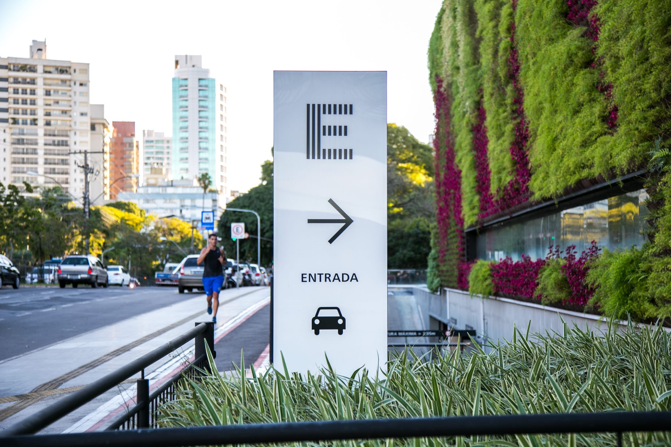
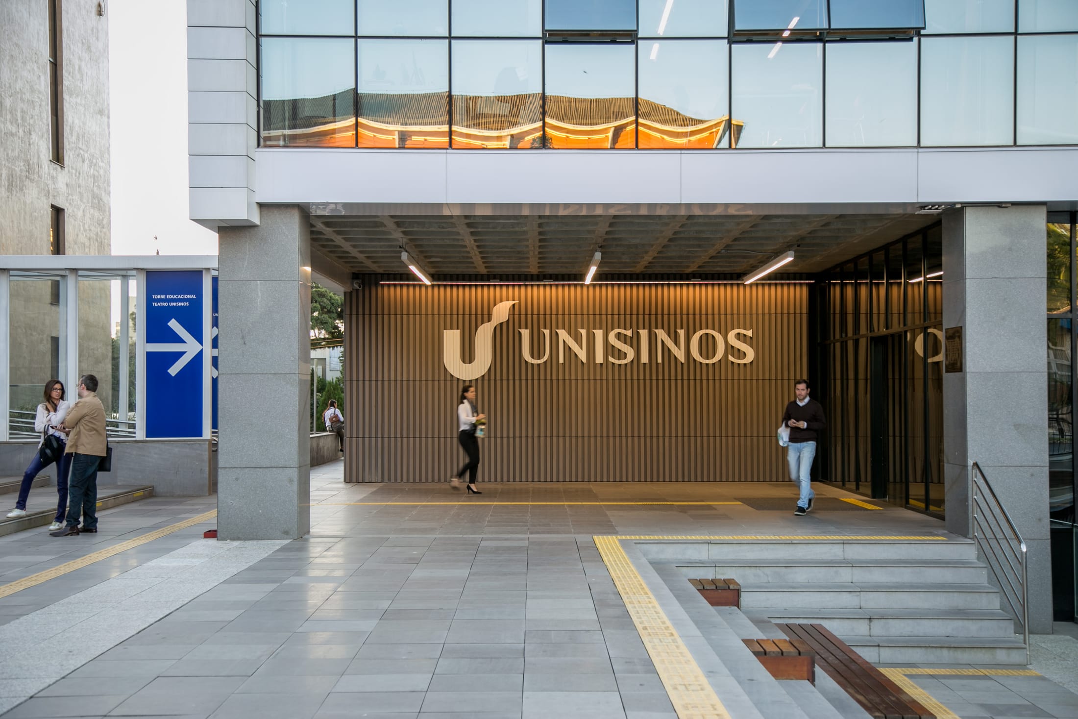
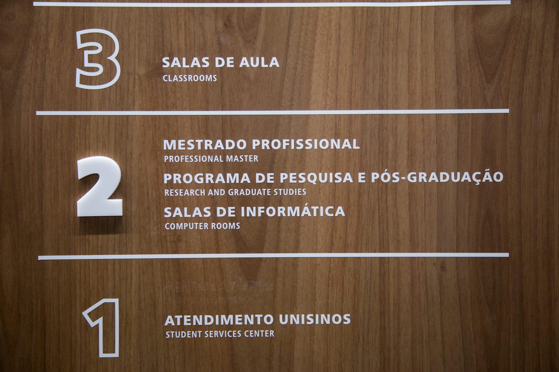
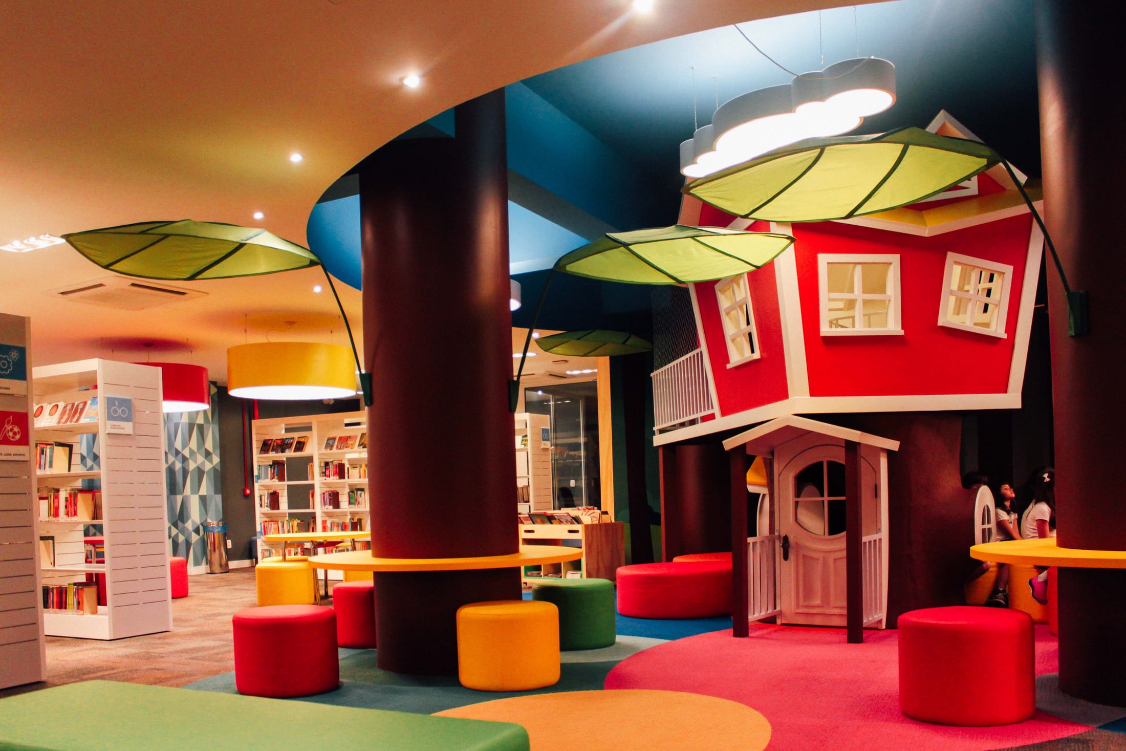
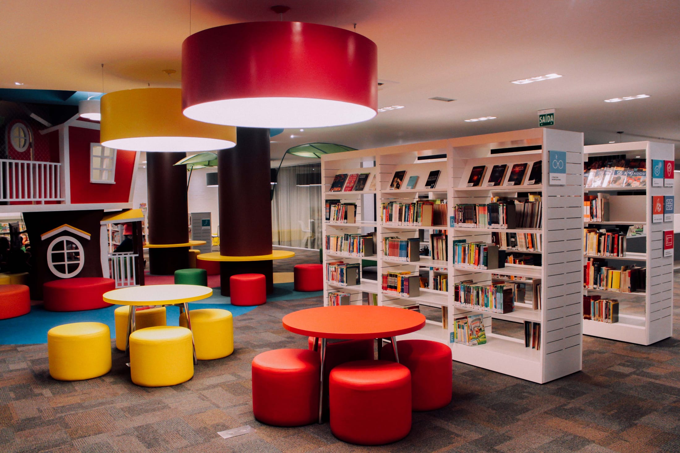
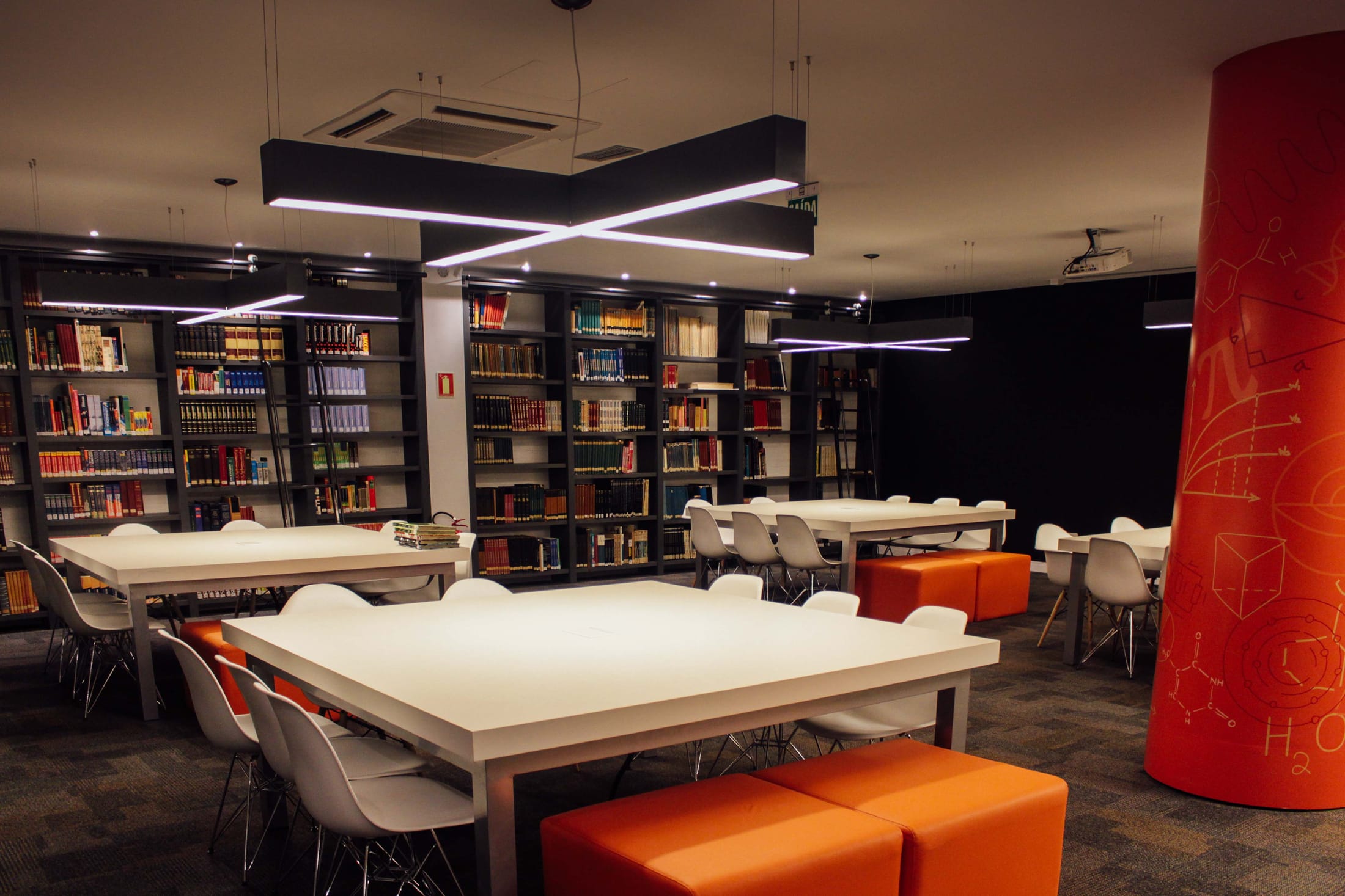
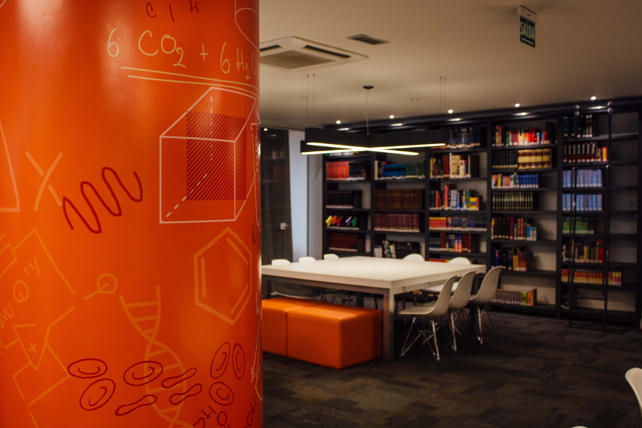
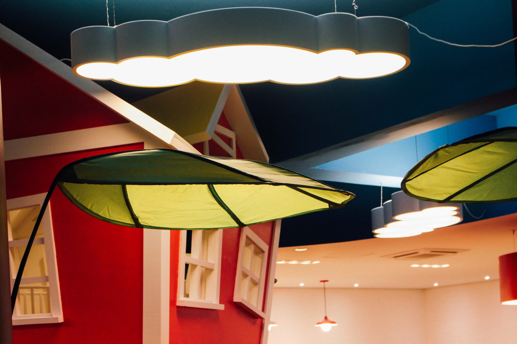
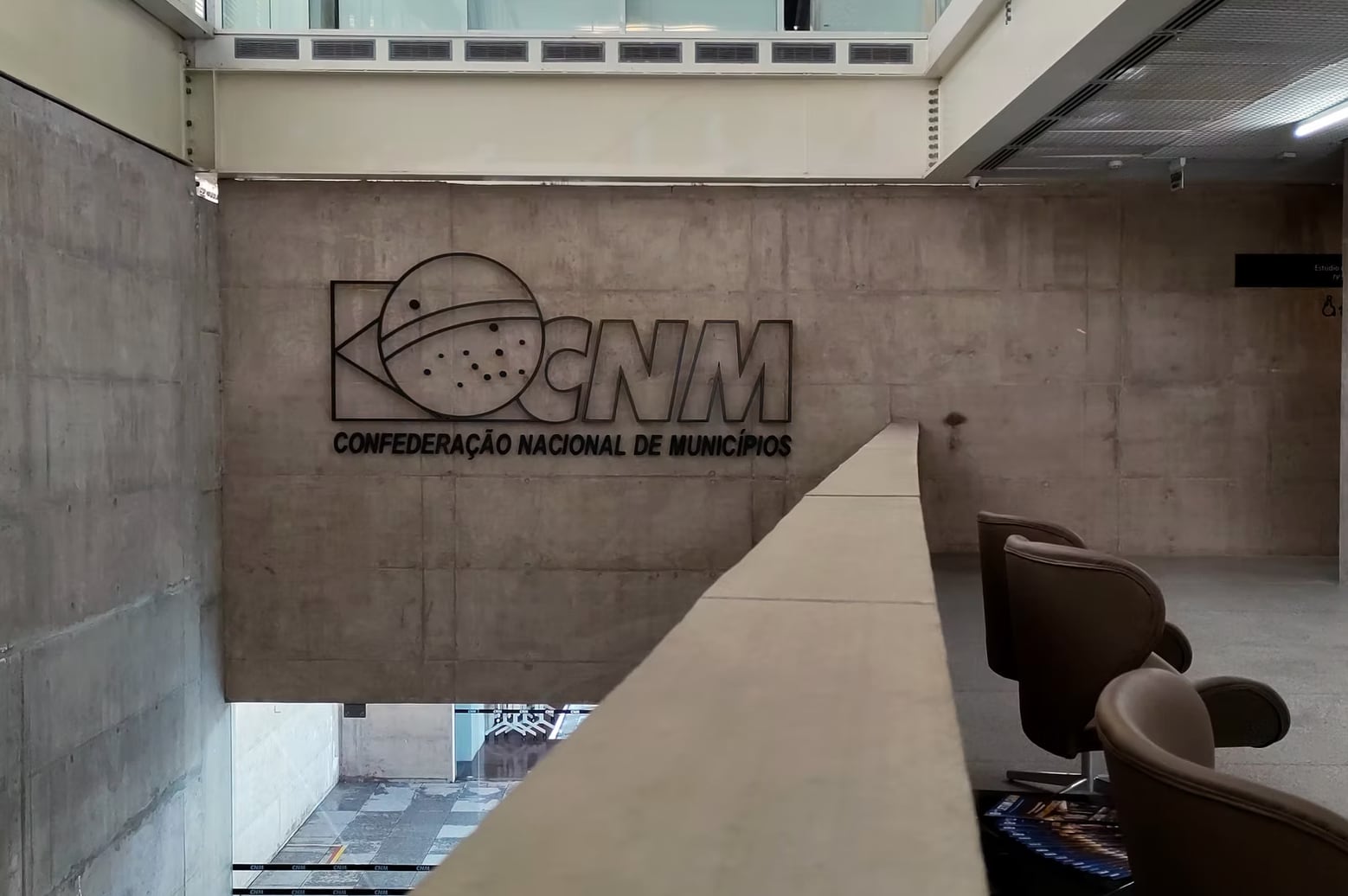
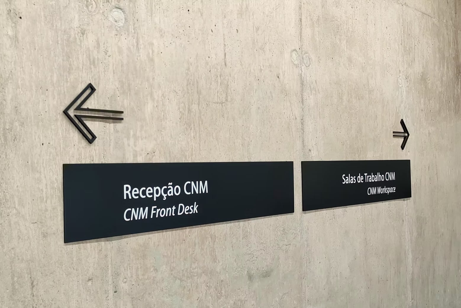
Projects included the Unisinos Porto Alegre campus, the Colégio Rosário library and the CNM headquarters in Brasília.