DIGITAL DESIGN:
CASE STUDIES
In this section, I showcase my expertise in digital design, marketing, user experience (UX), and user interface (UI) by presenting two comprehensive case studies. These projects highlight my ability to evaluate, redesign, and create effective digital experiences across various platforms, using tools like Figma and integrating marketing strategies.
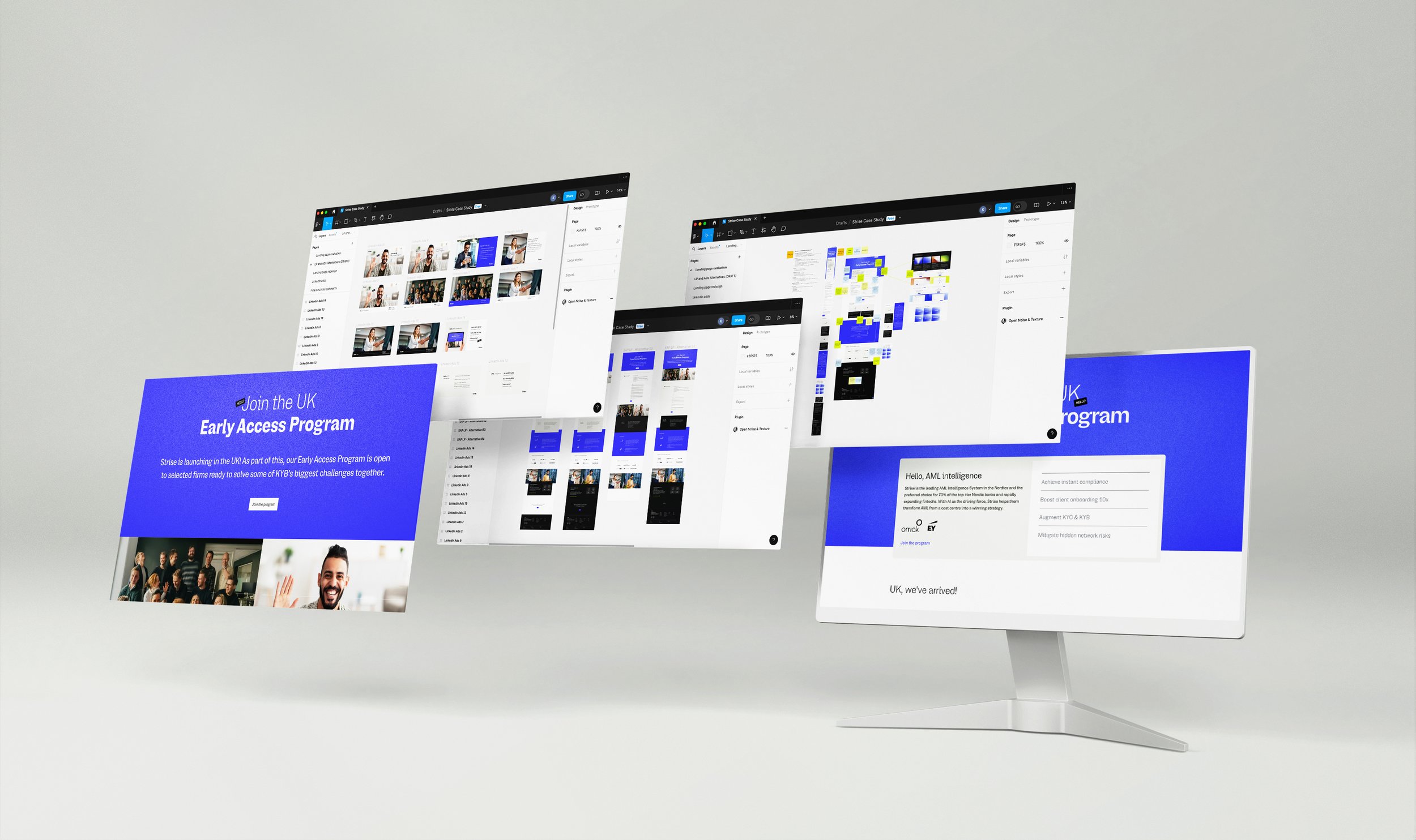
The first case study focuses on the evaluation and redesign of a landing page, accompanied by targeted LinkedIn ads for the company Strise. This project demonstrates my approach to optimizing user journeys, improving conversion rates, and ensuring that design choices align with marketing objectives.
The second case study, for reMarkable, features the creation of a mobile-optimized landing page, complemented by engaging ads. This project illustrates my capability to design for mobile-first experiences while crafting visually compelling ads tailored for social media platforms.
Through these case studies, I aim to demonstrate my skills in UX/UI design, digital marketing, and the effective use of design tools to create cohesive and impactful digital solutions.
STRISE: Landing page evaluation
and redesign + LinkedIn ads
Strise is an innovative software company based in Oslo, Norway, specializing in AI-driven data and analytics solutions. The company is known for its advanced platform that aggregates and analyzes vast amounts of data to provide businesses with actionable insights, particularly in areas like customer intelligence, financial services, and compliance. Their solutions are designed to enhance decision-making processes, making Strise a valuable partner for companies looking to explore the power of data in an increasingly competitive market.
In 2024, Strise expanded into the UK market, launching an Early Access program supported by a dedicated landing page and a series of LinkedIn ads. In this case study, I analyzed the original landing page, focusing on its visual design, user experience, and marketing messaging. I then redesigned the page and created a new set of LinkedIn ads. I have used Figma for the entire project.
Project type
Branding, UX/UI, Marketing
Place
Oslo, Norway
Year
2024
The project
For this project, I followed a basic structure of the Double Diamond methodology, beginning with research and evaluation to understand the problem, then defining the problem clearly, and finally crafting a design solution.
In this case, the general challenge was to enhance the Early Access Program landing page by improving its visual design, user experience, and messaging, while also designing LinkedIn ads that would effectively drive engagement.
The problem definition phase involved narrowing down specific areas for improvement to ensure the redesign would meet our goals. The ideation and design phases focused on developing and implementing these targeted changes.

Discovery: research and evaluation
Original landing page


I decided to do all the research and evaluation on Figma, so it would be easier to apply the changes in the next steps.
Evaluation and problems definition
During my evaluation of the original landing page, I organized my insights using sticky notes and color coding, grouping them into three categories: visual design, user experience, and messaging.
Key findings from this evaluation revealed issues such as duplicated content, unnecessary elements, unclear user actions, weak brand connection, and vague messaging.
Below, you'll find a detailed breakdown of the identified problems, categorized into these three focus areas.

Simplify layout and spacing: Simplifying the overall layout can encourage users to scroll down and engage more fully with the content.
Consistent use of graphic elements: Ensuring all the elements align with the brand identity and are used consistently throughout the landing page.
Avoid redundant elements: Remove unnecessary or repetitive visual elements to streamline the visual experience and focus attention on key information.
Visual design: Simplify and make it consistent
Prioritize key information at the top: The primary goal of the landing page is to have users fill out the form. The form should be one of the first elements on the page, ensuring that users can do so without needing to scroll.
Improve user flow and navigation: Combine related content blocks and create a smoother flow through the page, with options such as a return-to-top button and visible CTAs throughout.
User experience: Prioritize and optimize user flow
Clarify and consolidate messaging: Clear, consistent message that emphasizes the page's main goal, avoiding duplicated information that might confuse or distract users.
Connect with customers through imagery: Use images to build a connection with users and reinforce the brand's transparency and creativity.
Streamline call-to-actions: Ensure that all CTAs are aligned and unambiguous, making it easy for users to understand the next steps,.
Messaging: Engage and connect with the customers
Ideation: alternatives and potential solutions

For the ideation phase, my approach was to first prioritize the design of the Early Access Program (EAP) landing page, then develop LinkedIn ads that align with this design.

This strategy ensures a cohesive and consistent campaign across all platforms.
Design: Landing page final solution

Early Access Program landing page
I revisited my initial evaluation throughout the design process, addressing the identified issues to create a more user-friendly and focused landing page.
I simplified the header to emphasize the primary message of "join the program," allowing visitors to quickly access the form, while those seeking more information can scroll down with minimal distractions. I reordered the content to prioritize the UK launch, enhancing the flow of information. To foster human connection and credibility, I included images of employees.
Adopting a "less is more" approach, I merged redundant elements and streamlined the design to reduce distractions. Lastly, I added a call-to-action at the bottom of the page, ensuring users remain focused on joining the Early Access Program even after exploring additional content.
LinkedIn Ads
For the LinkedIn ads, I designed three distinct sets: a carousel with three images, a single-image ad, and a carousel with two images. Each ad reflects the clean, simple, and straightforward design of the landing page, featuring eye-catching visuals and elements that align with the overall campaign.
All ads incorporate clear and compelling CTAs, ensuring consistency and engagement across the entire marketing strategy.


REMARKABLE: “Back to Work”
marketing campaign
reMarkable is a Norwegian technology company known for its innovative digital paper tablets designed to provide a paper-like writing experience. Founded in 2013 the company aims to bridge the gap between the analog and digital worlds, offering a minimalist device that enables users to focus on reading, writing, and sketching without the distractions of traditional tablets.
This project is a marketing campaign targeting professionals returning to work after the summer holidays. Centered around a mobile-optimized landing page, the campaign will highlight the reMarkable 2 tablet. Digital ads on Facebook and email marketing will serve as the primary channels to drive traffic to the landing page, with the ultimate goal of increasing engagement and conversions.
Project type
Branding, Marketing, mobile UI, Social Media
Place
Oslo, Norway
Year
2023
Project scope
Project goals
Design a landing page for the mini-campaign "Back to Work," with the goal of facilitating users to click throughout the reMarkable store to make a purchase.
Create ads and email marketing materials leading to the campaign landing page.
Deliverables
– “Back to work” landing page for mobile
– Facebook ads for the campaign “Back to work”
– E-post leading to the landing page
Key resources
– Discovery and research: Miro
– Inspirations and references: Pinterest and reMarkable
website and social media
– Development: Figma, Illustrator, and Photoshop
Process
Discovery > Concept > Ideation > Landing page > E-post > Facebook ads
Deliverables

Research and concept


Visual concept: fall mood, back to work context, and reMarkable brand
The visual concept was the foundation for the ideation process, guiding key design decisions such as the use of warm, nature-inspired colors and personalized doodles throughout the campaign.
These elements helped create a cohesive and inviting aesthetic that aligns with the brand's message.
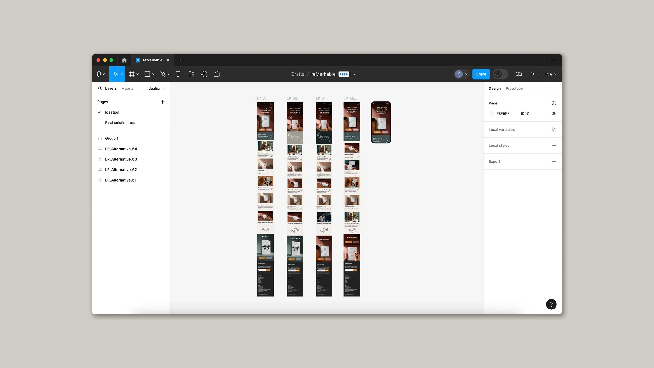
Mobile landing page alternatives on Figma

Ads and e-post alternatives on Illustrator
Design: Landing page final solution

Final solution
The final solution was carefully designed to align with the brand guidelines, resulting in a clean, cohesive, and content-focused design. Guided by the project's concept and visuals, the campaign features predominantly warm colors, and additional graphic elements created exclusively for the campaign to reinforce the brand's message.
A clear value proposition and strong call-to-action were emphasized across all materials. This attention to detail ensured visual cohesion throughout the entire campaign.

E-post final design

Facebook post and story ads
