
URBANODE
Urbanode is an architecture studio with a decade of experience in residential and commercial projects. The studio is run by Alessandra Fassina and Eduardo Paiva Ribeiro. Their mission is to deliver unique experiences through a meticulous and personalized design process. Urbanode prides itself on maintaining high quality and focus across projects of all scales, from small to large.
The name "Urbanode" embodies their commitment to transcending scales, reflecting their responsibility as architects to impact people's lives by creating designs that transform the user's relationship with their environment—from the intimate spaces of their homes to the broader urban landscape.
10th anniversary
The studio is celebrating its 10th anniversary in 2024, and the rebranding was their way of marking this significant milestone. Over the years, they felt that their brand had lost some of its meaning and identity, prompting the need for a fresh strategy to reconnect with their core values.
Client
Alessandra Fassina and
Eduardo Paiva Ribeiro
Place
Porto Alegre, Brazil
Year
2024
Deliverables
Brand voice strategy
Rebranding
Brand guidelines
Webdesign
10th anniversary commemorative assets
The project
To effectively create a brand that would reconnect the studio with its core values and audience, a well-planned project was essential. The project was carefully structured into seven main milestones, each with several additional steps.
Strategy workshop
One of the first and most crucial steps was the strategy workshop. Over the course of two sessions, and in close collaboration with the owners, we were able to extract key concepts and tools that would shape the brand's voice and overall concept.
The result of the workshop was the Brand Voice book, which outlines the brand's communication strategy. This comprehensive guide includes:
– Key strategic concepts such as the brand's vision, mission, and core principles.
– An analysis of the brand's primary strengths and weaknesses.
– The creation of a target persona to define the ideal audience for the brand's communication.
– The establishment of the brand's personality and tone of voice.
This Brand Voice book serves as a foundational tool to ensure consistent and effective communication that aligns with the brand's identity and goals.


Workshop on Miro to define the brand's voice

Brand's voice boards: strategy pyramid, principles, tone of voice, brand's personality and personality's visual moodboard
The concept
For the concept, it was decided to focus on the brand's personality. A brand's personality refers to the attribution of human characteristics and distinctive qualities to a brand as if it were a person.
This construction of personality aims to create an emotional connection between the brand and its consumers, helping to shape how the brand is perceived.
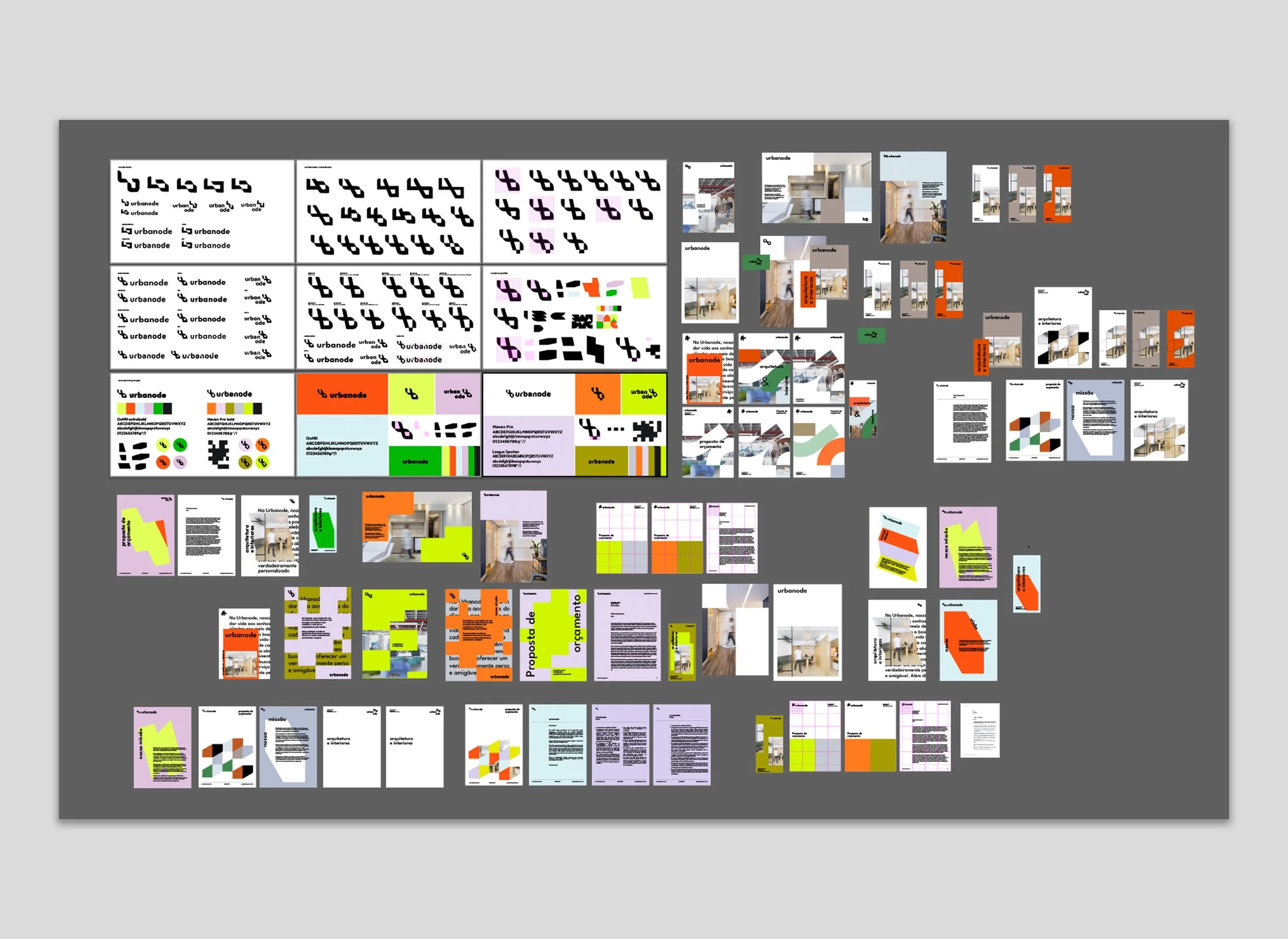
Urbanode's traits were first translated into visual moodboards, then into key visual aspects, and finally into the core components of the brand identity, such as the colour palette, typography, and illustrations.
Urbanode embodies the following traits: Appreciative, Authentic, Creative, Conscious, Young, Introverted, and Uncomplicated.
The rebranding
In the rebranding phase of the project, the studio aimed to preserve key elements of their original identity, including the symbol representing the letters "U" and "O" from UrbanOde, along with their signature color, orange.
While they were open to fresh ideas and bold new colors, they also wanted to ensure the brand’s evolution felt authentic. During the alternatives phase, numerous ideas were generated and tested, ultimately reinforcing that the final solution was the right direction to take.

Previous brand

First round of alternatives: testing new logo ideas and colour palettes
Second round: focus on one of the ideas, layout and colours testing
The reimagined brand is more in tune with the present, reflecting a modern and dynamic aesthetic.
The updated typography conveys a friendlier and more approachable image, addressing a quality the architects felt was lacking in their previous brand identity. The redesigned symbol adds a sense of dynamism, combining straight and curved lines to create a more playful and engaging form. The new colour palette is vibrant and cheerful, while also introducing calm and introspective tones through the use of pastel shades.


Graphic elements
The graphic elements that make up a brand identity are distinct and consistent visual components that help define the personality and aesthetics of a brand. These elements are crucial for conveying the essence of the brand and creating a cohesive visual experience across all touchpoints with the audience. This consistency strengthens brand recognition and establishes a lasting connection with the target audience.
For Urbanode, these elements were derived from the symbol, further emphasizing the connection with the brand’s personality. The basic shapes can be combined in various ways to create dynamic, versatile, and unique graphics, resulting in new forms.


Urbanode's new website
The design process for creating the new version of the studio's website using Figma began with a thorough exploration of the brand’s updated identity. I focused on developing a clean and straightforward design that aligned with the studio's desire for simplicity and ease of implementation since I wouldn't be part of that step. The owners emphasized the need for a website that would be easy to update and adjust independently in the future.
Wit that in mind, I directly created solutions that integrated the updated brand identity, ensuring that the design was both visually appealing and functional. The result is a website that meets the studio’s requirements for simplicity and future flexibility.


In addition to the rebranding, to celebrate their 10th anniversary, exclusive graphic elements were incorporated into the new brand identity.
These elements were designed as stickers, allowing for versatile use across various platforms, including commemorative merch and social media posts.


